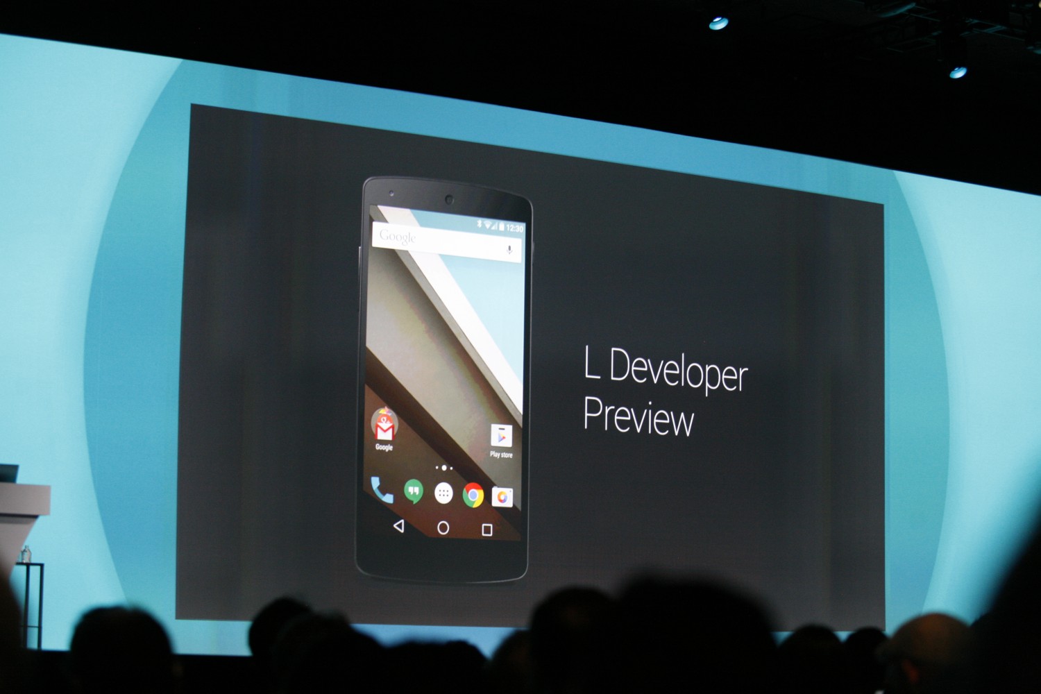
As promised in a Bloomberg Businessweek interview, Google today showcased the next version of Android during its I/O keynote. The new interface sports what Google calls “material design,” a new aesthetic that will be adopted for all of its offerings on mobile, desktop and other hardware platforms.
The interface looks flatter than before, with blocks of color and minimal outlines for its preferred fonts. Everything has been redesigned with simplicity in mind. The navigation bar at the bottom of Android, for instance, now has three simple shapes – a triangle, circle and square – to denote basic system functions. Animations are smoother and more natural, with other UI elements being rearranged as you interact with icons, buttons and content.
As part of the L Preview, developers will now be able to specify an “elevation value” for different parts of their apps, which will allow different parts to be layered on top of one another with dynamic lighting.
Google says it “drew inspiration from paper and ink” for the way its software now intelligently expands and reforms on-screen. “Material has physical surfaces and edges as the human mind is wired at its most primitive level to distinctively understand objects and their relationships,” the company said.

The new typographic layouts should be cleaner and easier to understand, with a focus on content above all else. Developers will be able to colorize new parts of Android to accentuate this fact – the menu bar at the top, for instance, could be light blue to match the color of Rdio. Designers will also be given bassline grids and other assistive tools to help them push their apps from a mobile device to desktop and other Google-supported platforms.
“So your users will already know their way around the app, no matter what screen they use it on,” one of Google’s employees said.
Animations have been completely overhauled too. Developers will be able to create seamless animations from any screen and also between apps, making Android feel more intuitive and beautiful than before.
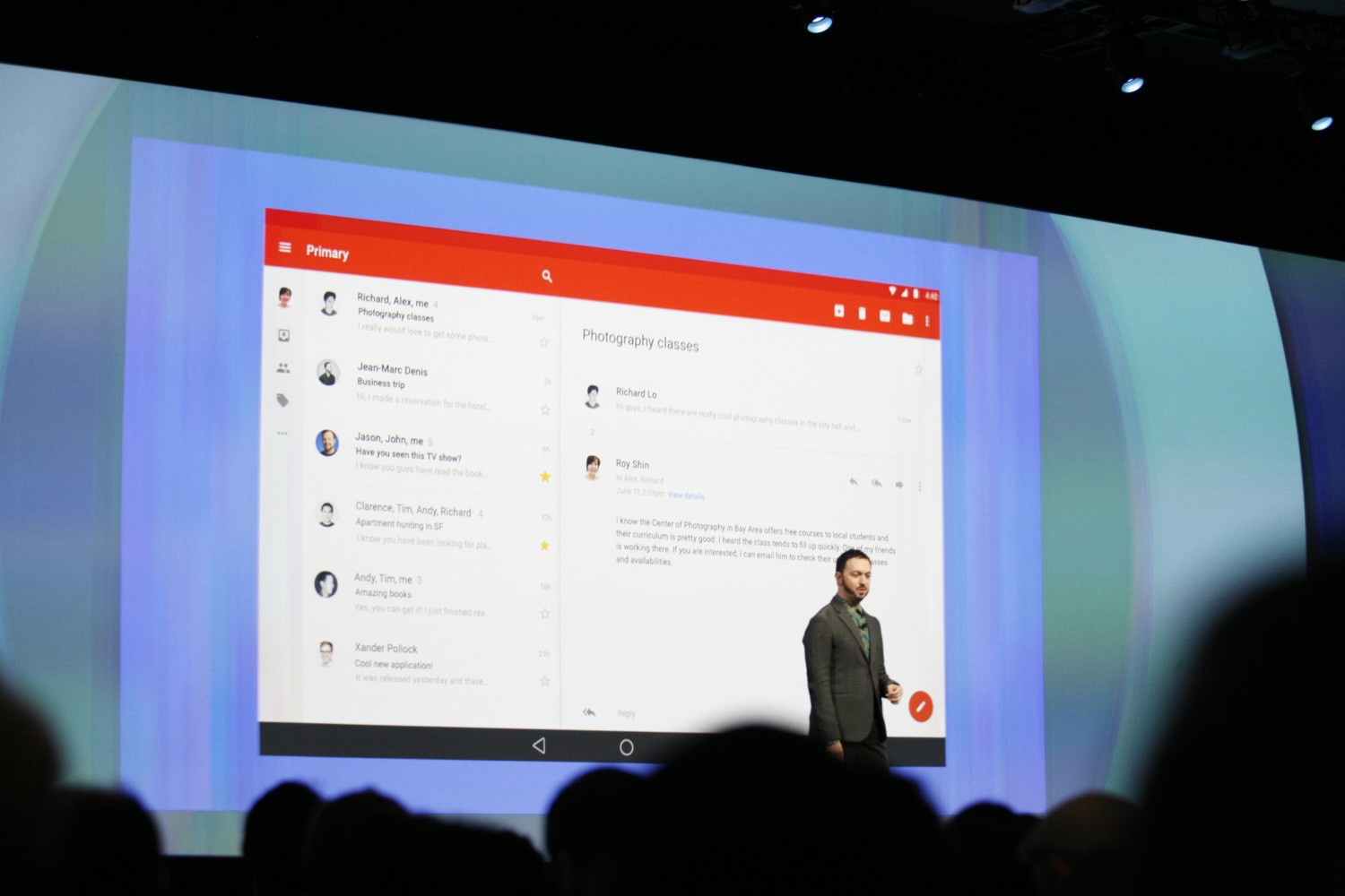
As an example, Google showed an upcoming redesign for Gmail. The tweaks were subtle, but it was clear the company had taken a detailed approach to typography and spacing. If you’ve seen the recently redesigned Google+ app on Android, you’ll be familiar with the new look.
To help developers with the new approach, Google has created a unified set of design guidelines. They can be accessed on google.com/design and offer advice on animations, layouts, typography, color and much more. The first draft will be released later today.
The dialer button floats above the UI and when pressed, there’s a slide out animation for the virtual representation of a traditional number pad. If you swipe across to recent contacts, those cards will fade away as you browse further down your list of contacts.
The new version of Android will also boast enhanced notifications, which allow you to read, open and dismiss alerts from the lock screen. They’re rendered as individual cards, and pop above their siblings when touched. If you swipe down, you can see a full list of notifications and then double-tap to launch the app.

There’s also a new type of ‘heads-up’ notifications, which appear at the top of the screen as a small card. Rather like iOS 8, these notifications can be quickly launched or swiped away.
Chrome has also been tweaked, with the addition of new animations and a full-screen look for cards in search. If you look up Vincent van Gogh and preview some of his artwork, they’ll rise up from the screen in a natural, fluid way. It’s a not a complete overhaul of the browser, but it looks more engaging.
Android will also feature a stacked card mode which will show you a list of recently opened apps and webpages. It’s unclear whether this is a replacement to the current app switcher in Android, or just a widget for moving between content in a more visual way. Again, it uses the layering effect that Google is pushing forward with its ‘material design.’
On the performance side, the L Developer Preview runs solely on Android Runtime (ART). It’s less resource-intensive and therefore beneficial for lower-end devices and general battery consumption.
Under an initiative called ‘Project Volta’, the new version of Android will include a new battery saver mode to help your smartphone or tablet run for longer. On the Nexus 5, Google is promising up to 90 minutes of extra charge each day.
Check out our liveblog and Google I/O 2014 page to keep up with all the latest announcements.
Featured image credit: KIMIHIRO HOSHINO/AFP/GettyImages
Get the TNW newsletter
Get the most important tech news in your inbox each week.