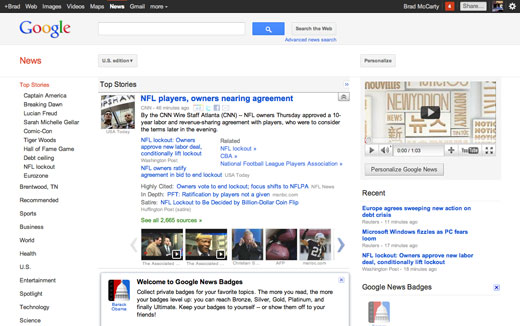
A new design of Google News based on the aesthetic conventions introduced by Google+ last month has begun rolling out, according to Google Operating System.
But while it uses the same conventions as Google+, it misses the mark — the layout doesn’t work, there are careless padding issues and it is in general a big step down from the more traditional layout.
We loved Google’s new design direction when it started appearing, but we’re not really sure how to explain what happened here. Here’s hoping Andy Hertzfeld comes in and kicks some ass soon.
Get the TNW newsletter
Get the most important tech news in your inbox each week.


