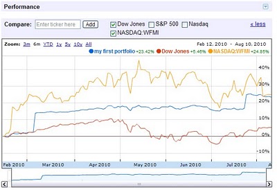
Google today is adding a useful feature to investors that use Google Finance – Portfolio Charting.
Before, Finance just showed a chart for each individual stock, but now – using transaction data users have either entered and/or uploaded – the chart shows the “market value of each portfolio at a given time”. According to a post on the Google Finance Blog,
Now you can graphically track your portfolio’s historical performance either individually or versus a specific stock or market index to get an instant snapshot of how you’re doing. For the first time on Google Finance, you can see a visual representation of an entire portfolio as well as track it over time, rather than graphing each stock individually.
To use Portfolio Charting, you go to ‘Portfolio related news’ on your Portfolio page, then you can use the chart to view your portfolio against the Dow, S&P 500, NASDAQ and other indices as well as against a particular stock (using the stock symbol). Certainly a welcome addition to Google Finance.

Get the TNW newsletter
Get the most important tech news in your inbox each week.


