There’s a lot to be said for great design. In fact, may things have been said, including the idea that good design is only complete when nobody notices it. Google, as much as we may love its products, has never really been known for its design prowess.

In fact, being the design junkies that we are around here at TNW, we’ve had moments where we would forego Google’s functionality in order to use a product that was simply more aesthetically pleasing. Generally speaking, things that are pretty are also easy to use (let’s leave Color out of this equation) and that’s just an area where Google has never really excelled.
Fortunately, it appears that Google is now putting a heavy focus on design. In fact, we’re pretty certain that the focus has something to do with having a former Apple design team member on the staff. It became glaringly obvious with Google+, but that trickle-down effect can be seen in other Google products too.
Google’s design direction now, according to a blog post, is in three areas:
Focus – Making it easier to find what you want
Elasticity – The same experience, regardless of device
Effortlessness – Using the right tools for the right jobs
Both focus and effortlessness should fall into that category of “unnoticed design”. When things are working the way that they’re supposed to, you should never know that it’s happening. What’s important to note, though, is that Google’s focus on elasticity is something that we’ve been pushing for here at TNW for some time.
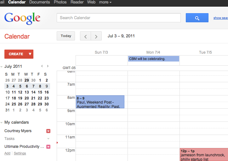
Today (if the features have rolled out to your account) you’ll notice some slight yet important changes in how Google’s products operate. The Calendar, for instance, has an open and airy feel to it. Previously, while it was hugely functional, it was cramped and difficult to navigate. The new version feels like something in which we’d actually want to work:

In Gmail, it’s a matter of “the little things”. Previously, if you were inside of a message and had to scroll down, you’d lose the ability to do anything other than reply. Now there’s a fluid bar at the top of messages which will stay in place while you scroll, allowing you to have any of the actions that you’d want without having to scroll back to find them:

What will remain to be seen is whether Google will be able to sway the Apple fanboys. Notoriously, Apple fans have swayed toward Apple’s web and desktop apps, often times just because they look great. With Google’s shift toward beautiful, usable design, will it be enough to tip the scales?
In short, Google is making the changes that will keep it on pace with other offerings in the market. It’s incredibly welcome and we’re rather keen to see the rest of what Google has to offer in the coming months. Just like in life, you should never have to choose beauty or brains.
Get the TNW newsletter
Get the most important tech news in your inbox each week.


