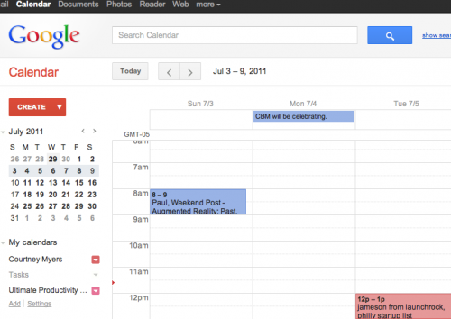
“Oh, hello there!” I said to my shiny new Google Calendar this morning. Google has been busy revamping its products to reflect its new look, likely in celebration of its massive Google + social push. Here’s a screen shot of the new look:
Starting today, you’ll notice a fresh new look for Google Calendar, which Google says is the first in a series of changes to make their products “more consistent and intuitive so your experience is more enjoyable and productive.” Google says the changes are just cosmetic and have not affected the way Calendar works. You can also choose to turn off the new look by clicking the gear icon and choosing “Use the classic look” and turn it back on by going to the gear icon and choosing “Try the new look.”
New calendar functions include:
- “Quick add,” which is now under the down arrow next to the Create button.
- Calendars selected for viewing in your My calendars and Other calendars lists will have colored arrows next to them as opposed to colored backgrounds.
- Print and Refresh buttons are now icons rather than text links.
- Visual indicator icons such as alarm clock icon for events with reminders, person icon for events with guests, etc. will only show when hovering over the event.
- My calendars and Other calendars lists on the left are now collapsed by default and may be expanded using the small gray arrow.
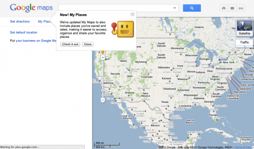
Google says expect more changes to the look and functionality of its Calendar throughout the summer and into the fall. Google also updated its Maps today. Google Maps are updated to include places you’ve saved and rated, adding clout to Google Places, Google’s evolving shopping products and possibly, Google’s adventure into the daily deals space with Offers.
Why has Google made these changes?
The way people use and experience the web is evolving, and our goal is to give you a more seamless and consistent online experience — one that works no matter which Google product you’re using or what device you’re using it on. The new Google experience that we’re working toward is founded on three key design principles: Focus…Elasticity…[and] Effortlessness.”
Google has always been on the cutting edge when it comes to technology and its functions in our daily lives, but it’s a breath of fresh air to see the company concentrating so diligently on the design side as well. Google’s previous lack of attention to aesthetics has led its many Apps customers to become devoted Apple fans. Its design and social efforts are going to give Facebook and Apple reason to hold more than a few board meetings. More on Google’s new design philosophy here.
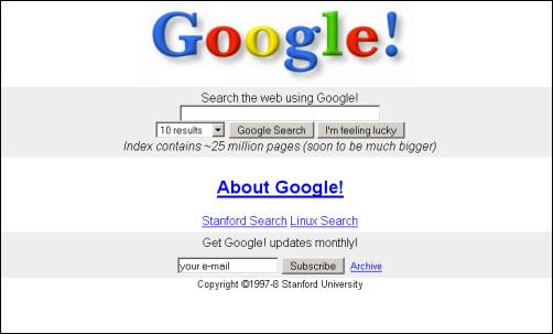
Looking forward to new looks from Google. After all, remember the original Google?

Get the TNW newsletter
Get the most important tech news in your inbox each week.


