
 Earlier today, a sneak peek of a major Foursquare iPhone App UI update – we’ll call it the SXSW update – briefly slipped into the App Store. Fortunately for us, Nick Starr was paying attention and was able to grab screenshots of the new look before it disappeared from the store.
Without further ado, here is a side by side comparison of the current Foursquare UI with the pending SXSW update.
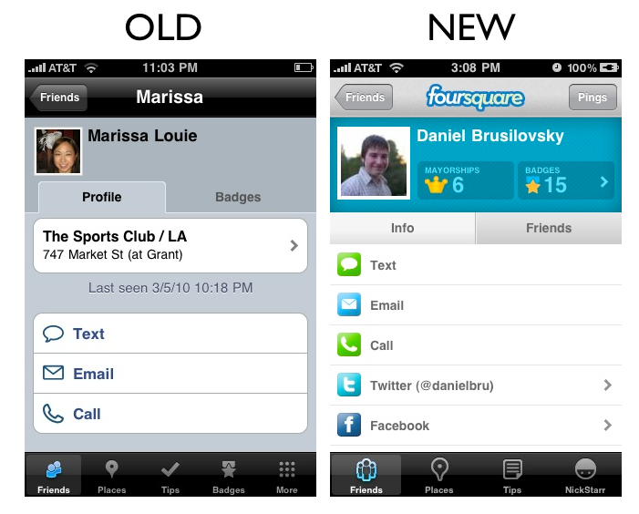
Friends View
(note the fun refresh control)
Places Views
(note the Gowalla-esque venue icons)

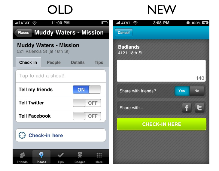
Check-In View
(Note the inclusion of the “Shout” field on the check in submission page (or is this field for tips?))
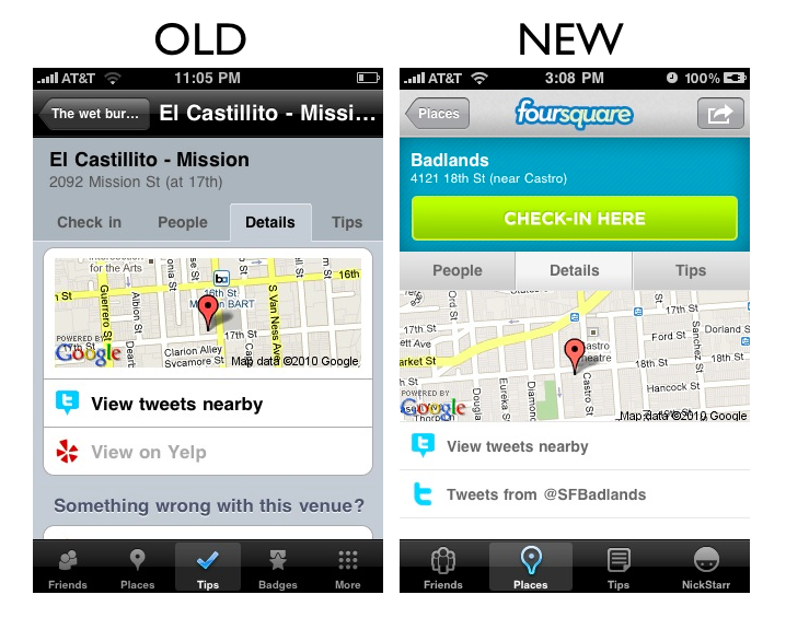
Places Detail
(Note how the Yelp links have been booted out)

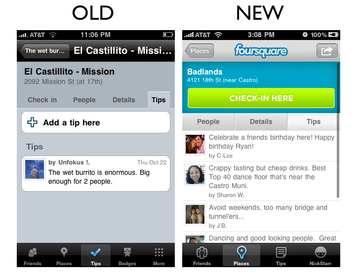
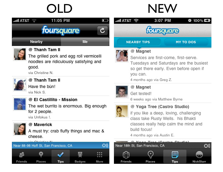
Nearby Tips
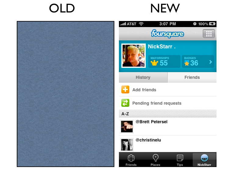
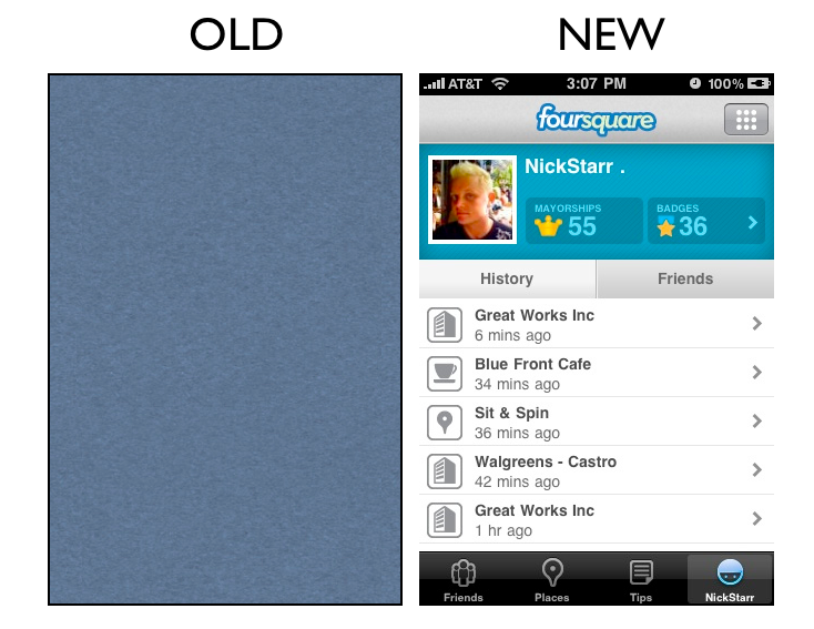
Your Profile
(Note how Foursquare has introduced a self Profile View)

In summary, lots more color, the introduction of venue icons, the introduction of a profile view, a rethinking of the primary tabs at the bottom of the app, the polite ejection of Yelp, and more.
We think this is a pretty solid refresh of the UI.
Related articles by Zemanta
- New Version of Foursquare for iPhone Coming Soon [SCREENSHOTS] (mashable.com)
- Foursquare Update Coming Soon (thetechscoop.net)
- Location Will Be This Year’s Twitter At SXSW (techcrunch.com)
Get the TNW newsletter
Get the most important tech news in your inbox each week.