
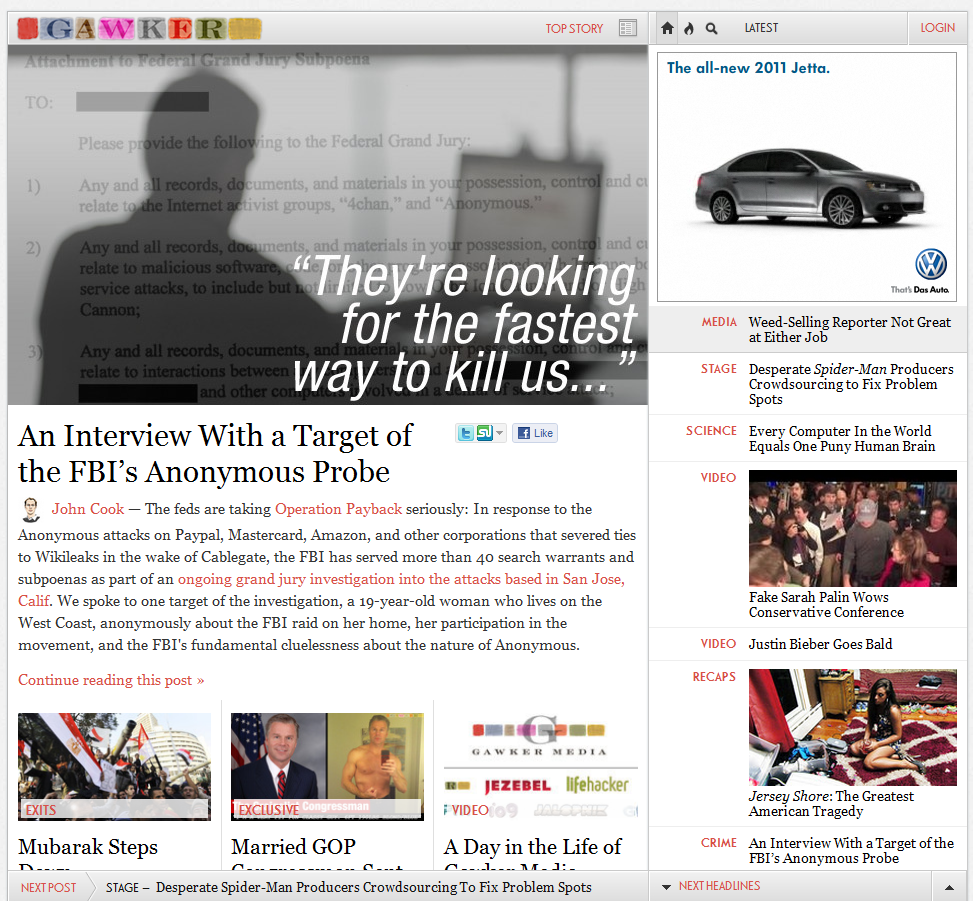
 Hate it or love it, the new Gawker layout is a massive change that represents an important moment in blog design. While it is indeed forward-looking, if it is actually usable is a matter up for debate.
However, Gawker was not always so innovative. Their first designs were downright normal. In fact, the first two proposed designs for the website were a bit dull. Here, coming from the designer himself, is the first design submitted to Nick Denton for Gawker in October of 2002:
According to the designer: “Nick [Denton] didn’t like it too much. Background too dark, masthead text not logo-y enough. Two weeks later, I sent him this, with a half-assed technicolor logo that I’d dashed off in Photoshop in like 30 minutes:”
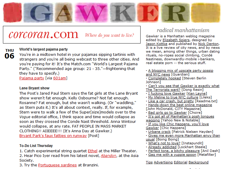
Look familiar? That became the first Gawker design to actually make it into the wild. This is what the site looked like when it was finally launched:

The 💜 of EU tech
The latest rumblings from the EU tech scene, a story from our wise ol' founder Boris, and some questionable AI art. It's free, every week, in your inbox. Sign up now!
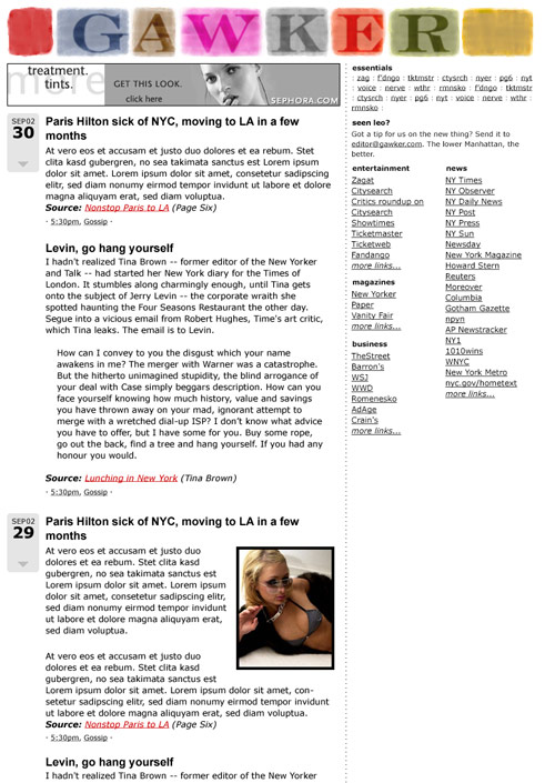
And finally, this is what Gawker looks like today, for better or for worse:
TNW has also gone through big design changes, but with the massively positive response that our current layout has garnered, you have little to fear in terms of us making the site harder to use. Which version of Gawker do you prefer?
Get the TNW newsletter
Get the most important tech news in your inbox each week.