In design, trends are fleeting. From Art Deco to Swiss Style to Grunge, design movements come in waves and unsurprisingly, the Internet is accelerating our tastes.
But when it comes to memorable designers, none were praised for diving blindly into trends.
Sure, David Carson is well-known for his application of distressed type and harsh, jarring layouts, but his work remains incredibly beautiful and meaningful — all while Grunge falls so out of style that it just might come back ‘in’ again.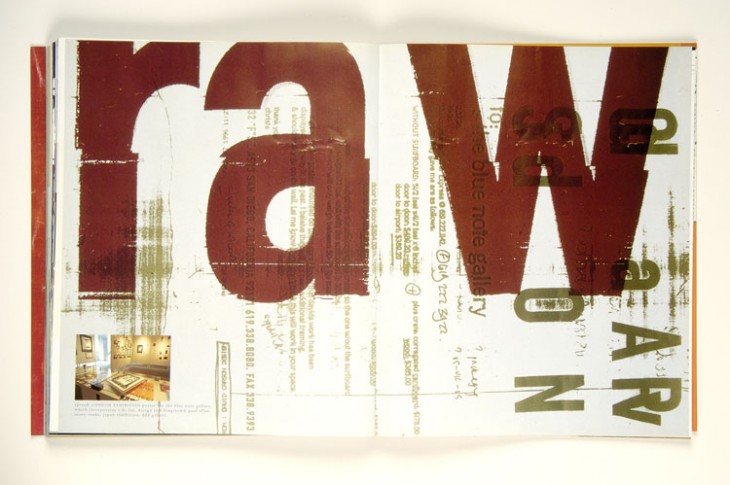
A.M. Cassandre is another that managed to embody a trend, but more memorable than his embrace of Art Deco styles is his painterly, jaw-dropping way of merging fine-art with poster design.
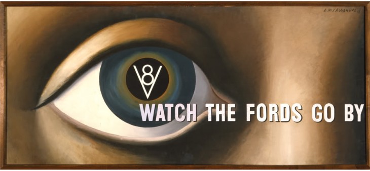
My point isn’t that you should ignore trends — every designer is a product of their time — but you shouldn’t let tends define you or your work.
Flat
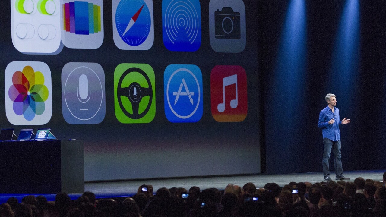
On June 10, 2013, Apple’s introduction of an incredibly flat iOS took many by surprise. Now, the OS has abandoned skeuomorphism (almost) entirely for a trend that was already gaining steam amongst minimalist-inspired Web designers and yes, even Microsoft.
Just as before, Apple’s design of its OS will heavily influence app makers. This makes sense, because no company wants to build an app that deviates so heavily from the OS that it creates confusion.
But when you’re designing your mobile app, Web app, or any other interface or product, I beg you, don’t build walls around design. If something calls for a gradient, use it. Shadows, and yes, even gloss, should be in your palette — use them only if you need them to create something beautiful and memorable. Something lovely, or grand, or forceful.
With Apple’s blessing, just about every design is about go incredibly flat, and that’s fine. But if you’re going flat, it better be good. Otherwise, you’re just wasting everybody’s time.
The same goes for every other design style.
Trends are fleeting and if you follow them like a bible, you’ll get left behind with the times.
Featured Image Credit: Kimberly White / Getty Images
Get the TNW newsletter
Get the most important tech news in your inbox each week.


