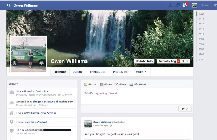
Facebook is experimenting with a new single-column Timeline design for users in New Zealand, shifting status updates and shared content to the right-hand side while adding a refreshed ‘About’ section on the left.
The trial could be affecting only a select number of users in the country and follows a slightly different profile redesign that was rolled out to some users there earlier this year.
New Zealand is often Facebook’s testing ground for new or experimental updates, and this one appears to be in keeping with some of the new aesthetic touches introduced with Graph Search in January.
Screenshots from TNW contributor Owen Williams show that Facebook has decided to keep the updated Timeline headers, hiding the current boxes for ‘Friends’, ‘Photos’, ‘Maps’ and ‘Likes’ under a sub-menu.
Timeline activity still takes up roughly two-thirds of the page’s column width, giving greater prominence to uploaded content, shared links and messages left by other people. As a comparison, most users still have their Timeline split exactly in half; one side for status updates, the other for recent activity, thumbnail images of friends’ profiles, independent app activity and more.
The difference is that the two columns have now been swti
The second image shows an entirely new feature, however, associated with posted links and Facebook Pages. A status update from BuzzFeed links to an article online, but there’s also a new ‘Like Page’ button underneath where users can choose to be taken to the publication’s official Facebook page.
It’s a small addition, but one that will no doubt help to encourage more users to look, discover and ultimately follow more Facebook Pages. That’s a significant incentive for any business wondering where it should focus its marketing efforts online, or deciding which social network can offer the greatest traction with its target audience.
With more opportunities to click-through to a company’s Facebook Page, there’s likely to be a growth in overall page use, adding to the value of the social network and overall adoption by businesses.
The most recent redesign was spotted last October, before going live in New Zealand earlier this year. It came with a whole host of design tweaks, which are still yet to be rolled out worldwide. If this additional design revamp is a success, it will likely be released to users worldwide – at least, eventually.
We have reached out to Facebook to find out more about both the profile redesign and new Facebook Page like button, and will update this article if and when they respond.
Image Credit: BRENDAN SMIALOWSKI/AFP/GettyImages
Get the TNW newsletter
Get the most important tech news in your inbox each week.


