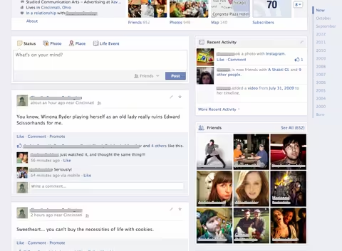
Facebook recently started testing a new version of its Timeline design that cuts the number of columns for posts from two to one. While there are still two columns, the left one is for items shared on a user’s profile (Wall posts, status updates, and so on) while the right one is for everything else you want on your profile (boxes for Friends, Photos, Places, and so on).
In fact, the column on the left is made wider to accommodate all posts while the column on the right is narrower but still manages to include active modules. Facebook manages to pull this off by simply making the content on the right taller instead of wider (for example, the Friends box is 3×3 instead of the current 2×4).
Here’s how the new design looks, courtesy of Inside Facebook:
We reached out to Facebook to confirm this isn’t just a glitch, and boy were we thankful it isn’t. “This is a new design Facebook is testing with a small percentage of people to make navigating timeline even easier,” a Facebook spokesperson told The Next Web. Great, now roll it out to me so that I can finally scroll down someone’s Timeline without feeling like my eyes are playing ping pong.
This is how Timeline should have looked like from the start. It’s seriously annoying to keep jumping between posts on the left and right sides, not to mention trying to figure out the chronology of them.
Playing devil’s advocate, there are some minor flaws with this change. First of all, there’s no longer a line down the center that is supposed to make the profile look like a “timeline,” although I doubt many users will care. Furthermore, the right-column is empty if you scroll down too far, which results in quite a bit of wasted space.
Nevertheless, I’m personally hoping this test goes well and that Facebook decides to move all users to this new look.
Image credit: Marcelo Terraza
Get the TNW newsletter
Get the most important tech news in your inbox each week.


