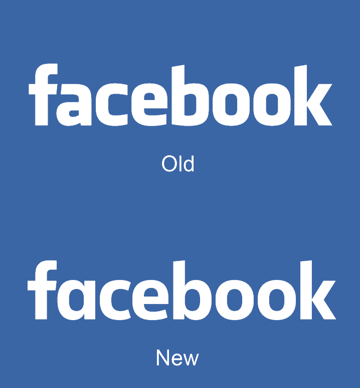
Facebook quietly changed its logo yesterday for the first time since 2005 and you probably didn’t even notice.
Say hello to the new Facebook logo pic.twitter.com/ofoFm4JQmK
— Christophe Tauziet (@ChrisTauziet) June 30, 2015
The update is only a refresh of the company’s wordmark, which is the text-only version of its logo used for identifying its brand.
Josh Higgins, Facebook’s Creative Director told Brand New that the company “set out to modernize the logo to make it feel more friendly and approachable” and settled on an update instead of a full redesign.

Facebook asked Eric Olson, the designer of Klavika, the font used for the original wordmark, to design a new typeface.
Ben Barry, a former designer at Facebook, had also proposed tweaks to the Facebook wordmark in 2012 which were approved by the company but never implemented.
The actual Facebook ‘F’ logo isn’t being changed. You’ll only notice the difference where the full name is used.
➤ New Logo for Facebook done In-house with Eric Olson [Brand New]
Read Next: Facebook’s new iOS photo uploader looks a lot like Snapchat
Get the TNW newsletter
Get the most important tech news in your inbox each week.


