Odes Roberts is an in-house designer for Shutterstock. This post was originally published on the Shutterstock blog and has been reprinted with permission.
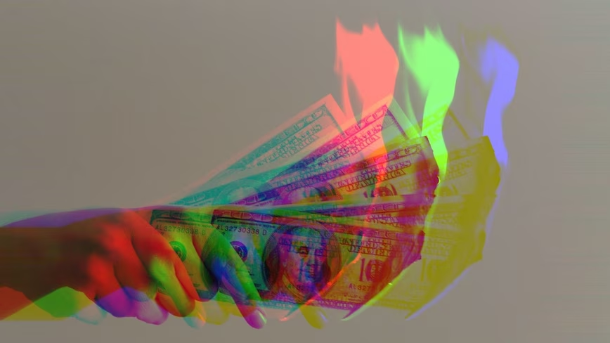
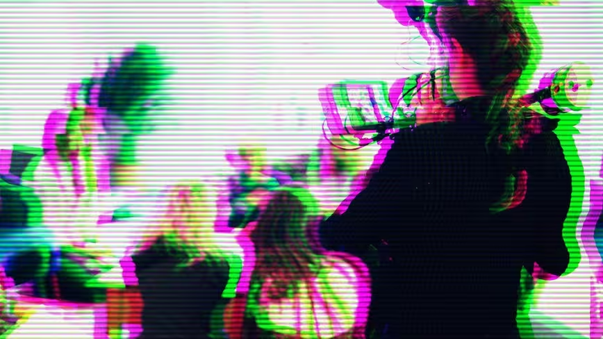
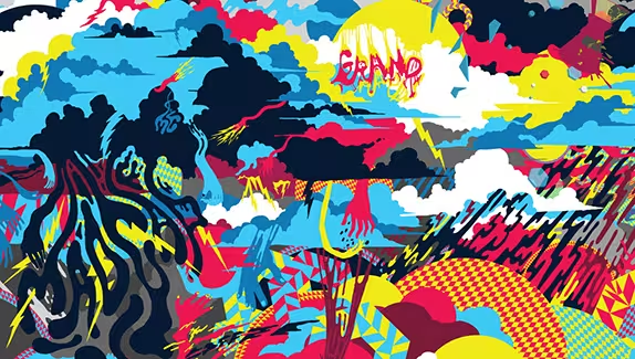
The work of artist and designer Chuck Anderson (aka NoPattern) is a fantastic example of how to combine photography, light effects and color harmony to come up with bright, vivid images with an undeniable sense of individuality.
Anderson’s work has been widely recognized by many, and has earned him commissions from brands including Nike, Reebok, ESPN and Microsoft. He also has a podcast called Life + Limb that’s always worth a listen. We caught up with the artist to ask a few questions about his work, inspiration, and process. Read on for what he had to say, and to view a handful of his amazing artistic creations.
Shutterstock: You use a blend of color effects and photography in your work. How do you go about picking the right photo for a project?
Chuck Anderson: This completely depends on the project. If it’s a client project, their brand or the subject matter typically dictates the overall color scheme. When I do work for a sports team, for example, there’s a very clear direction on what colors should be used — usually ones that stay within the theme and style of their branding. When working on personal projects where color is completely up to me, it really depends on the mood I’m in. Sometimes I’m feeling more of a stark, dark color palette with lots of black and deeper tones. Other times, it’s more bright or intense. It really just depends on what I’m trying to do. Sometimes I try and fail at different things and end up surprising myself with whatever ends up working.
What do you do artistically to keep your creativity going?
I try lots of things. I draw a lot, take photos; I don’t get stuck doing just one thing. I love what I do, I love making things, so even when I get into creative ruts, I still always fall back on the fact that this is very much who I am, an artist and creator of things. It’s my natural default to keep myself creatively busy.
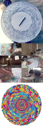
You did this amazing marker piece for the Turnstone Furniture Campfire Table that had a variety of bright colors. Did you have a plan for that project, or did you just freestyle?
That was completely freestyle. So much so that I was on camera in the first moment I touched ink to the paper — that was all filmed. I had no idea what I was going to do, and right before I started, I decided I would follow the circular shape of the paper and do clouds until I got bored of them. I never wound up getting bored of them, and it just became this giant cloud texture!
How did where you grow up influence you? Where did you get your early inspiration from?
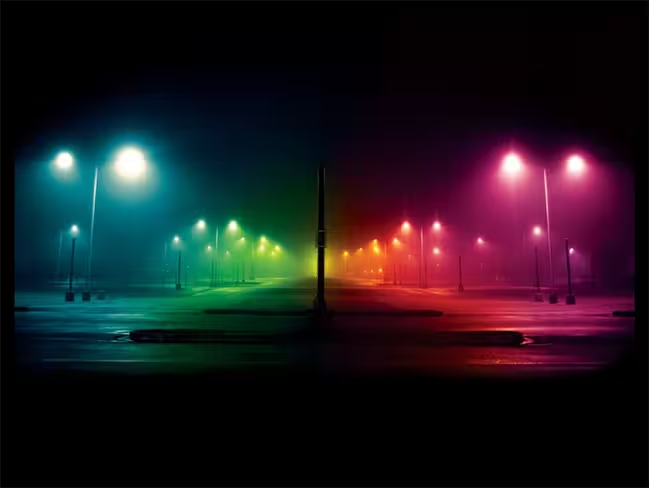
I’m from the Chicago suburbs, which had almost no creative influence on me. I really had to hunt for things, and that’s when I started to see the beauty around me. A dark foggy night in an area that was usually boring would totally inspire me to go out and take photos. Driving to downtown Chicago and getting on Lake Shore Drive, driving along the city any time of day — that’s a huge source of inspiration to me, even now, as I actually live in Chicago, not the suburbs anymore. I just love Chicago. I think its a wide open city in terms of making a dent. If you want to make a name for yourself here, there’s plenty of room. It doesn’t feel fiercely competitive the way New York or LA do. I think it’s just a huge place full of potential.
For more on Chuck Anderson/NoPattern explore his website, or follow him on any of his social media channels: Twitter | Facebook | Tumblr | Behance | Instagram.
Get the TNW newsletter
Get the most important tech news in your inbox each week.
