
 Eye-opening Facebook news on a Sunday? Indeed, and certainly not what we were expecting.
It was assumed that any news from Facebook today would arise from Mark Zuckerberg‘s appearance on 60 Minutes (watch here). Boy were we wrong.
Facebook’s been extremely busy of late, launching and then tweaking, Places, making changes to Facebook photos, Groups, deals, acquiring both Hot Potato and Drop.io, in addition to hiring Google Wave’s Lars Rasmussen.
Now it’s come to light that Facebook has been poking (pun intended) around with design changes to profile pages, and chose today, 3:12 pm CST to be exact, to announce the changes using a link to a video posted via the company’s Twitter account.
If you desire, get your new Facebook profile by visiting here.
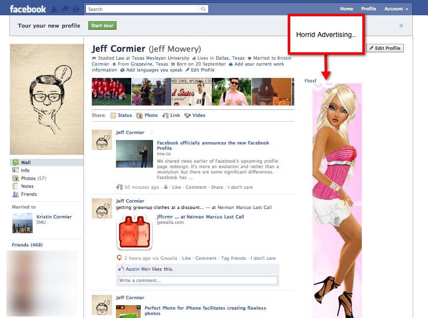
I’ve changed my profile (updated version pictured below). Shocking that I would run right into traffic without looking, so to speak, I know.
Once you’ve updated your profile, Facebook offers a “Tour” of the new features, and here’s what I think of the changes, are they a hit or a miss, feature by feature.
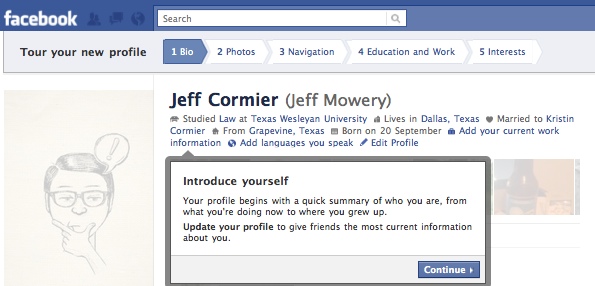
“Bio” – Miss
From Facebook,
“Your profile begins with a quick summary of who you are, giving friends an easy way to see where you live now, where you’re working and more. A collection of recently tagged photos also shows what you’ve been up to lately.”
Our Martin Bryant was spot on with his opinion that this section, and the remainder of the updates for that matter, are aimed at ensuring people keep their personal information up to date, making it easy to serve relevant ads.
To me this section is cluttered, duplicative, and if the idea of the new profile design is to give visitors to your page a quick summary of who you are and what you’re up to, in addition to other information, it fails miserably.
Why? Keywords in the “Bio” section are hyperlinked. Clicking on one takes visitors quickly away from your profile after immediately arriving on it, making your profile more akin to a one-night stand than a long-term relationship.
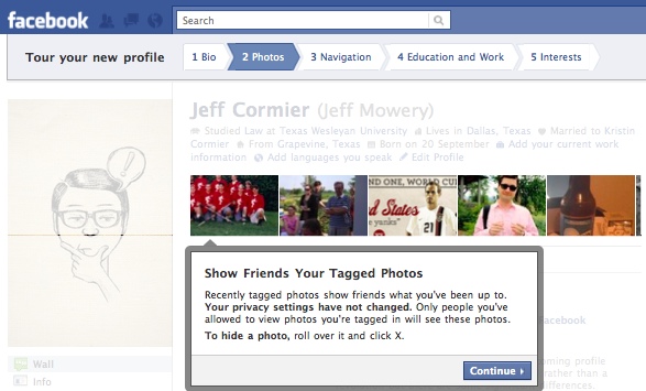
“Photos” – Hit
Adding photos to the top of one’s profile page is a nice feature, making profile pages more visually engaging. The feature just looks nice, unfortunately it’s sandwiched between the horrid “Bio” section and one’s wall.
To keep photos from being seen by others simply hit the “x” on the photo and hide it. An interesting note is Facebook’s making the statement on privacy bold, given their repeated negative issues with subject.
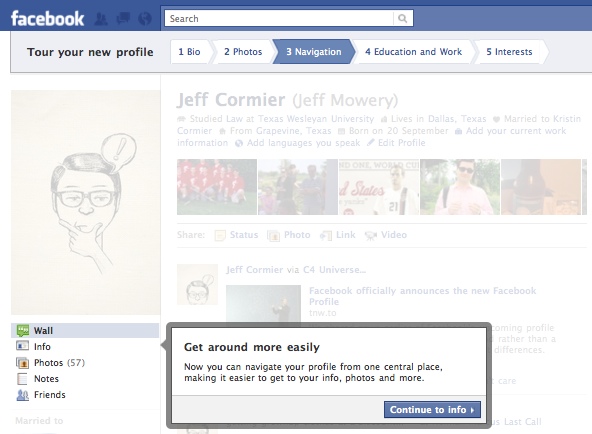
“Navigation” – Miss
Perhaps I’m missing something, but all Facebook’s done is move the “Wall,” “Info,” “Photo,” and other sections from tabs where the photos reside in the new page design to a spot under your profile picture. Sorry Facebook, but this is putting lipstick on a pig. It’s still a pig, it just looks different.
Nothing’s been made any easier with this change. In fact, one can argue, and I will, that it’s made navigation more difficult not only because one has to learn where these sections are now located, but also because it de-emphasizes the sections by making them smaller.
Moreover, profile pages are so duplicative it borders on the absurd. The “Friends,” “Photos,” “Info,” and other sections are visible multiple times on one’s profile page. If Facebook believes its new profile page design is easier to navigate, their reasoning must be based on the fact that one is bludgeoned with the same sections in multiple areas on a single page.
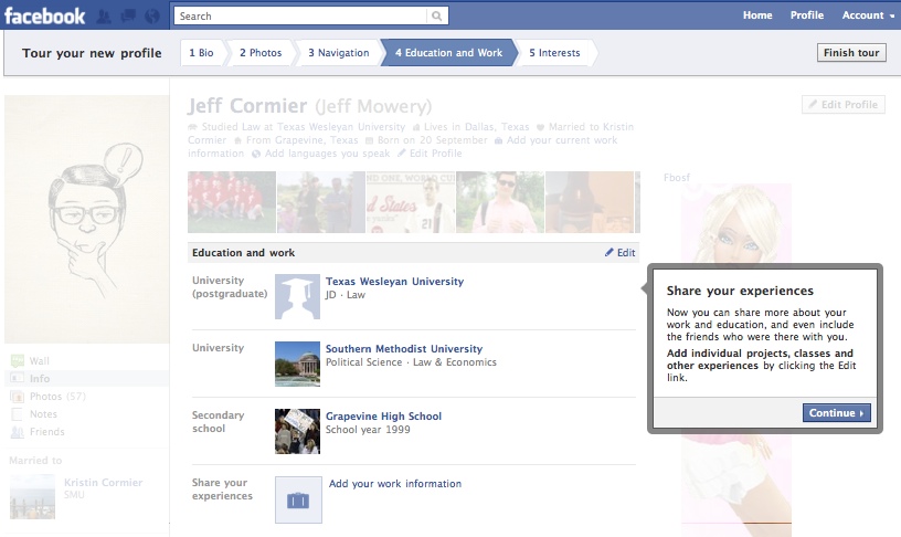
“Education and Work” – Hit
With the ability to add classes taken, classmates, and other information concerning places of employment and education, what is Facebook trying to accomplish? Simple, Facebook’s attempting to further connect individuals, and with the updates one can make to the employment section, they are clearly taking on LinkedIn. Who would needs another social network, geared only towards professionals, when Facebook can be a one stop shop? R.I.P. LinkedIn.
“Interests” – Hit
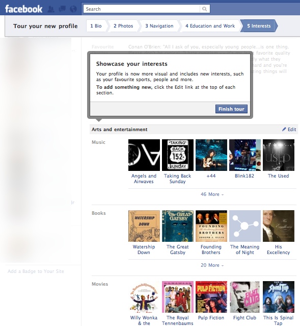
The new “Interests” section is visually appealing and adds some really neat features. Facebook highlights the new ability to add favorite sports teams, people, and more.
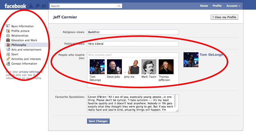
As you can see from the shot below, one can edit their interests from a side-bar on the left, including adding, “People who inspire you,” in a new section, “Philosophy,” by typing their name in the designated box. A grand little feature that gives your profile page visitors additional insight into what you enjoy and who shapes your personal views.
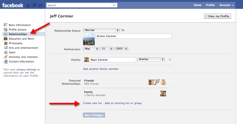
Two final little nuggets that Facebook’s added, and I’m sure there are more that we’ve missed and if so let us know what you’ve discovered about the redesign in the comments section below, is first the ability to feature specific friend lists on your profile.
Why is this important? It’s similar to lists Twitter users are familiar with creating. More importantly though, as pointed out by one site, the new feature allows one to:
“create or associate existing lists that they can share on their Facebook Profile. Then, in their privacy settings, they can set who gets to see those lists (Everyone, Friends, Friends of Friends, or even Custom Lists). The list then appears in their list of friends when you click on the “Friends” link on the user’s profile… this step is definitely interesting, as you can see some of the favorite people individuals like myself have friended, hopefully so you can discover people you know as well that may be of interest.”
The second feature is more disturbing than lists. It’s the ability to edit one’s friends’ interests with respect to sports, on Facebook. This feature, discovered by Jason Keath, allows one’s friends to add sports interests to your profile, and likewise you to theirs. A feature which is both annoying and could cause friends to become more distant rather than closer if one begins messing around with the interests of others to a great degree.
In conclusion, Facebook has redesigned profile pages. It’s news, but it’s not earth-shattering and like many changes Facebook makes to their service it’s far from perfect, features confusing elements, and will no doubt enrage some while pleasing others.
Having said that, I like the changes Facebook’s made to profile pages. There are some design issues, but I’m pleased with the greater focus on photos and friends, two of my favorite areas of Facebook, which overshadow the features I don’t so much care for.
What about you? How do you feel about Facebook’s redesigned profile pages? Likes/dislikes?
Get the TNW newsletter
Get the most important tech news in your inbox each week.


