Jo Plumridge is a UK-based photographer, writer and lecturer. This post was originally published on the Shutterstock blog and has been adapted with permission.
User experience (UX) designers are among the unsung heroes of the digital world. They make the tools, sites and apps we use simple, understandable and usable.
We sat down with UX specialist Steven Snasdell, a 15-year veteran of the digital creative industry — whose work with the team at UK technology company Monterosa has helped propel apps to the top of Apple’s store and contributed to a 2011 BAFTA Award for Creativity — to discuss his approach, using digital imagery, and the future of design.
How would you describe your work to someone unfamiliar with UX?
I’m a UX specialist, which essentially means that my role is all about making sure that a user experience — be it a product, website, mobile or tablet app, etc. — is intuitive and simple. I have to make sure that the user goals of that app or project are delivered on. So, for example, if it’s an app that allows you to vote, I’ll make sure that you can actually do the voting; if it’s a shopping site, I’ll make sure that there’s relevant information about products, and that things are easy to buy. Essentially, I’ll facilitate this process.
 ronstik | Website wireframe sketch on digital tablet screen
What’s your process for starting a new project?
It’s vital to begin with research so that you can understand your audience. I do this in a number of ways: I can create personas, develop user stories — anything that helps to illustrate the user and audience. Then there’s the practical part — sketching out a storyboard and wireframing.
A wireframe is like a blueprint. It’s a structure where you can make sure information is correctly displayed and that clarity of message is portrayed easily on each frame. Wireframes are usually digital and can be printed out (which is sometimes useful for meetings, so that you can make changes on the spot).
From there, the project will go through a period of iterating the wireframe with the client or stakeholder and an evolving process of refinement. Design tiles are produced to aid user testing of the interface and look at the finer details. Is the style correct? Do I need to look into using buttons, toggles, or finger press features? I use this stage to test out different methods of interaction.
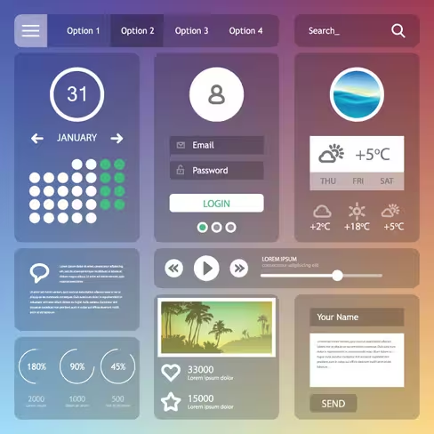 Yes Man | Flat Web design elements
Does your involvement end at this stage, or do you still work on the project through its final design?
Sometimes I work in an environment where UX and design happen at the same time and evolve as an Agile process. We’ll test it, design it, look at it, and then go with this process — or change it. We might even go with an idea that’s different from the original concept. At other times, UX is done up front and then the project moves into design and development. In that situation, my role is to make sure that usability is still there and to cast a critical eye over things.
A lot of being a UX person is about soft skills. You need to communicate in a concise and relevant way, so as to be understood by the general public. And you should never forget the basic rule: don’t make the user feel stupid! I think it helps that my background is in design (I did a visual arts degree), and early in my career I did a lot of programming. Like a lot of UX people, the right and left sides of my brain work well together. I’m a very idea-based person and constantly have ideas going round in my head.
You do a lot of conceptual work. Do you use photos and vectors for inspiration?
Concise, clear imagery is very handy for a UX person to have. There are times, especially with wireframing, when you need an icon, illustration, vector, or image to get the job done. These can communicate your ideas to clients and stakeholders more effectively than written descriptions.
Stylistically, there is a certain clarity of icon I look for — one that will inform the other designers about functionality and help sell the overall idea. Designers can look at the wireframe and know what to do, with the imagery aiding that process. Imagery helps make things more accessible, and it’s my job to educate a wider audience.
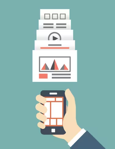 Max Griboedov | Responsive web design of mobile applications.
What do you look for when you’re choosing images?
There’s a certain need to be wary when choosing images. There are hundreds of messages in each image. If you use the wrong one, you can influence people in the wrong way. Using a poor quality or badly chosen image can change your entire message. And that message is the most important thing – the abstract emotion that imagery has and what it conveys to a viewer.
How do you make sure that people will get the right message from an image?
There’s a lot of instinct behind it. I believe that you have to be empathic and able to position yourself as the consumer of your end product. What will that consumer want to see? You need to use common sense as well.
Equally, design trends will influence the kind of thing that people want to see — e.g., at the moment everything is very flat, very face-on, and not very realistic. And it’s interesting how people now view an icon that is flat as professional rather than a glossy one. The image selection process can’t just rely on your own style; it has to be user-guided and sit in the current environment.
You don’t notice all this from a consumer point of view, but you are exposed to it without realizing and naturally accept it. Things can jar if they don’t fit. Images have to be relevant— clichéd images make a website look clichéd.
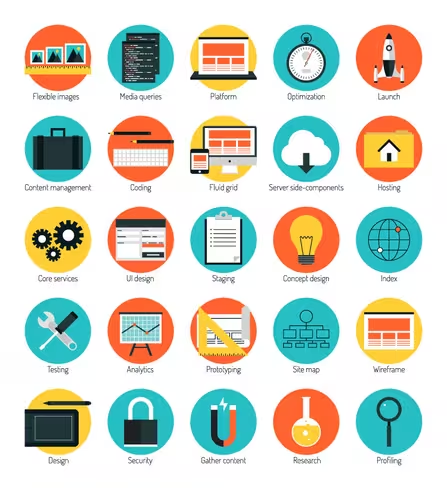 bloomua | Flat designs icons, responsive web design
The design industry as a whole has changed massively over the last ten years. What new techniques do you enjoy using and how have you seen things change?
It’s become a lot easier, because there are more people producing better quality imagery to be used. It used to be that you had to do most things yourself. Nowadays it’s about plugging together bits and pieces that others have developed, and there are people out there who are just producing good quality icons. There are enough of them now to be varied and of professional quality.
This is one of the really good developments in the last ten years — the fact that you can plug different factors together. It’s about knowing where to look, rather than being able to do absolutely everything yourself. It’s all great for UX workers because it’s not a final project; it’s a set of ideas.
I used to dread the idea of making time-consuming icons for a UX document, but now I can easily go and get a set of quality icons and concentrate on getting the message across. It all helps, as UX is very front-loaded — you generate ideas and then you can move on to the next thing!
What design trends do you think we’ll see over the next year?
The next design trends will be based around the way tech goes. That may be around wearable tech, or it may be that touch-based interfaces evolve further and that will be the way things go. For instance, there’s been some concept work done around touch screens becoming transparent when they’re not on, which raises questions about what illustrations and imagery you’d want hanging in space.
It’s all quite sci-fi! But I do predict that design trends will be heavily based around whatever tech is adopted by the general public. Where technology goes, design will follow.
Get the TNW newsletter
Get the most important tech news in your inbox each week.

