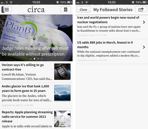
News consumption service Circa has been updated its iOS app to version 1.3 today, making it easier to follow multiple stories from across the Web and access them from the main homescreen.
Users have always been able to follow specific articles by tapping the plus symbol in the top right-hand corner of the screen. These were then added to a list called My Followed Stories, located under a sub-menu with all the other news categories.

It worked well enough, but the feature always seemed a little buried and undervalued. A small circle representing the number of story updates, for instance, was a nice touch but ultimately useless because the user never knew they were there – at lease without stumbling into the sub-menu for other reasons, anyway.
The developers have moved the My Followed Stories section, however, so that it’s now located in the top-right hand corner of the homescreen. It makes an awful lot of sense, given that this is the exact same area where users would tap to add articles to the list anyway.
Circa has also updated how updates are added to a story that the user has already read. They now appear right at the top of the article as a new segment, with clear markings to show that they’re new.
“Ok, we’ll admit it: our previous followed story interface was a *bit* confusing,” the app’s iTunes page reads. “But thankfully we’ve come to our senses and made it much, much better and dead simple.”

Although the app is free, Circa wants its users to register with the service. Realizing that some people might not be ready to make the jump, the team has decided to give all users access to the My Followed Stories feature, even if they haven’t signed up just yet.
Circa is an interesting take on the news curation model, taking top stories from around the world and displaying them as bite-sized nuggets of useful and interesting content. By stripping stories down to a series of concise sentences, quotes and images, the reading experience feels lighter, faster and more accessible.
Launched in October 2012, the team has pushed out two updates before now – a design refresh in January and a new sharing interface in March – but continues to tweak the service.
Alongside the usual array of bug fixes, Circa has improved the speed of the app “dramatically” for this release, making it “at least 5-10x faster than the previous versions.”
Circa has never been a slow app by any means, but performance improvements will only help people stay engaged in the news reading experience. The update is available right now from the App Store.
➤ Circa | iOS
Disclosure: This article contains an affiliate link. While we only ever write about products we think deserve to be on the pages of our site, The Next Web may earn a small commission if you click through and buy the product in question. For more information, please see our Terms of Service.
Image Credit: Ye Aung Thu/AFP/Getty Images
Get the TNW newsletter
Get the most important tech news in your inbox each week.


