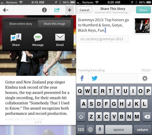
News consumption app Circa has updated its sharing interface for iOS devices, making it much easier to email, tweet, or post about specific parts of an article.
The sharing pop-up now features three primary outlets for distributing content; email, text messages and iMessage, and Twitter and Facebook. The real difference though is that using the two tabs above, users can choose to share the entire story, or just specific quotes and images.
It’s a small, but significant overhaul when using the app day-to-day, as it helps users to pick out particular passages that they’re either shocked or elated by. Rather than posting a dreary headline and letting the recipient do the digging, it’s now simple and effortless to point friends and followers to a specific section.

When you’re sharing content, there’s still the option to toggle off/on a pre-connected Twitter or Facebook account, although now Circa will also pre-fill the text so that it’s much easier and quicker to share breaking news.
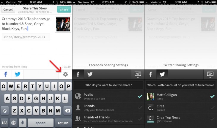
Over the last few weeks, the company says they’ve been working on how they can make sharing not only easier, but also much more personal and customizable. Now, before you share a news article it’s possible to tap the settings icon and choose more specific options. So for Facebook, users can select who sees the update – the wider public, just friends, or friends of friends. Meanwhile on Twitter, you can specify which connected account(s) you want it to tweet from, which is always useful if you own more than one.
It’s disappointing not to see a few more social networks thrown into the mix – Google+ is the most notable omission – but Circa says they do plan to add more services in the future.

The news consumption app has also announced today that its technology news category is now live. Nicholas Deleon, the firm’s lead technology editor, has been sharing stories to a beta group of readers until now, but Circa says it’s now ready to make it live for everyone.
There tends to be a whole lot of noise out there in the tech news world, so we wanted to provide a super simple place to get the big stories quickly,” the company said. “Nicholas has been doing a great job, and we’re excited to see where this category goes.”
Circa launched in October last year, but rolled out its first update earlier this month with a cleaner design, sharing via email, pull to refresh and swipe to go back functionality.
➤ Circa | iOS
Disclosure: This article contains an affiliate link. While we only ever write about products we think deserve to be on the pages of our site, The Next Web may earn a small commission if you click through and buy the product in question. For more information, please see our Terms of Service.
Image Credit: PASCAL GUYOT/AFP/Getty Images
Get the TNW newsletter
Get the most important tech news in your inbox each week.


