It’s no secret that the BlackBerry Priv is the company’s last roll of the dice in terms of building its own hardware. Hell, even the company’s CEO John Chen said it would have to carefully review future plans if the Priv flops.
That’s a pretty critical situation, and as such, there’s a lot riding on BlackBerry’s belated defection to Google’s Android OS.
But with its position in the consumer market at an all-time low, and no previous Android form, will the Priv offer enough to save the company from a future outside of hardware?
However the phone performs, it’s going to be a hard sell.
Hardware
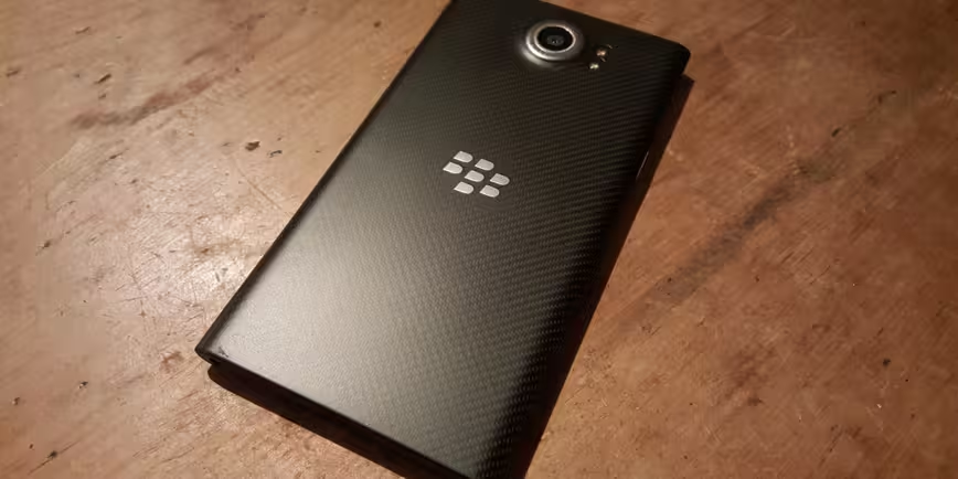
To say that the Priv’s hardware makes it stand out from the rest of the Android crowd would be a lie. The phone does have a physical QWERTY keyboard, but it’s not immediately noticeable. It’s an understated approach that’s a long way from the early days of Android and handsets like the T-Mobile G2.
Instead of just leaving the keyboard exposed as it has previously, on the Q10 and Q5 among others, this time it’s hidden away as a vertical slider. That means the keyboard is always within quick reach if required, but that you otherwise have a regular-looking smartphone. You can easily use the phone every day, with or without the keyboard, without resenting the design choices Blackberry has made.
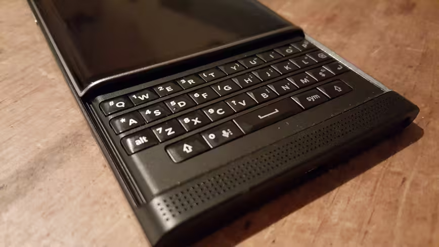
Actually, the overall shape of the device — with its rounded edges, a curved screen and a weight associated with premium phones — is reminiscent of earlier Lumia handsets.
Taking up most of the front is a 5.4-inch (2,560 x 1,440 pixels with a PPI of 540) display with Corning Gorilla Glass 4 to help it withstand scratches and impacts.
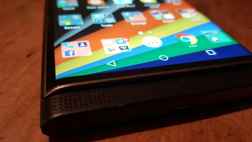
Below the display is a single front-facing speaker, and on the bottom of the chassis is the micro USB charging port.
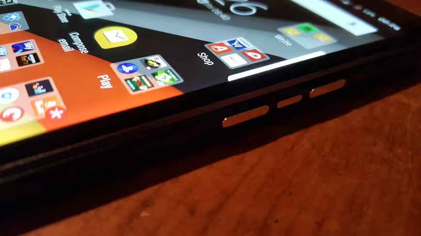
On the right side is a volume rocker with a dedicated mute button in the middle. On the left side is the power button and on the top edge of the device are the SIM and microSD slots. It’ll support cards up to 2TB.
On the rear is a Schneider-Kreuznac certified 18-megapixel snapper with dual-flash.
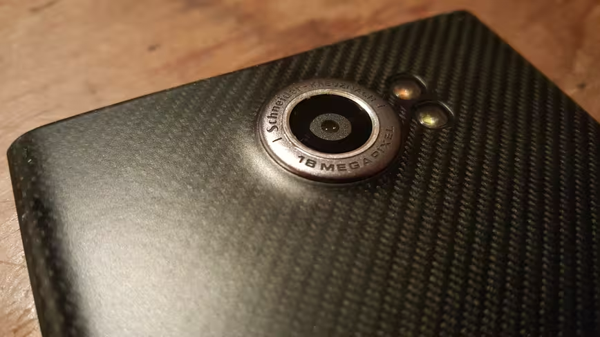
While the rear panel looks like carbon fiber from a distance, it actually feels more like a soft-touch rubber. That helps with the phone’s overall ‘gripability’— or it would if that was a real word.
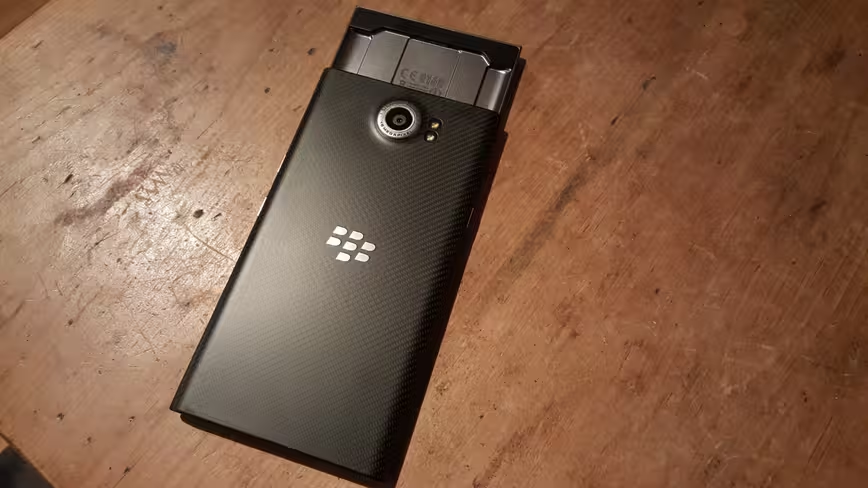
Officially, it measures up at 147mm (184mm when open) x 77.2mm x 9.4mm, and weighs 192 grams, making about the same weight as the Nokia XL and 20 grams heavier than the iPhone 6S Plus.
Getting re-acquainted
BlackBerry’s first Android phone needed to have well-performing software with smart choices. After all, that aspect is so crucial to how it’s received by the wider market.
At its core, the Priv runs Android 5.1.1 with a few BlackBerry-specific tweaks here and there.
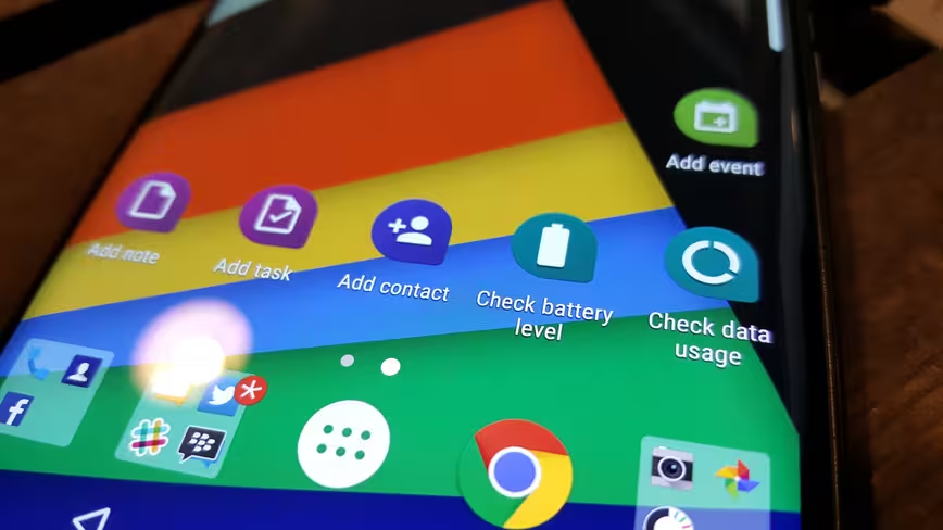
Now, normally, I’m wary of manufacturer tweaks – they’re often made for the sake of it and add little of true value to a device. Thankfully, that isn’t the case with the Priv.
Anyone familiar with the BlackBerry 10 won’t be totally lost: the company has packed some of its best features from its own OS within its Android fork.
For example, I always found the BlackBerry Hub a really useful central resource for keeping an overview of all my notifications and messages. With standard Android, that’s a trickier proposition, there’s no central place that shows you all your emails, tweets, Facebook notifications and everything else in one place, at least not without installing a third-party app.
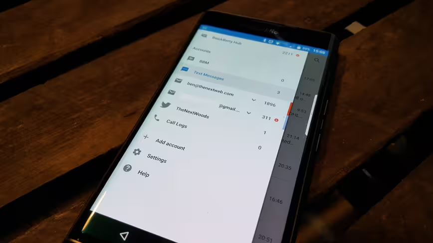
BlackBerry has fixed this with its version of Android for the Priv – the Hub is still very much present, and still very useful.
In addition to providing you with an overview of your notifications, they’re all actionable. Want to snooze that SMS until later? No worries. Mentioned in an interesting tweet that you want to respond to when you get to work? Easy.
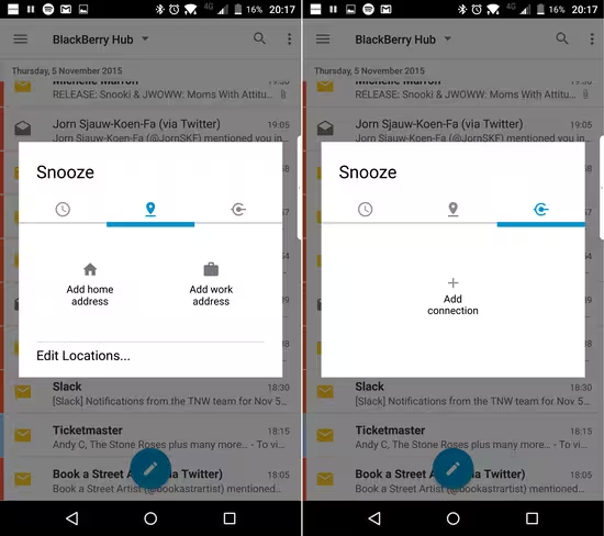
As well as allowing you to snooze to a specific time or day, you can also snooze any of these notifications until you get to a certain location, or until you connect to a certain network. So, if you know you want to remember to download those new design mockups but don’t want to do it on your data connection, you can snooze the email with them until you reconnect to your home or work network, at which point you’ll be reminded of the message.
If you can’t remember what you’ve snoozed, they’re all stored in their own separate section for review at any time.
Another thing I liked about BlackBerry 10 OS were the gesture controls. While the rest of the devices and OS left a lot to be desired, the general navigation and ‘swipe and peek’ gestures was fairly intuitive.
Part of the spirit of swipe and peek has been carried forward. It’s not going to let you peek at your messages, but the same swiping gesture – up and to the right from the center bottom of the screen – does take you directly to BlackBerry Hub by default.
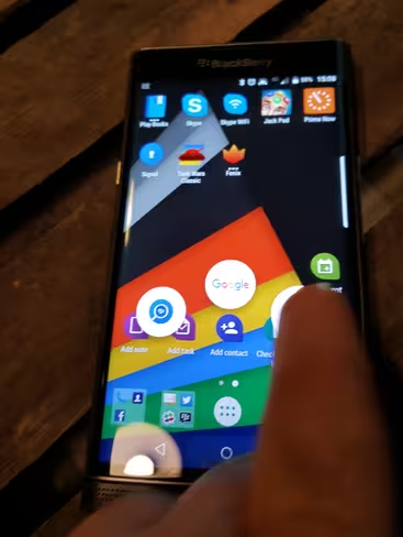
Swiping straight up takes you to Google Search (as it would on most Android devices) and swiping up and to the left takes you to BlackBerry Search, which searches your whole phone for pretty much anything – contents of emails, SMS, and apps, among other items.
It’s really useful to have this sort of functionality permanently a swipe away.
If you disagree, however, you can customize any of those three shortcuts to any other apps you want on hand.
A little like the Samsung S6 Edge, the BlackBerry has a screen with a curved edge. Unlike the S6, I actually found myself using it now and again.
Sliding in from the right edge brings up a semi-transparent overlay with an overview of your calendar, Hub, tasks and contacts. Tapping on each presents the relevant info.
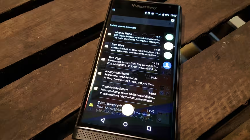
If you slide the keyboard down while you’re on the home screen, you can just start typing to bring up Instant Actions (like ‘Send an email’, ‘Send an SMS’, ‘Create a note’) at the top of the screen. Scrolling down brings you search results from things like apps, websites you’ve visited, contacts.
Again, it’s really useful to have this ability at any time, and a pattern that BlackBerry has repeated; there are loads of ways to achieve the same common actions, which makes it easy for pretty much anyone.
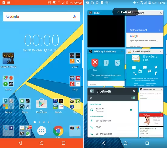
Open apps and browser tabs are accessible via the square symbol on the on-screen buttons, and are displayed by recency in a mosaic style. You can change this for a more standard approach though, if you prefer.
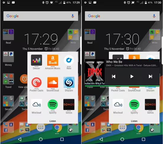
The Priv also has a smart way of allowing you to access far more widgets but not use up any home screen space. Any app with a widget available has three small dots above its icon on the home screen. Swiping up or down on it will pop up that widget.
Keyboard
The keyboard isn’t something I found particularly comfortable to use, at least not for typing – I did find it handy that you could take a photo with the keyboard open and use the space bar as the shutter.
If you’re buying the Priv solely for the keyboard, you’ll be pleased that it’s present and as easy to use as previous BlackBerry handsets – it’s obviously not as spacious as the Passport’s though.
I’m not a hardware keyboard kinda guy, and it just feels a little cramped for tapping out messages for me.
The beauty of it, however, is that once it’s tucked away you can easily forget about it until you do find a use for it.
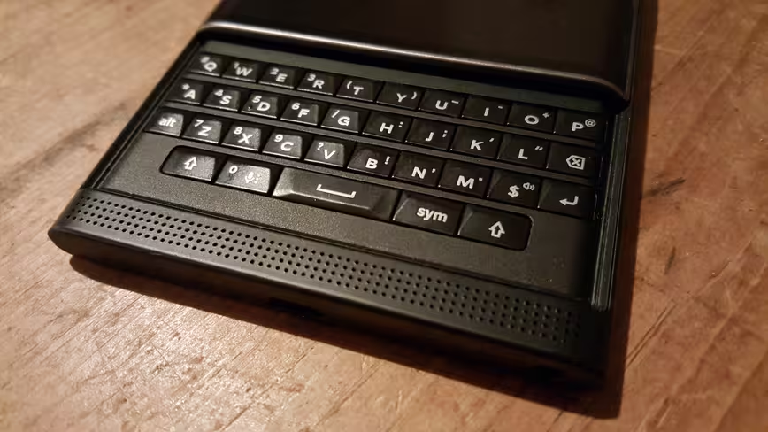
For example, it also functions as a touch sensitive control for the phone. Swiping your finger down the rows of keys will scroll you down a webpage, or down through a message or list of apps.
This is neat both as a control function and because it allows you to view webpages without your fingers obscuring the screen. When you’re writing a message, it also means you can see more of the text, as there’s no on-screen keyboard taking up space.
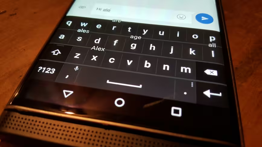
So, even though I don’t use it much as a keyboard for messaging, it does still open up some interesting options. BlackBerry’s excellent word prediction system is still here too.
Secure
BlackBerry is partially pitching the Priv on its security claims – the Canadian company has long been considered a secure option, but it’s never really been something that has interested me. It’s always felt like it has been for ‘corporates.’ I’ve never been that.
The Priv, however, does come with an interesting consumer-facing feature called DTEK, which is essentially a privacy checkup and a few bundled tools.
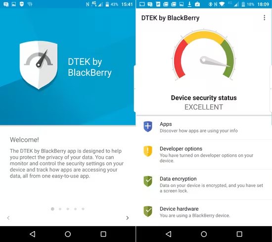
Opening the app presents you with the overall privacy and security ‘health’ of your phone and indicates where things could be tightened up, if required.
There’s also an interesting option that lets you set alerts if an app accesses a specific permission.
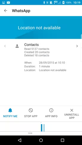
It’s not quite the granular level of app permission control that Android Marshmallow would allow, but information about how often and when an app is accessing a particular feature on your phone is a powerful one to have.
The known unknowns
On the back the handset is the 18-megapixel camera – and, as tends to be the way in the UK, there hasn’t been a whole lot of sun to test the camera or screen brightness against. I have no fears about the latter, but right now I have no idea how color reproduction is on the camera, or whether the white balance is off in bright shots.
It doesn’t tend to be bright whether that’s the problem for most smartphones though; it’s the dingy, late-night shots that come out the worst every time.
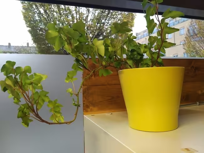
For the most part, in slightly limited testing, the camera seems to reproduce colors well, although the sky looks a little blown out on the outdoor rain shots.
I was really pleased with how quickly it focused and took a shot though, that’s been a big problem for me on the S6 Edge.
There’s also the option of overlaying a live filter on your photo before you take it.

Another of the known unknowns is the battery.
The Priv has a 3,410mAh battery, and BlackBerry claims a ‘mixed use’ life of 22 hours. A spokesperson told me that they could have made the handset thinner, but deliberately avoided it so that it could accommodate a larger battery.
If you consider ‘mixed use’ as emails, Twitter, SMS and a bit of browsing, then the Priv will see you through the waking part of your day just fine. Throw in at least four or five hours of music and podcast streaming via Bluetooth headphones every day and you’ll definitely notice a difference.
As that tends to be how I work, I found that the Priv would see me through a full day of unrestrained usage….right up until about 10:30pm, at which point it shut down. I use a phone a lot in a single day, so I just about find that acceptable.
I found that with the Galaxy S6 Edge, the battery life and software became increasingly unstable as the handset aged – there’s just no way of knowing whether that will happen with the Priv yet.
There was also occasionally a slight delay in switching between apps quickly when multiple were running – nothing too concerning though. Again, whether or not this minor niggle will disappear with future updates is uncertain, but it wouldn’t put me off too much.
Perhaps the only real disappointment for me is the max volume of the front-facing speaker – it’s just not loud enough for my needs. It does sound pretty nicely balanced and rounded, as much as a speaker of its size can, but is definitely on the quiet side.
Last throw of the dice
You’re not going to find a fingerprint scanner buried away anywhere and it’s not waterproof but if you want a solid Android device that brings a more useable version of Google’s OS to the table then you could do an awful lot worse than considering the Priv.
It’s clear that BlackBerry has listened to feedback and considered how best to make a phone that everyone could use, not ridden roughshod over the core OS with its own pointless services and features to create a deformed version of Android that no one should want.
Unlikely as it might seem, including to me, it’s probably one of the best Android phones I’ve ever used – admittedly, I’m still yet to spend any time with Marshmallow, so I have no comparison to the newer features on handsets like the Nexus 6P.
No, it’s not perfect, and if you want bells and whistles then it’s probably not for you. That’s not to say it’s boring; it’s efficient.
It’s for people who want to get things done. It’s for busy business execs rushing between meetings. Sure, that’s BlackBerry’s market pedigree and no surprise.
But the Priv is also for people who just want a phone to work as a phone. Not a ‘dumb phone’ – you can access as many apps on the Priv as any Android device – but one that’s logical and easy to use.
In achieving this, BlackBerry’s finally made a smartphone that the average person on the street should want.
Whether or not they do is the $4 billion dollar question.
The Priv is priced at $699 in the US, and £559 in the UK. Accurate as of Nov 6, 2015.
Get the TNW newsletter
Get the most important tech news in your inbox each week.
