
Hot on the heels of our last post demonstrating the new Bing abilities with regards to food, the search giant has also today released a new version of their normal map product, version 1.1, to help users find what they need on the double.
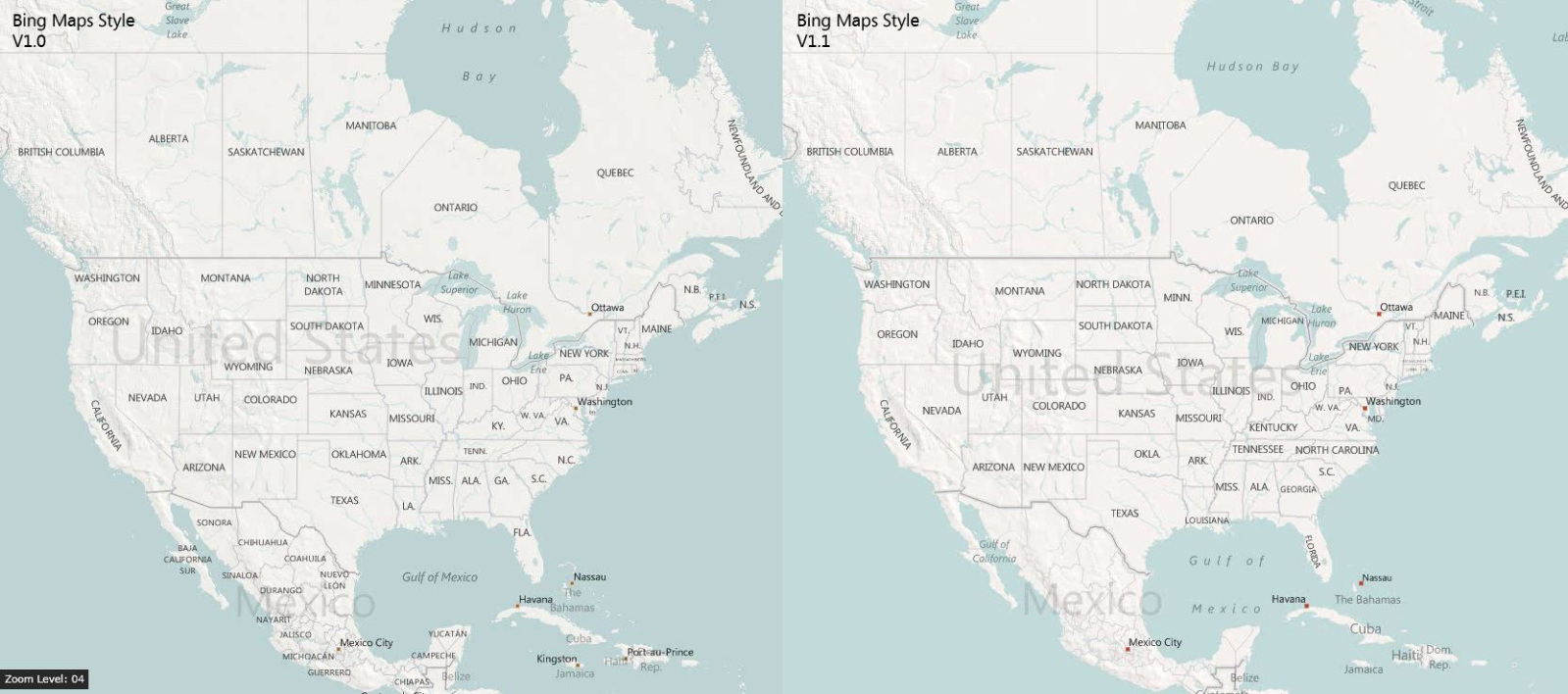
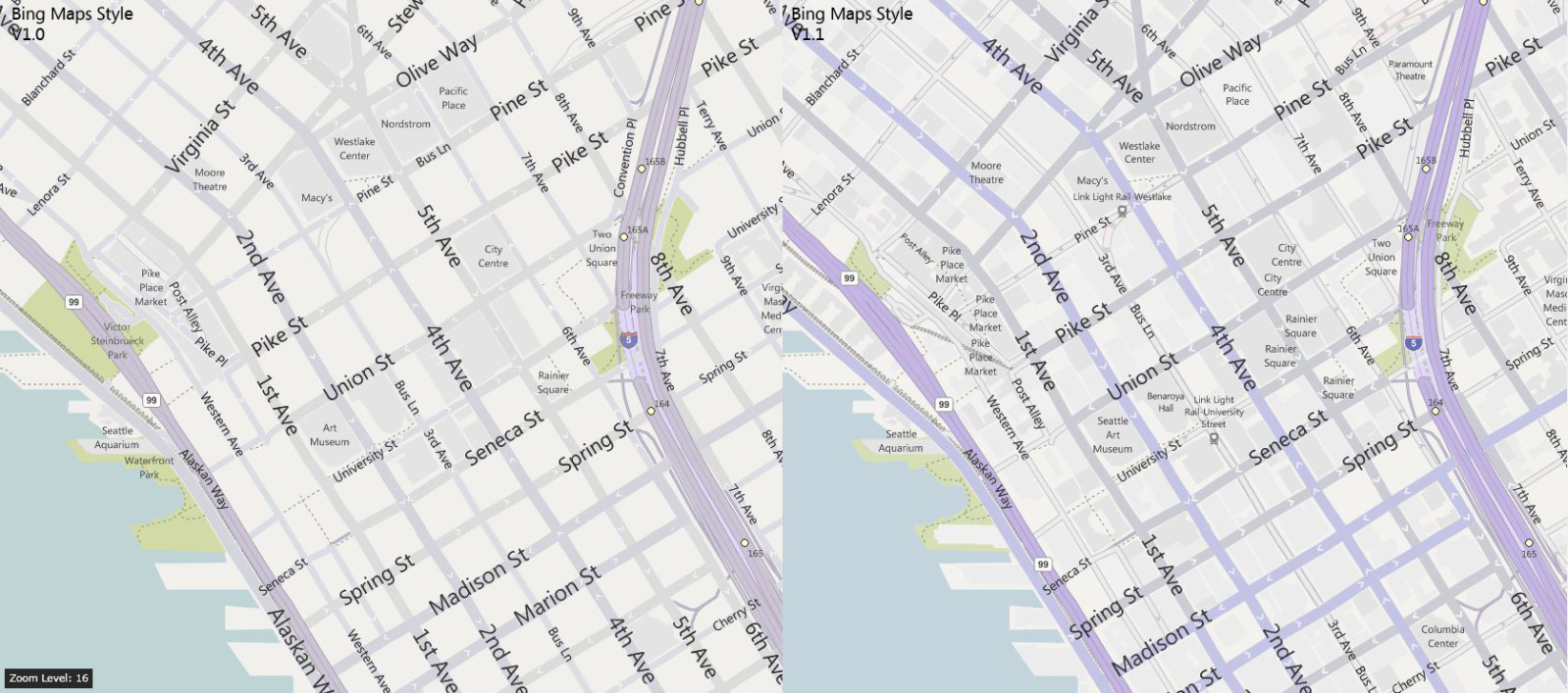
The changes center around five main ideas of improvement, which are:
- Increased city density while preserving a clean, visually appealing map
- Clearer differentiation between major and minor city streets
- Greater color contrast at the city-level so streets “pop” out more
- Altered font sizes and contrast for crisper, less cluttered map labels
- Improved highway shields for US and added new shields for 7 countries
The effect is at once mild and noticeable across Bing Maps, never my favorite when compared to Google’s map offerings, making them faster to use accurately. Take a look at a few examples. The new version is always on the right in the following images:

The 💜 of EU tech
The latest rumblings from the EU tech scene, a story from our wise ol' founder Boris, and some questionable AI art. It's free, every week, in your inbox. Sign up now!
This is an incremental change, but one that Bing put quite a bit of thought into. If you read the team’s blog post on the matter, the level of care that was employed is impressive.
Will it woo people from Google? I don’t think so, but upgrades and tweaks like this from Bing will surely help keep their users loyal. What do you think of all of today’s Bing updates?
Get the TNW newsletter
Get the most important tech news in your inbox each week.