Updates at the foot of the post
I visit the BBC on a daily basis. In fact the only website I visit more is The Next Web. I’m going to assume it’s the same case you for you too.
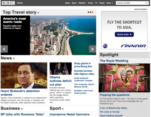
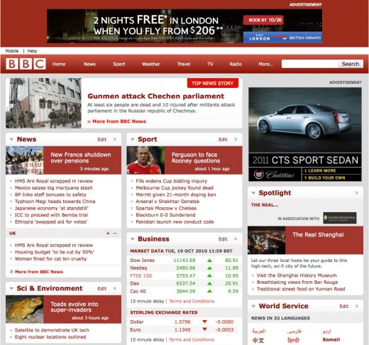
Today sees a massive revamp of the site’s iconic homepage. The new site sees the departure of the movable widgets and the arrival of a rather typical magazine-like homepage. I’m not going to pretend I’m not disappointed, because I am. One of the most prominent features of the BBC’s website was the ability to customize the homepage to suite your chosen interests. I would constantly keep technology and sport above all else because, well, those were the topics I was most interested in. Unfortunately, for those outside of the UK, those options have now gone.
Whether this is permanent or not – we don’t know – but irrespective it’s a pretty significant departure from the rather innovative homepage of the last few years. One that we admittedly used for inspiration in our previous design – albeit rather poorly.
On 24 January 2011, the BBC reported that it will cut its website spending by 25%. Whether the removal of the customized homepage is the BBC’s first steps towards meeting those cuts we’re unsure – but it is rather timely. The changes sees BBC Online’s budget cut by £34m which will also result in the loss of up to 360 posts over the next two years.
More to follow once we find out whether this is a permanent move or simply a test.
Before:
After:

Updates
Update 1:
Currently only the main homepage seems to have seen drastic changes. The rest of the site is as it has ever been – whether you’re in the UK or abroad.
Get the TNW newsletter
Get the most important tech news in your inbox each week.


