
Apple appears to be introducing a new style of App Store page for categories that mimics the look of the home page. The new look has appeared in the Eductation category, as well as the Games category while others remain in one of two older styles.
The new category home pages feature a large horizontal banner that displays a few choice apps in a primary position. The banner scrolls through the selections, just like the home page does.
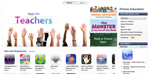
The new design brings the category pages more in line with the look of the rest of the iTunes stores and serves to give it a more unified look. It does limit your ability to easily view all new apps in the category though, displaying the ‘New and Noteworthy’ and ‘What’s Hot’ sections more prominently.
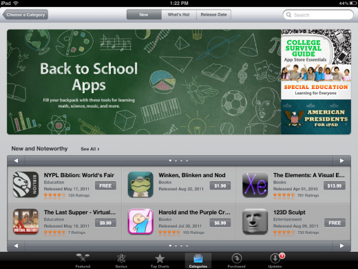
The new design is also live on the iPad version of the App Store but, once again, only in the Education and Games categories so far. On the iPad, the ‘What’s Hot’ section is replaced with ‘Staff Favorites’.
At the moment it’s unclear if this is a temporary or permanent change, but my feeling is that we’ll see this roll out to the rest of the categories soon.
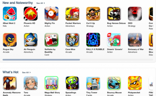
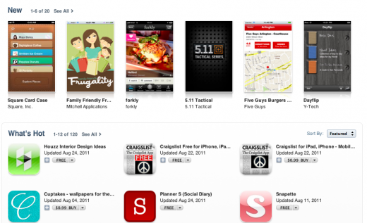
For future reference, here are the two ‘old’ category home page looks. One features simple icons and the other uses the first submitted screenshot to represent the app.
Thanks to Ouriel for the tip.
Get the TNW newsletter
Get the most important tech news in your inbox each week.
