As a global stream of real-time information, Twitter is by its very nature amorphous. It can be a lot of different things to different people, and it’s highly unlikely that any two people use it in exactly the same way.
This was especially true in the early days of Twitter, when the service was a very simple web-based application that didn’t automatically refresh and featured a simple global feed of all tweets, along with some basic functions that allowed you to follow users.
Twitter actually existed primarily as an SMS-based service that most followed on their phones, and slowly transitioned out to the web. The ‘interface’ of Twitter, with its replies, favorites, re-tweets and more was heavily shaped by forces external to the company: third-party app developers.
The development of third-party apps, especially on mobile devices, ended up being the catalyst for Twitter’s growth as a product. This was facilitated by an application programming interface that Twitter provided which allowed easy access to reading and writing Twitter data.

The 💜 of EU tech
The latest rumblings from the EU tech scene, a story from our wise ol' founder Boris, and some questionable AI art. It's free, every week, in your inbox. Sign up now!

That interface and the challenge of bringing form to Twitter was enough for The Iconfactory to begin work on Twitterrific. And they weren’t alone. Twitter had a developer ecosystem building for it that is essentially unmatched.. Eventually it would include Iconfactory’s Craig Hockenberry, Gedeon Maheux and David Lanham; Loren Brichter, of Tweetie for iOS and Mac, which Twitter would later go on to acquire; and later others like Paul Haddad and Mark Jardine of Tweetbot.
But The Iconfactory, more than many other developers, helped to define the Twitter experience through its beautiful and unique Twitterrific. The material contributions of the app to the Twitter ecosystem are documented in a short list of ‘Twitterrific firsts‘. Among these is the use of a bird to represent Twitter (Iconfactory calls him Ollie), the first use of the word ‘tweet’, the first in-app implementation of replies and conversations and a bunch of other stuff.
Now, nearly six years since the first version of Twitterrific was released — and after nearly a year of work — Twitterrific 5 makes its debut in a very different environment for Twitter developers.
Twitter has decided that the best way forward for it is to collect and control the ways that users view tweets and other information shared on the network. This means making it a far more hostile place for developers by restricting the number of users that any one Twitter client can have and pruning away bits of that formerly powerful API that it doesn’t want people playing with.


And all of this was happening while Twitterrrific 5 was being developed. I spoke to Iconfactory designers Gedeon Maheux and David Lanham about the development process, and soldiering on despite the worsening atmosphere.
As Twitterrific for iOS existed before the rules went into place, the app has a lot more wiggle room when it comes to maximum users. It can accomodate up to double the users that it currently supports, giving it space to grow. Maheux says that he’s not sure that Iconfactory would be releasing Twitterrific 5 at all if not for that.
“It definitely is stressful, to say the least,” says Maheux. “Especially when you’ve built a good chunk of your company’s livelihood around this product that uses Twitter. That was the really stressful part. Committing to it without actually knowing what was going to happen. It turned out ok, which was lucky for us.”
Lanham says that they had some “pretty nervous moments during development,” but they knew that they had to get the concepts that they had for Twitterrific out the door. “We were really excited by the mockups and comps that we had done. It all just felt too good. And it’s stuff that we can learn from and apply to our other applications.”
And those ideas centered around stripping down the interface of the app to place the tweets front and center. The new Twitterrrific features a stream of mostly unadorned tweets floating on a bed of deep black, popping in bright, pleasant colors with well-chosen fonts. By default, the interface features few buttons aside from compose, a menu and three section buttons for navigating Twitter.
Even the buttons that allow you to reply, re-tweet, favorite or access things like translating are hidden by default. This eliminates a dozen or more extraneous icons that appear by default in many clients, allowing the text to stand front and center.


A swipe to the right activates a beautiful reply card that features the text of the tweet you’re replying to for context and plenty of composition space. You can add a location or an image here and a clever shortcut allows you to long-press on the image box to add the last picture taken automatically.


A swipe to the left brings up the conversation view, letting you see the thread that the tweet is a part of. This can be viewed from the point of the tweet on (replies) or all tweets in the conversation at once.


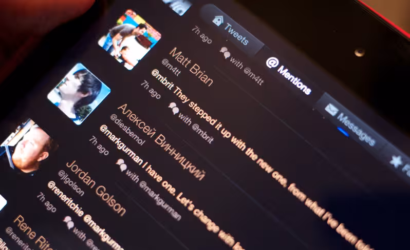
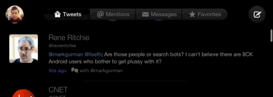
Twitterrific’s unified timeline makes a reappearance here, but thankfully the last version’s dedicated mentions tab remains. This means that you get brightly colored replies interleaved with your mentions, but are able to see them as a separate section as well.
Mercifully, the Direct Messages still make an appearance in the main timeline, but now have a more traditional threaded structure. The DM tab is actually really well done, with an icon along the left indicating who the last person to participate in that conversation was. This makes it easy to scan for icons that need a reply given. A swipe to the left or right triggers the thread view or the compose window.


The menu pops out from the avatar and gives you access to things like lists, settings and the theme tweaker that gives you access to light or dark views. I personally feel that the three or so tweets shown by default on iPhone is too few, so I tweak the spacing to narrower and reduce the font size a bit. You also have a choice of fonts between Helvetica, Proxima Nova, Signika, Museo Slab and Calluna.

The interface elements have been refined in a way that’s reminiscent of a wine reduction. The good wine of Twitterrific 4 has been boiled down to its essentials, to just the tastiest sauce of Twitter.
And that’s what Maheux says their goal was: “To present an elegant and easy to use experience for Twitter itself.”
The feeling overall is one of ‘classic Twitter’. The tweets and links take the main stage. There are no inline image previews (images are presented in a popup) and no Twitter cards here. Instead, the tweets are treated as the first and only thing that should capture your attention.
“It was influenced by the Retina displays in the 4 and now the 5,” Lanham tells me. “The phone itself is the frame for the tweets. It looks like the tweets are floating on the black display.”
And the experience is minimal in more ways than the interface. Some common features still do not appear in Twitterrific, like tweet streaming, push notifications, keyword filtering and more. Twitter apps like Tweetbot have all of these things, and they fit the power user mold much better.
“Before 5, we couldn’t do streaming, because the database code wasn’t up to snuff. But the majority of our development time was just spent getting 5 done,” Maheux says, when I ask him about streaming capabilities. “[It] now has the ability to do streaming, which is on the roadmap for the future. But we prefer to take things conservatively, listen to our users and have them tell us what they really want. Once we get that kind of feedback we can prioritize what…is really important to users and what isn’t.”
This approach is better for Iconfactory for a number of reasons, Maheux says, including “the extremely quickly changing landscape of the Twitter universe right now. I get the feeling that [Twitter] can announce changes to things at any day or moment. And when you’re in that kind of environment, it’s really risky to embrace some of these things when Twitter may say tomorrow ‘no, you can no longer do this’.”
The direction that Twitterrific is going is one of refinement, rather than competition based on feature set. And it’s taken them some effort to get here. Most of the code in the previous versions of Twitterrific had to be burned and re-written from the ground up.
“The legacy code wouldn’t support a lot of the things we wanted to do,” explains Lanham. “Even if we kept the Twitterrific 4 design, we were running into a lot of walls because that codebase took a lot of stuff from the very first versions of Twitterrific.”
Much of this has to do with the sheer age of Twitterrific. As it’s been around for much of Twitter’s existence, it was conceived when Twitter was a very different service. The team says that it just felt right to start over, to apply everything they’ve learned from building other apps in recent years and to rebuild it.
Part of that rebuilding process is a focus on revamping the gestures in the app. The simple swipes and long-presses of Twitterrific 5 are refreshing after the complexity of the last version. One of my favorites is a two-finger swipe up or down that hides the status bar, further cleaning up the interface (even with the bar hidden, the scroll-to-top still works).
“In Twitterrific 4, the gestures consisted of multi-taps…and it was very hard to get your brain to do the right one that you wanted to do,” Lanham says. “These are very simple gestures…normal people may not ever encounter them and that’s ok. They’re not essential to the app, they enhance the app.”
All of the gestures for interacting with tweets also operate on a one-to-one level. They stick to your fingers, letting you move them partway through the cycle and even cancel them by swiping them back. This interaction makes the timeline feel like a physical thing. This helps to instruct the user by telegraphing what that action is going to actually do.
“When you make the initial move and there’s no going back…it doesn’t feel like it’s connected to you,” says Maheux. “There’s a disconnect there that doesn’t feel as natural.”
And the app is full of these little bits of attention. The pull-to-refresh icon is a wonderfully animated version of Ollie hatching from his egg, and almost everything animates by sliding in or springing back, giving the app a subtle physicality.
“We wanted to get some fun interactive details and animations that are kind of cute,” says Lanham, explaining, “because the rest of the app is just avatars and text.”
These interactions include the ability to do something which I feel is going to elicit some jaw dropping and sharing once the app begins to make the rounds. When viewing an animated gif in the popup window, you can tap it with a finger and scrub it back and forth through its animation.
Necessary? No. Delightful? Yes. You won’t be able to stop trying it.
When I ask Lanham who the audience is for Twitterrific, he’s quick to reply that ‘it’s for us’, but I get the feeling that he doesn’t mean ‘us’ as in Twitterrific staffers. Instead, it’s for ‘us’, the people who still actually read Twitter. There are plenty of other uses for it these days, including self promotion and as a news aggregator. “We don’t really do data mining or follow a lot of celebrities,” says Lanham. “I would guarantee that we use Twitter differently than the majority of users.”
As far as I’m concerned, Twitterrific provides one of the better Twitter reading experiences on iOS. I like Tweetbot for its strong, capable feature set. But Twitterrific feels great as I’m reading Twitter and laying back with my iPad mini. For a lot of people, that’s going to be very important.
I wrapped up my discussion with a question about the past, the early days of Twitter. “I loved the diversity of the Twitter development community,” Lanham tells me. “Everyone was taking things from each other and learning, it’s been a great experience overall. I hope that there’s another platform that emerges that allows that kind of flexibility.”
Until then, you can get your classic Twitter experience now, with Twitterrific.
Disclosure: This article contains an affiliate link. While we only ever write about products we think deserve to be on the pages of our site, The Next Web may earn a small commission if you click through and buy the product in question. For more information, please see our Terms of Service.
Get the TNW newsletter
Get the most important tech news in your inbox each week.