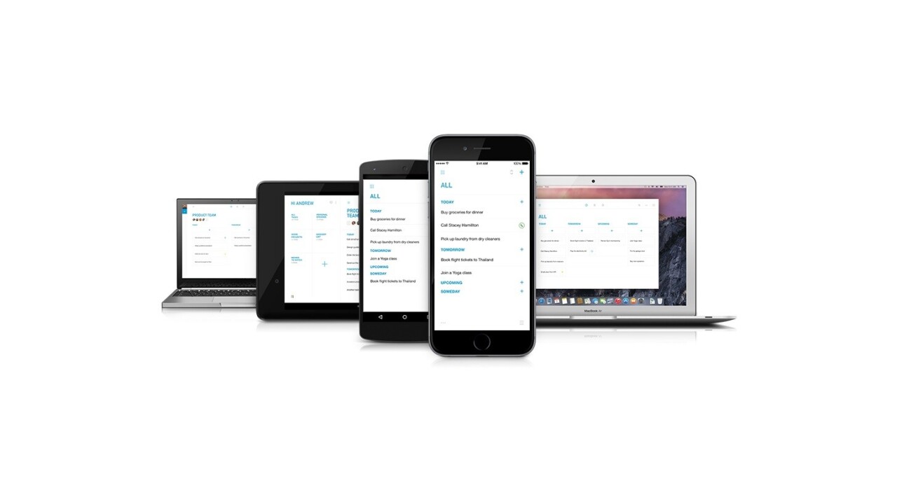
To-do list app Any.do has today been updated across all platforms to offer a refreshed design and new features.
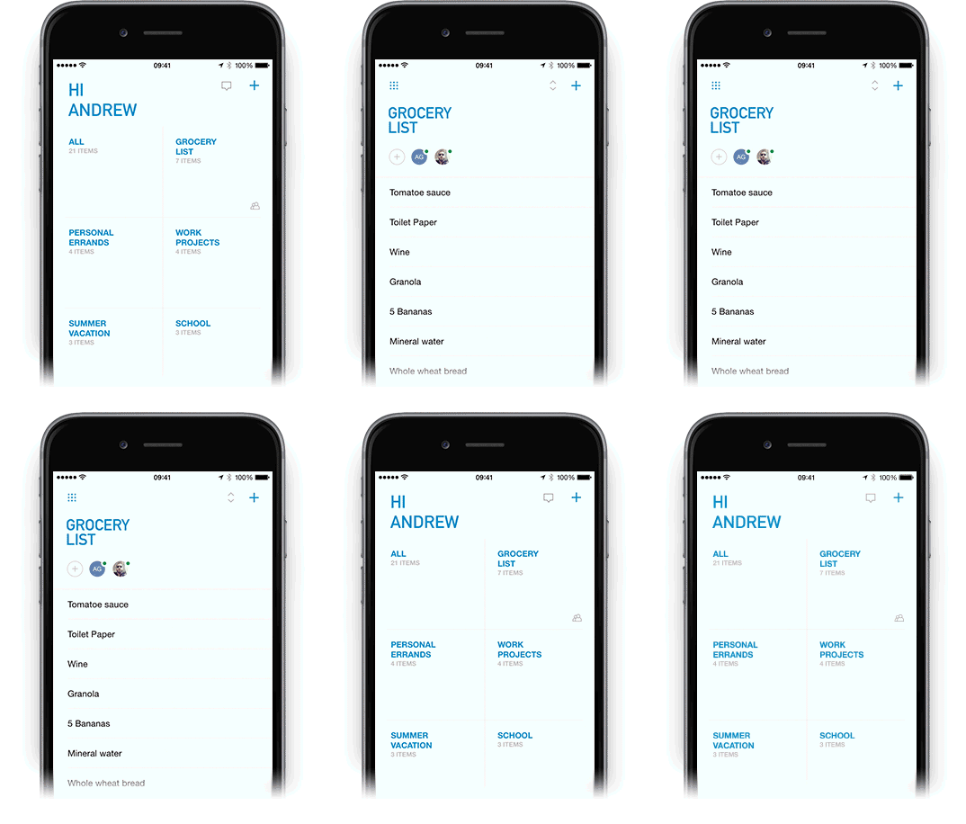
Among the headline changes are quicker ways to jump between your different lists, for example, by providing a new way to filter them by Date view, List view or Priority view. There’s also the ability to zoom in and out of your lists in a grid view, to help you go from looking at an overview of detail to drilling down into a specific item.
Alongside these tweaks, users can also now more easily create and share lists with specific people – just tap the + button to invite new people.
Alongside these tweaked features, Any.do has also received a bit of a visual makeover across all of its apps (Android, iOS, Mac, Chrome and Web) to keep the experience consistent regardless of platform.
The new version brings back full responsive design for Android tablets and improves syncing between devices, Any.do added.
Get the TNW newsletter
Get the most important tech news in your inbox each week.


