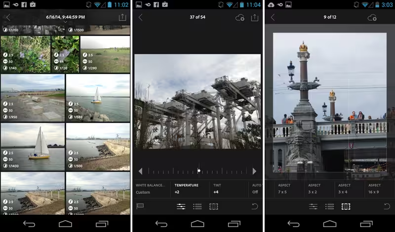
Adobe has put plenty of energy into the mobile side of its Creative Cloud marketplace. However, this concentration has thus far been focused on the iOS side of the equation. That is about to change with the launch of Lightroom Mobile for Android, available free on the Google Play Store.
It makes sense that Adobe has tackled the most accessible category of its Creative Cloud apps first: While the $9.99-per-month photography plan directly targets photographers with the lowest priced subscription, Lightroom is the only Creative Cloud app that can still be purchased as a perpetual license. And with Lightroom Mobile as a service-based adjunct to the desktop app, it’s critical that Android users get equal time.
The app’s interface, characteristic of Adobe’s cross-platform development strategy, is almost completely analogous to the iPhone app Adobe released in June, with some very minor differences. The biggest point of contention for me today is that the Android version is not optimized for tablets.
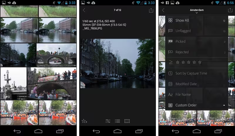 Low resolution previews in the grid layout lead to higher resolution images for editing.
Whereas the mobile Lightroom iOS version debuted on the iPad and then migrated to the iPhone, for Android, Adobe has taken the opposite tack. It’s unclear when an Android tablet version will be released (or, for that matter, when Lightroom 6 will be making an appearance), but Adobe assured TNW that Android tablets are indeed on the roadmap.
Android phones span a large range of sizes, but I can only speak about the one I own, which is roughly the size of the iPhone 6. Using Lightroom on the phone is obviously more of a challenge than on a tablet because of the limited screen real estate. Everything is compressed and crowded, but if your Android handset is the camera you always have with you, then you’ll appreciate that Lightroom got to your phone first.
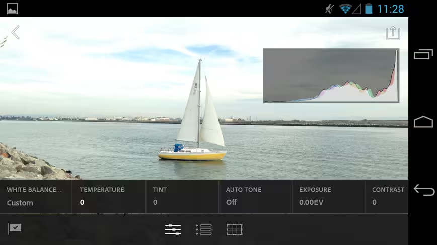 Lightroom for Android has many familiar tools and presets.
Adobe gave some members of the press an advance of the shipping software to check out before release, and for the most part I was impressed with the Android implementation. On the phone, the Android version worked largely as I expected. I have an older Android phone running Jelly Bean (Android 4.3). It’s great that Lightroom Mobile for Android accommodates several generations of the OS.
Despite its cramped interface, I had no problem navigating the new Lightroom Mobile on my older Galaxy Nexus. The performance was spry with no lag time, though the app quit suddenly and I had to relaunch a few times, so I suspect that some bug fixes are on the way. Overall, it performed well for an initial release.
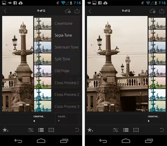 Nudge the menu to the right or left to give the picture more room as you edit.
Like its iOS counterpart, the Android Lightroom makes liberal use of gestures. A single tap with two fingers navigates to the collection where your images are located. Another two-finger tap directly on the grid displays focal length, ISO and shutter speed of each image. A second two-finger tap reveals date, time, resolution, name and file format of each picture. A single tap opens the picture you want to work with.
You can view the handset in either portrait or landscape orientation and use the pinch and spread gestures to adjust the size of the image in the window. While you can tap to remove the EXIF notations from the window, if you want to use the controls, tapping will make it reappear and cover a part of your picture unless you do another two finger tap.
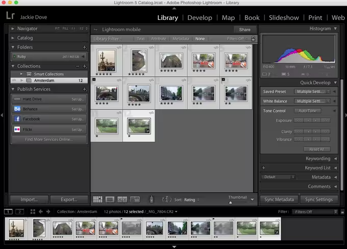 Newly ranked shots on Android show up on the desktop.
And speaking of marking images, the Android version does not include the flag and star notations separately at the bottom of the screen like the iPhone app does, but rather lets you toggle between them. That was no big deal for me, but obviously it would be more convenient to use them side-by-side. Both versions let you swipe up and down the picture’s mid-section to flag or unflag and to star in exactly the same way. If you customize a sort order, it will be automatically synced via Creative Cloud to the desktop app.
The basic editing and creative modules are identical between the iOS and the Android versions. However, there are differences in the cropping module. Here, iOS has more choices, such as a Free aspect ratio and the ability to flip and rotate. Neither has a straighten tool, unfortunately.
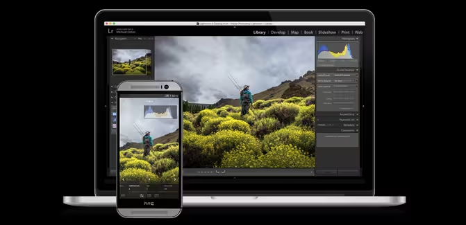
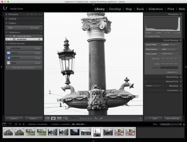 Every edit you make travels from the cloud back down to your desktop.
The Android version of Lightroom is similarly interoperable with the cloud and the desktop software. In my testing, I used the Mac version with my Android phone, and it was much the same experience as using the iPhone.
I set up a collection on the desktop and synced it with my Creative Cloud account so that the images appeared on my phone. Doing that allows you to work with shots taken in all formats including Raw, because the app creates a much smaller file that you can view in the mobile app grid. Lightroom mobile downloads low-resolution previews for display in its Grid, but when an image is opened it pulls down a higher-resolution Smart Preview file for you to work on and zoom into in detail.
You can also upload raw files to Creative cloud in the field and bring them into Lightroom Mobile via the same cloud route, and send them back to the cloud to reunite on your desktop. Shots snapped on the camera phone showed up in a jiffy on my desktop (and on my iPhone) too without the need to manually export.
If you want to move a portion of the creative menus out of your way as you try out different effects, you can move the menu to the left or right sides to show either the text or the image diagram. It’s not an ideal solution, but it’s better than not seeing your image at all as you try on edits and special effects.
The real value of Lightroom Mobile is the ability sync and share via your Creative Cloud account, passing edits back and forth from the field to your desktop, and that is partly why the apps are free.
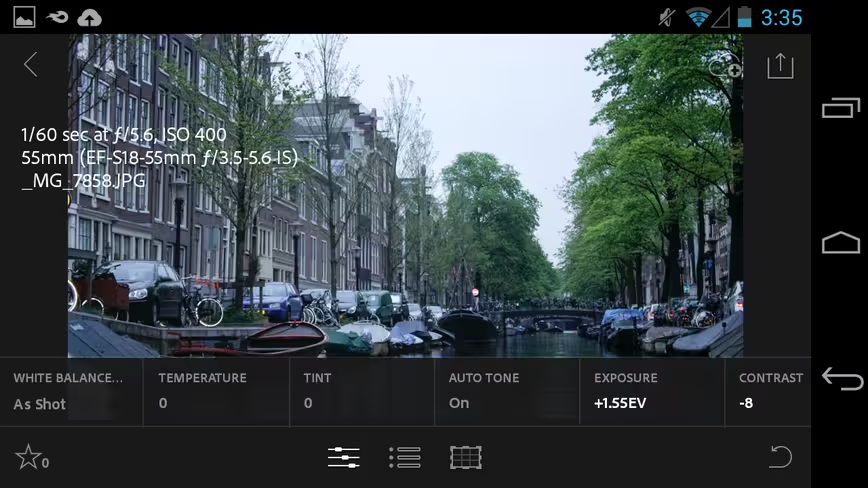 See this unsightly layout in landscape orientation? Get rid of it with a two-finger tap.
While Adobe, of course, wants you to subscribe to either the Photography Plan for $9.99 a month or the full Creative Cloud for $49.99 a month, you can also set up a free, 30-day Creative Cloud trial account, which will let you sync and store up to 2GB of images. After the 30-day trial period ends, you can continue using that free subscription indefinitely. That allows you to reap the full value of Lightroom and its mobile companion apps without going the subscription route, for as long as you like.
Lightroom Mobile works with Lightroom 5.4 or later on Mac and Windows and is available for download now.
Get the TNW newsletter
Get the most important tech news in your inbox each week.

