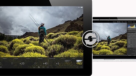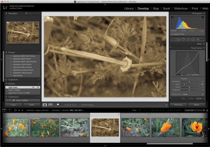
The first thing you need to know about Adobe’s new Lightroom Mobile for iPad is its mission: The app is an adjunct to the desktop Adobe Lightroom 5 photo management application—and you will need both to reap the full benefit.
Whereas Photoshop Touch, the mobile app Adobe released last year, is an independent, standalone analog to the company’s flagship image editor, Lightroom Mobile is tethered to its parent program.
The second thing you need to know is that in order to use Lightroom Mobile, you will no longer be able to circumvent Adobe’s controversial Creative Cloud subscription service. That’s because the specific Lightroom desktop update (version 5.4) that facilitates Lightroom Mobile is only available via Creative Cloud.
![photo[5]](https://cdn0.tnwcdn.com/wp-content/blogs.dir/1/files/2014/04/photo5-730x547.png)
Sit back and relax
Lightroom Mobile lets you step away from your computer, carrying your images with you to a more comfortable space where it’s just you, the tablet, and your picture. Relaxing away from the desk, you can apply more creative and experimental thinking and, hopefully, more original edits to your images.
With Lightroom Mobile, edits won’t get lost in the translation between tablet and desktop because the app features a powerful syncing function that lets you dynamically trade images back and forth from the desktop in real time with updates intact, regardless of where you made them.

If you’re working with Lightroom, it’s assumed that you have some professional workflow aspirations and that you have high resolution photos either in Raw or JPEG format from your camera or in Lightroom. The program’s smart preview technology lets you view and work with those large files by creating compact proxy images on the tablet.
![photo[6]](https://cdn0.tnwcdn.com/wp-content/blogs.dir/1/files/2014/04/photo61-730x547.png)
Tab-based interface
Lightroom Mobile features four tab-based adjustments—Filmstrips, Adjustments, Presets, and Crop Control. The Filmstrips tab gives you a full survey of the collection you’re currently working with. You can flag and pick favorites, and reject images.
There are few filtering choices in this debut version, so routine tasks such as applying titles, writing captions, listing keywords, setting star ratings, and choosing color labels, can only be done on the desktop.
The Adjustments tab gives you a sampling of more than a dozen of the most important controls available in the Lightroom 5’s Develop module, such as White Balance, Auto Tone, Highlights, Vibrance, Clarity and others, in a easy-to-use slider or illustrated list. The tab does not offer everything available in the desktop app, but it’s plenty to start with.
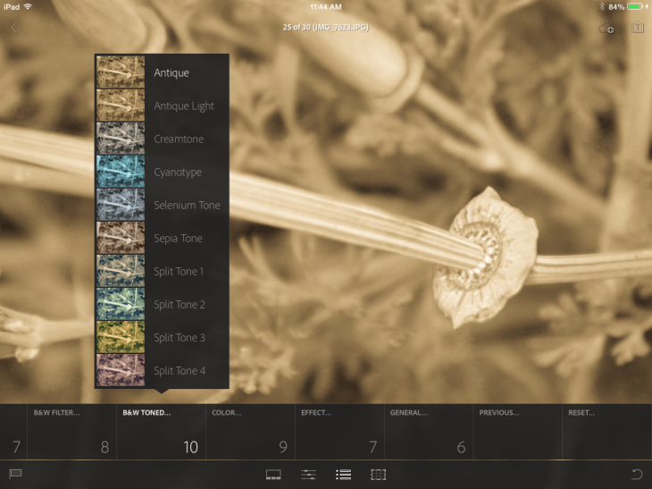
The Presets tab is where you’ll find some of the common edits you’d apply to most photos, such as Medium Contrast Curve, Sharpen, and Auto Tone. There’s a gratifying variety of Black & White filters, tones, and special effects to choose from. If the editing appears to cover significant parts of the image, a tap and drag moves it out of the way.
You can switch back and forth between the tabs as your work, naturally trying out different exposure levels or special effects. Reset buttons let you revert to the original version of the tab or to the shot itself. There are also controls for applying the same effect from previous photos to your present photo. Nothing is saved until you hit the cloud icon at the upper right of the image and tap on the Sync Now button.
![photo[4]](https://cdn0.tnwcdn.com/wp-content/blogs.dir/1/files/2014/04/photo4-730x547.png)
One small interface issue initially bugged me, though I got used to it after awhile: Every time you tap the Lightroom Mobile interface, it shows a good-sized red dot under your fingertip. That got a bit distracting because it appears universally regardless of what you are doing. I can see having a signifier for tap and hold operation, but if the app actually responds the way you expect, there should be no need for constant visual reinforcement.
As you make changes to your original image, there is no indication of when a process or procedure is finished. Instead, Lightroom Mobile employs a fluid strategy of adding on adjustments and changes as you work and saving them until you hit the Sync button.
![photo[7]](https://cdn0.tnwcdn.com/wp-content/blogs.dir/1/files/2014/04/photo7-730x547.png)
Responsive performance
Most of the editing operations for Lightroom Mobile were quick, fluid, and stable even on an older iPad. I encountered no lag between tapping a function and viewing the result. I never saw the app crash. Like most of Adobe’s mobile apps (except Photoshop Touch), Lightroom Mobile offers a simple slate of choices without overwhelming variety. And that especially makes sense because of the app’s connection to the desktop program.

Adobe implemented some simple tap gestures: a two finger tap hides or shows information such as the histogram and image metadata. A three-finger tap reveals the Before state of the image.
These interface features, together with excellent performance, lend a polished look and feel to the app.
Bottom line
Adobe’s Lightroom Mobile app is a meritorious execution, especially for a 1.0 debut. It offers a high level of functionality, and will prove useful and engaging to its target audience of advanced amateurs and professional photographers.
I’m disappointed but not surprised that Adobe has tied Lightroom Mobile to its Creative Cloud subscription service—and I get why the company decided on that course. The problem is that it further diminishes the rationale behind keeping Lightroom as a perpetual license for that segment of the professional market unwilling to adopt the subscription model. Sure, you can still buy and use Lightroom now and for the future, but without a subscription, you’ll miss out on this cool new thing.
![photo[8]](https://cdn0.tnwcdn.com/wp-content/blogs.dir/1/files/2014/04/photo8-730x547.png)
While there are some missing controls and functions, such as being able to rate images, we can probably attribute that to the product’s 1.0 status and expect improvements over time.
Lightroom Mobile is free to use with the desktop version of Lightroom, so the decision to “buy” the app rests more on whether or not you’re ready to take the Creative Cloud plunge. A 30-day free trial is available to help you make up your mind.
Pros: Easy to use and learn, lots of ways to edit high resolution images on the go or on the couch; plays nicely with the Camera Roll, good presentation options, several ways to share to social networks, interoperable with Lightroom 5.4 on the desktop.
Cons: Must have a Creative Cloud subscription, large red tap marker is distracting, some basic filtering functions are missing.
See also: Adobe launches Lightroom Mobile for iPad, but you must be a Creative Cloud subscriber to use it
Get the TNW newsletter
Get the most important tech news in your inbox each week.
![photo[1]](https://cdn0.tnwcdn.com/wp-content/blogs.dir/1/files/2014/04/photo1-730x547.png)


