I’ve talked before about why Apple makes their phones 3.5″ diagonally and why they will never be larger than 4″. Now a clever explanation of just how that 4″ phone might come about has been posted on The Verge forums by member Modilwar, inspired by a call in to the site’s podcast by Timothy Collins.
See, the hopes of a 4″ iPhone have always been mitigated by the difficulty of enlarging the screen of the device without immediately obsoleting every app produced for the current models. There are some 500K+ apps out there that would have to be completely rebuilt in order to work properly with a larger screen. And then there is the problem of increasing the size of the screen while retaining Apple’s Retina-level resolution.
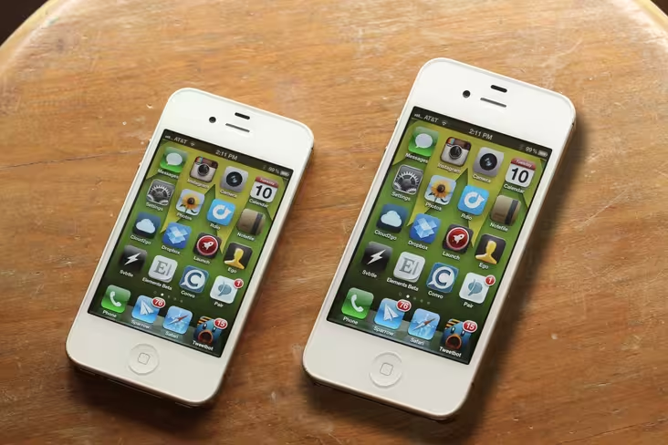
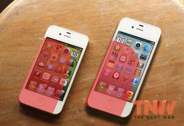
The draw of the explanation by Modilwar lies in its simplicity. Instead of increasing the overall size of the phone, they suggest that Apple will simply increase its length. This would allow many apps to simply increase the view area in between the bottom tab bar and the top status bar, easing the translation of apps that use standard Apple tableviews and other components.
Developers
Unfortunately, this hits a wall when you’re talking about apps that heavily use custom graphics across their interfaces, rather than stock Apple components or list views. These apps don’t get off easy with the ability to stretch the listview sections out. They have to be rebuilt entirely. Many of the high quality apps on the App Store use largely custom graphics.
“I’d mostly be annoyed,” said Tapbots developer Paul Haddad, when I asked him how a device with a taller screen would affect their apps. “But Tweetbot could deal with it pretty well since there’s nothing in there that’s too tied to the screen size. Pastebot would be fine too. Everything else would be very annoying to try to deal with.”
He’s also not convinced that changing just the ‘height’ will make it any easier on developers at all. “I’m almost certain the aspect ratio changing is a bigger issue than the resolution changing, though both would suck. Just raise the screen size, keep the resolution the same, make everyone but some bloggers happy.”
It’s not even worth discussing official Apple apps, of course those will be updated. But the App Store is big enough now that momentum is an issue. It’s a juggernaut that can’t pivot on a dime, even if concessions were made to apps that use two navigation bars that sandwich scalable content.
Your hand
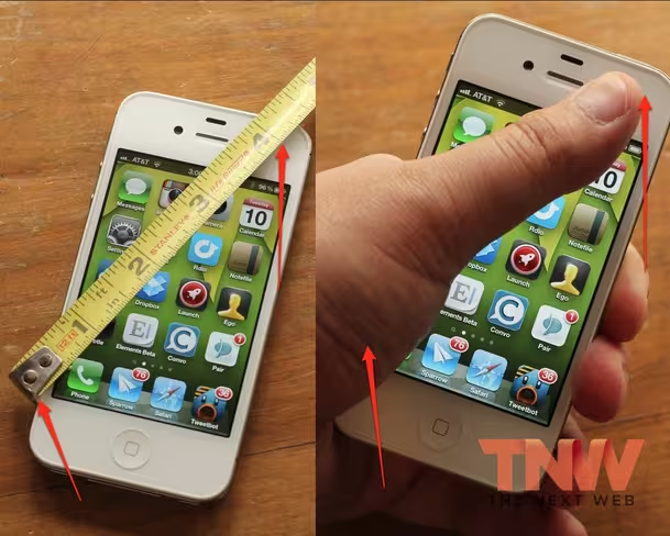
And then there is your hand. The iPhone is the exact size and shape that it is because Apple does rigorous, insanely iterative, testing on its products. Why do you think that it is that you can perfectly reach the upper corner of the iPhone’s screen with your thumb, all while using the phone one-handed?
A look at a crude mockup of a ‘widescreen’ iPhone tells the tale. The surface area of the screen that you can reach with your thumb is greatly reduced when the screen grows vertically, making all of the icons around the edge harder to reach.
But you don’t even have to do a fanciful mockup of a ‘wide screen’ 4″ iPhone to see what I mean. You can try it out on your own device if you have a current model of iPhone. See, the distance from where the joint of your hand and thumb rests on the edge of the phone to where the tip of your thumb rests on the upper right corner of the device. If you’re left handed, do the opposite.
That is just about where the upper corner of the screen would be located. You can see that, unless you have larger than average hands, you’re looking at a decent amount of strain in order to get there. Unlike the current iPhone’s screen, where almost no stretching at all is needed to reach the upper corner, it’s a concerted effort to get there.
Even though you can, the amount of effort needed to get you there means a lot of stretching and hand fatigue over a day’s usage.
I investigated these issues earlier, comparing the iPhone to the 4.3″ Droid Bionic, the Samsung Infuse 4G and the Galaxy S II and I came to the conclusion that once you get above 3.5″, things get hairy pretty quick.
Almost any device over 4″ feels too big to comfortably use the entire screen with just one hand. My hand span, from thumb to forefinger, is a little over 9″, which I understand to be fairly average if not a little big. For people with smaller hands, the issue is even worse.
The Droid Bionic (pictured middle), at a slightly larger 4.3″, is also far too large to be comfortable one-handed. Even if I try to use it specifically with one hand, I still find myself unconsciously reaching over to tap it with my right. It seems like the .3″ shouldn’t make a difference, but it does.
Photos
Changing the aspect ratio to 9:5 would allow the width to stay the same while increasing the length to 3.49″, with a diagonal of 3.99″. This would transform the confortable ‘snapshot’ (don’t think that is a coincidence) shape of the screen into something that is far more widescreen.
That alone should be a red flag. Apple is dedicated to making the iPhone the only camera you need to carry with you. Changing the aspect ratio of the screen heavily in this way would make viewing standard snapshots a far worse experience and printing them a matter of distress. The 4:3 ratio that the iPhone shoots photographs at is iconic. And it also matches the shape of the iPhone’s screen—and the iPad’s—very closely.
In fact, the images are ever so slightly wider than the 3:2 screen can display. You can see this by pinching in on an image in your camera roll. You’ll notice the black bars on the top and bottom. Apple wants to present you with a regular full screen view that shows off the photograph, even if it has to crop it slightly in normal viewing. With a widescreen display, it would only be showing you a sliver of an image shot at 4:3, making it impossible to display a full screen image without it looking ridiculously cropped.
In order to do this it would have to start shipping widescreen images, which it would never do.
I worked in photography and printing labs for years. Trust me when I tell you that cameras shooting ‘widescreen’ images caused the most heartache and issues when it came to digital cameras. People just don’t understand it. Apple knows this and wants people to see, shoot and share images at a size that is comfortable to them. Perhaps a new camera interface would use only a portion of the screen to shoot the images, and then they would be displayed by only showing a sliver of the image initially. But I doubt it.
Maybe 4″, but probably not widescreen
The conclusions that I reached last time still hold today:
The iPhone’s screen, at 3.5″, turns out to be nearly the peak of what is comfortable being used with one hand. Now, my opinion differs from Curtis’ in that I think a 4″ screen would actually work just fine…as long as it was no larger.
An iPhone 5 with a 4″ screen would be a nice bump in size and I don’t think that it would affect usability as much as one even a quarter of an inch bigger. But you can bet that Apple will be building and testing it—hundreds of times if necessary—before we ever see it.
Unfortunately, the increase in size coupled with the fact that it’s all put into the ‘vertical’ dimension make me think that this is an unlikely proposition when you look at it from a usability standpoint. Nothing is for sure, of course, and this particular explanation is well thought out, but I think that there is enough evidence to cast it into doubt, especially based on the ratio change.
Thanks to Jeff Benjamin for the home screen.
Get the TNW newsletter
Get the most important tech news in your inbox each week.


