Apple’s design is deliberate and iterative. This is counter to the feeling that many have about the designs of the iPhone, iPad and Mac because they feel so organic and inspired.
The designs of these products stand out as different and unique, making it seem likely that they were the creation of a flash of genius or spurt of design inspiration. While that may be true of some of the concepts used or details involved, the majority of what Apple does is procedural.
Any device that is offered for sale from Apple has undergone hundreds, if not thousands, of tweaks and changes over the course of its development. Every element has been carefully considered and most likely been chosen from a dozen different variations on a theme.
The screen of the iPhone is no different and I’ve long been a preacher of the belief that it is in fact the exact correct size. Designer Dustin Curtis also sees it this way and has posted a nice piece on his blog that lays out what he sees to be the primary reason for this:
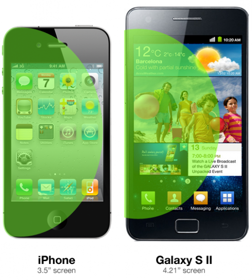
Touching the upper right corner of the screen on the Galaxy S II using one hand, with its 4.27-inch screen, while you’re walking down the street looking at Google Maps, is extremely difficult and frustrating. I pulled out my iPhone 4 to do a quick test, and it turns out that when you hold the iPhone in your left hand and articulate your thumb, you can reach almost exactly to the other side of the screen. This means it’s easy to touch any area of the screen while holding the phone in one hand, with your thumb. It is almost impossible to do this on the Galaxy S II.
He created this graphic which illustrates the ‘average’ reach of your thumb across the screen:
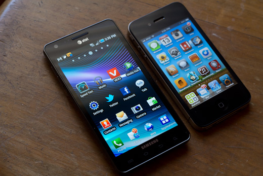
The Galaxy S II isn’t the only device that suffers from this thumb hyperextension issue either. Almost any device over 4″ feels too big to comfortably use the entire screen with just one hand. My hand span is a little over 9″, which I understand to be fairly average if not a little big. For people with smaller hands, the issue is even worse.
The Infuse 4G, with its massive 4.5″ screen size, was one of the first phones that I noticed the issue with, remarking in my review how difficult it was to reach icons on the right side of the screen while holding it with my left hand.
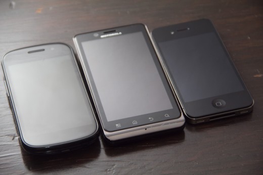
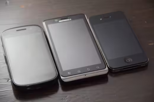
The Droid Bionic (pictured middle), at a slightly smaller 4.3″, is still far too large to be comfortable one-handed. Even if I try to use it specifically with one hand, I still find myself unconsciously reaching over to tap it with my right. It seems like the .3″ shouldn’t make a difference, but it does.
The iPhone’s screen, at 3.5″, turns out to be nearly the peak of what is comfortable being used with one hand. Now, my opinion differs from Curtis’ in that I think a 4″ screen would actually work just fine…as long as it was no larger.
An iPhone 5 with a 4″ screen would be a nice bump in size and I don’t think that it would affect usability as much as one even a quarter of an inch bigger. But you can bet that Apple will be building and testing it—hundreds of times if necessary—before we ever see it.
Get the TNW newsletter
Get the most important tech news in your inbox each week.

