This post was originally published on the Buffer blog.
Running a blog is so much more rewarding when you know people are reading, enjoying and sharing your work. If you’re managing a blog as part of your business, you probably want people to find and buy your products through your blog, as well. So increasing subscribers is an important task for bloggers.
These are some fairly simple hacks that you can implement without too much fuss, which should boost your subscriber numbers.
1. Lower your bounce rate – here is how
Cameron Chapman explained in a post on the Kissmetrics blog how he kept the bounce rate under 2% on his blog. His first tip is simple navigation:
The big thing here is that there’s no fancy, complicated navigation. No assisted search. No mega drop-down menus. It’s no more complicated than it absolutely has to be.
What I found most interesting was how much Cameron stressed the overall design. Both consistency and a focus on simplicity are more important than trying to pack as much as possible onto first. Another thing that stood out was the focus on navigation bars, the more easy they are to see, the more likely a visitor is to feel they are seeing something they’re already familiar with.
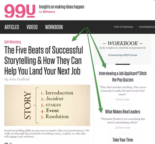
Another tip Cameron had is to only publish excerpts from your blog posts on your home page, which is something a lot of blogs do extremely well. Some great ones to see do this are Copyblogger, the KISSmetrics blog homepage or 99U. This means that if your visitors want to keep reading a post, they’ll need to click through to the post’s own page. Cameron said the trick to this was in the content your readers see before clicking through:
Make the first couple of paragraphs of your posts interesting and engaging. Avoid copy that tries too hard or goes for the hard sell. The goal is to get your visitors to click through to more of your content.
I’m a big fan of showing each blog post’s category, since I like to find more like it if I enjoyed the post. Cameron explained how he does this on his blog posts, and why it’s important for keeping his bounce rate low:
Since I don’t have a sidebar on the individual post pages, there’s a section at the bottom that lists the categories and keywords that the post is tagged with. (The category is also listed at the top of each post.) This makes it simple for visitors to find related posts.
Keeping the links at the end like this makes sense on a blog, where a lot of readers will be scrolling down to see comments on the post. Internal links also mean that there’s more opportunity for visitors to click through to other pages, rather than clicking their back button.
So if you want to implement some of Cameron’s advice immediately to start decreasing your bounce rate, here’s what you could do:
- Ensure your site has simple, consistent navigation on every page
- Only publish excerpts of your blog posts on your home page
- Add tag and category links to each post
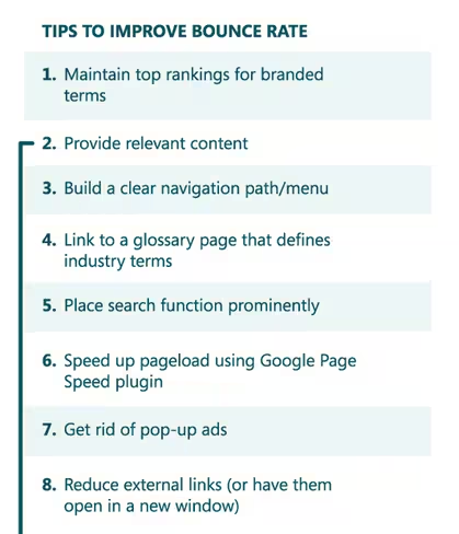
Our friends over at analytics tool KISSmetrics also have an amazing infographic explaining how to best improve your bounce rate:
2. Use a pop-up to catch email addresses (it won’t hurt!)
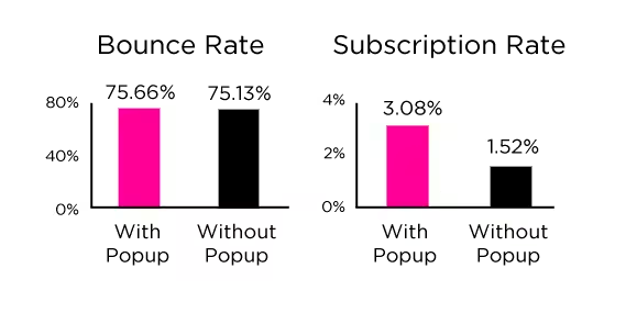
Social media scientist Dan Zarrella did some data exploration on his own site, to see how well his email capture pop-up worked, and how it affected his bounce rate.
Here’s what the pop-up looks like when you visit Dan’s site now:
Sometimes these are called lightbox pop-ups, because they often grey-out the content underneath.
The data Dan found is really interesting, because his bounce rate was barely affected when he had the pop-up enabled. In fact, it only rose by 0.5% when the pop-up was turned on for new visitors. The email subscriber rate, however, dropped dramatically when Dan turned off the pop-up:
I found that during that period my signup rate dropped dramatically. I was collecting far fewer emails from visitors. Also during that time, there was no noticeable change in bounce rates. Viewers didn’t seem to mind the popup at all.
Here’s how Dan summed it up:
To me this is a no-brainer. It’s not even a trade off between any kind of measurable visitor dissatisfaction and more emails. It’s just more emails.
And Dan’s not the only one. Nikki McGonigal from Nikki, In Stitches found a big difference between her sidebar subscription form and her pop-up in the number of email subscriptions they received:
Adding a pop-up to capture email addresses is fairly easy, as most blogging platforms and email newsletter services offer widgets or built-in options for setting one up. You can easily google “email lightbox” + the name of your email newsletter service or blog host, but I collected links to a few popular ones to start you off:
3. Optimize your loading time – 1 sec loading means 7% drop-off
We know that users don’t like to wait, it’s especially something we’ve tested before extensively, since we’re all used to technology being so fast these days, and blog readers aren’t much different. Slow loading times can be an easy way to lose visitors to your blog before they get to read your content, let alone sign up for more in their inboxes!
Sean Work from Kissmetrics collected some interesting stats about loading times. One fact that surprised me the most was this: A one-second delay in page response can result in a 7% reduction in conversions.
I don’t know about you, but 7% less conversions based on a one-second delay seems like a lot to me. That’s not something I’d want to risk if I had the choice.
Sean’s infographic also tells us that 40% of people abandon a website that takes more than 3 seconds to load. And that 73% of mobile internet users say they’ve encountered a website that was too slow to load.
So it seems like loading time is a pretty big factor in reader satisfaction.
In fact, slow loading times can even lead to your site being penalized in search rankings by Google, so it’s definitely something to pay attention to.
Here are some suggestions from Moz on how to improve your website’s loading time:
The back-end performance of a website directly impacts search engine ranking. The back end includes the web servers, their network connections, the use of CDNs, and the back-end application and database servers. Website owners should explore ways to improve their TTFB (time to first byte). This includes using CDNs (content distribution networks), optimizing your application code, optimizing database queries, and ensuring you have fast and responsive web servers.
4. Offer exclusive content for your subscribers – the 10x increase example
Giving away a free gift or exclusive content to subscribers can be the extra little push your readers need to sign up. Plus, if your email newsletter often includes exclusive content or freebies, it makes sense to start out by offering something similar when readers first subscribe. Especially testing different copywriting tips on the headlines can be a big driver for extra signups here.
Chris Spooner did this on one of his design blogs in a really clever way:
My Blog.SpoonGraphics site has been around since 2007 and during that time I’ve posted numerous freebies such as Photoshop brushes, textures and vectors. It would take a visitor ages to dig through the archives and download all this stuff, so I used this as an opportunity and created a bundle of my design resources as my free gift.
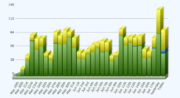
This is the graph of Chris’ spike in new subscribers after offering exclusive content, going from 10 to 100 subscribers a day:
flyte new media president Rich Brooks also found this to be incredibly helpful in boosting subscriber numbers:
By providing an incentive for site visitors to sign up for flyte log–our email newsletter on Web marketing–we now average over 120 signups per month…approximately a 5,000% increase from our “Join Our Mailing List” days.
As Rich explains, most email newsletter services will let you set up a customized first email that includes a download button so your readers can grab their freebies straight away.
5. Add sign up forms – the more the better
If you only have one place on your site where readers can subscribe to your blog, you might lose lots of reader who never see that form. This is something else that Chris Spooner tried. He found that his subscribers increased when he added more places for people to sign up. In addition to his existing header link to a sign up page, Chris added sign up forms to his side bar, his About page and at the bottom of each blog post:
One of the forms that has proved really effective on my sites is the placement at the end of every post. New visitors who have stumbled across your content and made it all the way to the end of the article have a high potential of wanting to stick around for more, so it makes sense to prompt them with the option of subscribing with a conveniently placed signup form.
I love what Chris has to say about adding a sign up option to his About page, since I would never have thought of that:
A strategically placed signup form slap bang in the middle of your bio is really effective to recruit those interested to receive more of your content. Despite having much lower display rates, my about page signup forms have amazing conversion figures (30x higher than the other forms!).
6. Change your wording choice
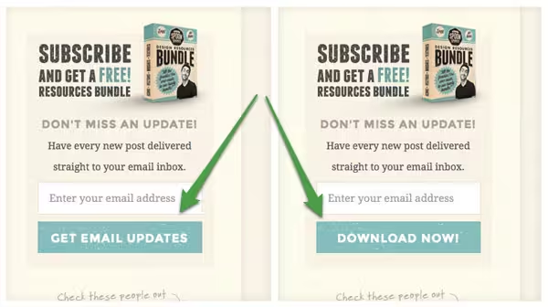
Something else that worked for Chris was testing different wording choice on his subscribe buttons. Because he was giving away a free downloadable gift to every new subscriber, Chris tested a “Download Now” button as well as his standard “Get Email Updates” button. The results helped him choose which one to keep:
The split test was run for around 40,000 impressions and during that time the “Download now!” button achieved 3 times more signups than the words “Get email updates”.
Willy Franzen wrote about a similar experiment on Copyblogger, where he changed the wording on his subscribe button from “Subscribe by E-mail” to “Get Jobs by E-mail,” with some pretty stellar results:
My subscription rate has increased 254% since I made the change, and 66% of the new subscribers are e-mail subscribers.
With just a quick change of some text, Willy saw a huge increase in his subscriber rate.
7. Use a feature box
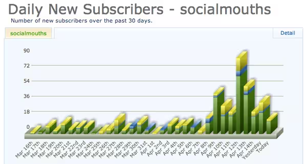
If you’re not a fan of the lightbox pop-up, you could try the feature box instead, which also seems to convert well. Francisco Rosales of SocialMouths used a feature box because he wanted a less intrusive, more customizable option than a lightbox pop-up.
While this was one of many tweaks Francisco made to his blog in the same week, it contributed to an overall jump of 500% in email subscribers.
Derek Halpern explains at DIYthemes how adding a feature box alone boosted subscriber rates by 51.7% overnight:
Literally overnight, our daily new subscribers to the Thesis blog shot up by 51.7%, and has stayed that way ever since.
Derek’s feature box did offer a free eBook for new subscribers (see #4) but he also found the feature box alone did the trick on his other blog, Social Triggers:
On Social Triggers, I don’t have a bribe in place, and it converts extremely well.
The last I checked, around 10% of the people who visit the home page turn into an email subscriber.
If you’re running WordPress, you can get the feature box built-in with Derek’s Thesis theme, which will save you from coding your own feature box from scratch.
Header image credit: Thinkstock
Get the TNW newsletter
Get the most important tech news in your inbox each week.

