
Born with smartphones in our hands, nowadays everything we do in our life surrounds these devices. From waking up in the morning and checking our phones (before even brushing our teeth) to navigation, communication and of course shopping.
In order to convert these mobile users into actual customers, it’s imperative that we truly understand our customers on an emotional level, identify their emotional triggers and translate that knowledge into a better product for them. This is the true formula for converting mobile visitors into customers.

Mobile isn’t the next big thing, it already is.
Just last May Google announced for the first time ever that mobile search has surpassed desktop. This is is a huge change in the way people consume content, search and buy. If that’s not big enough evidence, research by Statista shows that by 2019, mobile traffic to websites will increase by 480 percent.

The 💜 of EU tech
The latest rumblings from the EU tech scene, a story from our wise ol' founder Boris, and some questionable AI art. It's free, every week, in your inbox. Sign up now!
Unfortunately while mobile search and traffic keeps rising, (mobiles contribute 50.3 percent of all ecommerce traffic) conversions are extremely low, to non-existing. A research by Monetate shows a whopping 240 percent gap between conversion on desktop and mobile. This may be due to the fact that four in five consumers experience problems conducting transactions on mobile devices.
Another critical reason for extremely low conversions on mobile is to do with the vast majority (83 percent) of websites that aren’t optimized for mobile at all (pinch and zoom) and the rest are responsive design websites.
Responsive design means designing a website that looks good whether it is displayed on a desktop monitor or a five-inch screen of a smartphone. The layout is fluid and allows the website to automatically adjust according to the screen of the visitor.
The main reason why developers go for responsive design is because of their overall versatility. The long term maintenance of a responsive site is easier since the code doesn’t need to be tweaked anymore to accommodate different layouts. Added to the fact that Google recently updated their algorithm to favour sites which are mobile friendly, it’s easy to see why most business owners choose responsive design.
Unfortunately, what responsive design really means is taking an entire desktop experience and cramming it into a mobile one. Forcing a desktop experience, on a mobile user. Doing this, is extremely problematic.
Research shows, that while using smartphones we also spend 57 percent of our time using other devices at the same time! We do not use smartphones the same way we use desktop. We use each device differently and each device has it’s own purpose. Assuming that people will shop the same way on both devices leads to a HUGE loss in revenue.
Understanding your mobile visitors
As Herbert Simon once said, “A wealth of information creates a poverty of attention”. When we’re on our mobile phones we’re on the go and usually multitasking; everything happens in real time and we have absolutely no patience. Furthermore, 80% of mobile users still say they feel unsafe checking out on mobile.
If your site doesn’t load fast enough or requires users to scroll across multiple pages, these users will happily leave your page and skip across to your competitor. In other words, mobile users require a different user experience which allows them to find what they want on your site with minimum effort and time. Websites who have noticed this and have created a separate mobile experience have seen large increases in revenue.
Where to Start
Creating an optimized mobile experience can be time consuming and expensive. This is where dedicated mobile landing pages come in to play. By creating dedicated landing pages for mobile visitors you can create an optimized user experience, save time and money on rebuilding a responsive website and address key issues your mobile customers are experiencing.
Similar to desktop optimization, converting customers on mobile Web is a big challenge which requires a lot of experimentation and testing. Rather than building a complete mobile site, start by optimizing the most important pages on your site and go from there. Visit Google Analytics to discover the most popular pages mobile visitors land on and the leaks in your mobile funnel.
The Metrics you should be following:
- Mobile device report
- Keywords
- Mobile bounce rate
- Funnel visualization
- Site speed report
These metrics will provide a clearer insight into user behavior, leaks in the funnel and technical issues you can address on your site. Discover what mobile visitors are looking for, which pages they see, the devices they’re using and your load time to create a better user journey only where it matters.
Next step, create dedicated mobile landing pages for those pages and test them.
I’ve listed 42 mobile landing page tips on Conversioner’s blog, below are a few of our best practices:
- Utilizing Space – Remember that mobile visitors need a quick answer to their search and that most people do not have the patience to scroll on mobile. Have the most important elements “above the fold” so people can reach what they need quickly.
- Emphasise Search – Search is a key feature for mobile visitors that allows them to find what they need as quick as possible. Make sure to highlight search on your site and make it accessible. As you can see, IKEA puts search front and center in their design.

3. Utilize Click to call – One of the best mobile conversion methods today is a simple click to call button which allows customers to instantly contact you. Rather than get to the checkout and leave or bounce on the first page, offering customers the option to call you can save many sales.
4. Ask for less – The general rule in conversion optimization is only ask for what’s necessary. If you don’t absolutely have to know their date of birth, phone number or pet’s name – do not ask for it. This matters twice as much on mobile where real estate is at minimum and people have much less patience. Try to keep your form fields and requests to a minimum.
5. Offer exclusivity – Another one of my favorite tips is offering exclusivity and giving mobile visitors a reason to convert on mobile. Since the majority of people prefer to checkout or convert on web you should give them a good reason to convert where they are. The example below by Banana Republic does exactly that.
6. Utilizing mobile technology– one of the best things about mobile is the wealth of information you can get on your visitors. Banana Republic utilizes GPS and does a great job in offering exclusive features to their mobile visitors by allowing logged in customers to locate stores next to them:

Pro tip:
For companies that do not have the time or resources to create dedicated landing pages, checkout Banana Splash which helps business turn mobile visitors into customers. With their custom layers, you can show real time personalized messages to your mobile visitors and convert them in one click.
Putting theory into practice:
Many companies have tested and succeeded with dedicated mobile landing pages. One similar test was ran by Hubspot on one of their landing pages. Having noticed that conversion rates from mobile traffic were lower by almost 30 percent than on desktop, they set out to optimize this by creating a dedicated user experience for their mobile traffic. Instead of working on the entire funnel or creating a responsive design, Hubspot tackled one page at a time.
Hubspot’s hypothesis was that the form was too long and that the page consisted of too much data. To optimize these issues, Hubspot went from a responsive design to a mobile dedicated user experience. Content was shortened, images were reduced and the amount of fields required on the registration form were brought down to a minimum. These changes resulted in an increase of 27 percent in conversion rates.
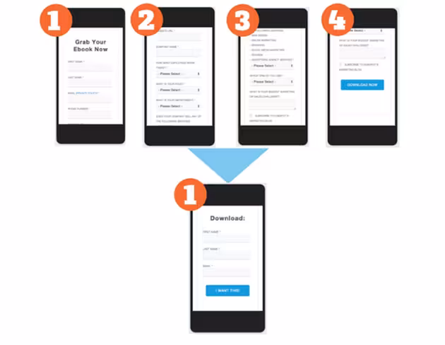
One of our earlier tests this year at Conversioner was for a company which had been spending a huge amount of money on mobile campaigns to generate paying customers. Their site was mobile responsive and had a 0.79 percent conversion rate to purchase. To optimize their mobile site they removed the main image from the homepage but kept all the content. This was the landing page and flow mobile visitors used to see:
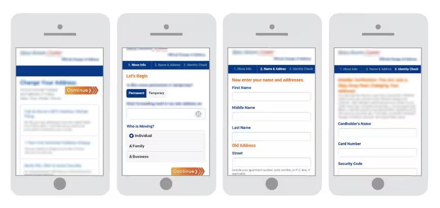
Once we completed our emotional and behavioral research we started work on the test. We made many changes in terms of the design, adding call to action buttons, reducing the amount of text, changing the copy, reducing the amount of fields and requirements from visitors and added different emotional triggers to make customers feel safe, in good hands and increase reliability (for a full list and explanation on the changes we made check out the case study). This was the optimized version:
We ran a full AB test and the dedicated mobile landing page increased conversion to purchase from 0.79 percent to a steady 4.62 percent! Which meant the company was now making six times the revenue it was making before. This was an exciting result.
In both examples, by addressing the key issues mobile visitors were facing companies were able to understand their target audience better and increase conversions.
Over to you
Simply understanding your visitor’s behavior on mobile can assist in increasing conversions tremendously. Once you understand your mobile customers better you can create a better user experience for them and increase revenues. The bottom line is that just because something looks good doesn’t mean it’s going to work well. Find out what your mobile customers are trying to achieve and help them get there whether it’s by optimizing search on your site, creating dedicated pages or simply adding a save for later button.
What do your mobile conversions look like?
Read Next: 10 psychology secrets to supercharge your sales
Image credit: Shutterstock
Get the TNW newsletter
Get the most important tech news in your inbox each week.