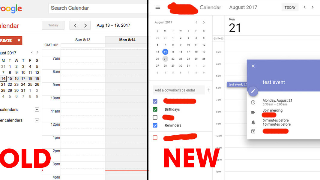
Google finally appears to be giving Calendar a facelift – and a whole new user interface.
Redditors are rushing to the Google and Android subreddits to report that the Big G is currently testing a new and improved visual identity for the desktop version of Calendar. The new design appears to be based on the company’s own Material Design language.
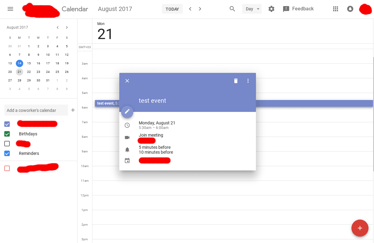
According to commenters, the touched-up layout mostly keeps the service’s basic functionalities so you should still find them where they used to be in the previous version.
Redditor xDawnut has posted several more photos from the yet-to-be-released design. You can browse through them in the Imgur gallery below:
It appears the test is currently being displayed to a limited amount of users, so in case you still see the old version – now you know why.
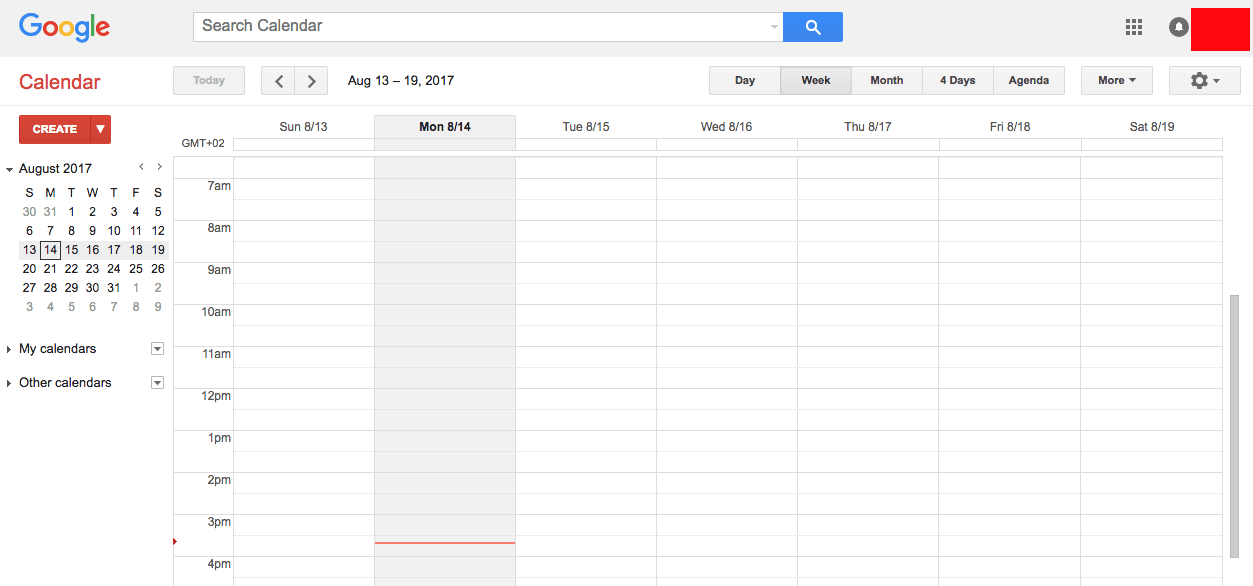
Just for comparison, this is how Calendar looks right now:
Given that Google has been gradually updating its line of existing products – including YouTube, Chrome, Gmail and more – with Material Design, revamping Calendar seems like an absolutely logical step.
It remains unclear when the search engine giant plans to roll out the new Calendar layout to all users, but we’ve asked Google for more details and will update this piece accordingly should we hear back.
Get the TNW newsletter
Get the most important tech news in your inbox each week.
