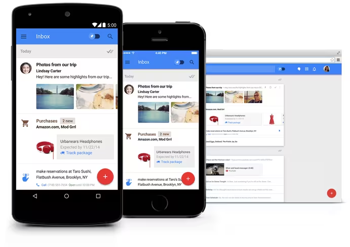
One week ago, Google opened up Inbox by Gmail to everyone, meaning you no longer need an invite to use the email service across your personal or work domains. Google Apps users do need to activate the option in the administrative console first though.
It’s not the first time I’ve tested the service, of course. I gave it a shot back at launch in October last year, but without general access to it for Apps users, Inbox wasn’t a whole lot of use. Given how many work emails there are each day, I don’t devote a lot of time to my personal address.
When that changed last week, I was keen to give it another shot with a proper volume of mail. And this isn’t a post moaning about the mass of daily email – that’s an increasing part of most people’s everyday lives now, which is why there are so many email clients trying to solve the burgeoning problem.
Settling in
Inbox looks notably different to Gmail’s default view, which is disorienting at first. I’m a fan of Material Design overall though.
There are a lot of changes (and I’m not going to walk you through all of them, you can go and experience them for yourself), but the thing you’ll either love or hate about it is the way it bundles up promotional mail and ‘updates’ (it uses the same categories as Gmail to organize your mail, but they all appear in a single feed of messages).
This isn’t compulsory, you can opt to receive email as it arrives, just as you can in Gmail. If you choose to keep them bundled, each time a new message arrives for that particular category it will make the whole bundle jump back to the top of your inbox.
At first I found that really distracting – most ‘promotion’ or ‘update’ emails that I received don’t need replies (or even keeping) so seeing them at the top of my inbox every few minutes seemed irritating.
Then, after a couple of days, I realized I was dealing with – and removing – significantly more email from these categories just because they weren’t hiding in a tab any more. I couldn’t ignore them. They just kept popping back to the top of the inbox with each one received.
For comparison, I also switched off the tabbed view in Gmail to see if dealing with each of them individually as they arrive is a viable alternative. It didn’t, it just made my Gmail inbox messier.
In your face
I’m still not totally convinced about the persistent bumping of categories – I remove more crap but have to pay more attention to see important emails – but there is one thing I know for sure. Last week I had 14,000-odd unread emails and now there are just 3,500 or so. Am I going to read all of those? No, probably not, but Inbox seems to make dealing with them a whole lot easier, particularly on mobile.
When it first launched, you couldn’t set the default swiping behaviour to delete mail, only to archive it which limited its usefulness – much of my mailbox doesn’t need archiving, it just needs deleting.
It’s still too ‘noisy’ though. Opening Inbox still gives me the feeling that I’ll perhaps never get through all the email sent in a day, and it’s still a bit overwhelming but somehow it just seems to present mail in a way that’s easy to organize – just not understand.
Part of it is that thumbnails of attachments are shown in-line on the main inbox screen. In one way that’s useful for at a glance information, but in another it’s confusing if you’re scouring for a specific email.
Of course, if you’re looking for a specific email from a while back, you’ll probably search and Inbox is pretty damn good at that, returning instant results before you hit ‘enter’.
The snooze function is pretty handy for anyone used to Mailbox or other apps that also offer this option, although it would be nice if selecting a new snooze time didn’t take quite as many clicks.
Then there are pinned items, for those emails you really don’t want to lose track of, which works pretty neatly too. If you don’t want to miss that important email from the boss, or forget about an upcoming task, just add it to your pinned list – just don’t forget to check your pinned list every now and again.
A permanent switch?
Much as I’ve enjoyed taking a scythe to my email backlog, Inbox still isn’t quite ready to replace Gmail for me – though it has completely on mobile. Gmail notifications are now fully switched off on my phone, which is a pretty big step.
I’m also a big Google Keep user, so it’s nice to have reminders synced directly into their own section of my inbox too.
Inbox is still too messy and too noisy though. Still too much like everything just merges into one stream. That makes it hard to keep track of mail in the main view, but easy to organize into separate sections. Inbox isn’t a Gmail replacement for me yet, but it’s getting close.
For now, I’ll just keep running them side-by-side.
Read next: Spark is a new iOS email app for power users, with some clever ideas
Get the TNW newsletter
Get the most important tech news in your inbox each week.


