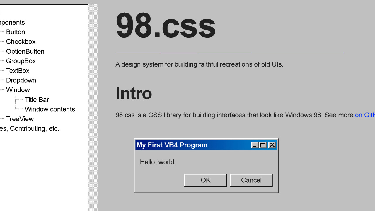
Windows 98 was my very first exposure to PCs, but by the time I got my own it had already been replaced by its successor, Windows XP. At the time, I thoroughly dreaded the 98 aesthetic. I found XP’s vivid color scheme and rounded corners infinitely more appealing.
XP’s design seemed more modern to my eyeballs back then. But with time, I’ve come to develop a keen appreciation for the 98 aesthetic. I’m not the only one: Up to this day, people are still paying homage to this classic look with Windows 98-inspired DIY gadgets and appreciation sites — just like 98.css.
It’s a new CSS library that lets you effortlessly build interfaces in the likeness of Windows 98. If you’ve been thinking about recreating that look for one of your upcoming projects, you should absolutely have a gander at it.
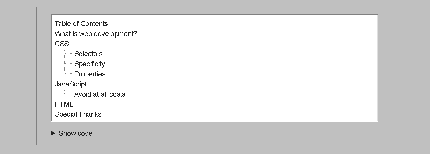
98.css comes with several pre-styled components, including buttons, checkboxes, textboxes, a dropdown menu, and a window among others.

The library uses semantic HTML and doesn’t contain any JavaScript, which means you can easily apply it to a variety of frontend projects. It simply styles your HTML with a bit of CSS.
Another cool thing is the project is MIT-licensed, which should give you enough flexibility to tweak it to your needs.
And if you’re looking for a trip down old-school OS memory lane, check out Microsoft’s unexpected throwback to Windows 1.11 or this snazzy music feed disguised as a retro Mac OS.
Get the TNW newsletter
Get the most important tech news in your inbox each week.


