If you’ve been on the Web in the past decade, you’ll likely have visited Reddit, Craigslist, Wikipedia, 4Chan, Hacker News, or The Drudge Report at some point. While these sites are all vastly different, they have two things in common: they’re all extremely popular among their audiences and they all look, well, terrible.
Web technologies have come so far in the past few years and designers now have a vast array of tools and techniques at their disposal. Yet these sites feature unflattering layouts that have no connection to the modern design philosophies seen around the Web today.
Why do some of these sites look like they were built in the 90s? Where are the clean layouts, carefully selected fonts and complementary colors?
For the record, The Drudge Report and Craigslist are indeed more than 20 years old — both were launched in 1995. Wikipedia just turned 15 last month. Reddit has now been around for 10 years, while image board 4chan is going on 13.

The <3 of EU tech
The latest rumblings from the EU tech scene, a story from our wise ol' founder Boris, and some questionable AI art. It's free, every week, in your inbox. Sign up now!
The thing is, it’s not always easy to say at a glance whether a site is well designed or not. You might be able to quickly decide whether it looks nice, but there’s more to good design than merely creating an aesthetically pleasing layout. You also have to consider how usable a site is and if it helps visitors find what they’re looking for or accomplish the task they have at hand.
To understand this better, I spoke with Amit Das, co-founder and head of data visualization at Intelligent Interfaces. According to Das:
There is surely a huge gap in terms of design that we see in sites like [Reddit, 4chan, etc.]. The gap arises from the expectations that content consumers have from user-generated and aggregated content apps and sites today from the likes of Medium, Facebook and Twitter versus more classifieds-driven content platforms like Craigslist or forums like Hacker News.
But let’s look at the current state of the aforementioned sites: they’ve been around for a long time now and weren’t initially built to meet the expectation of consumers in 2016. As organizations, their priorities are slightly bent towards handling the volume of traffic that these platforms cater to. Reddit, for example is the 32nd most visited website in the world whereas Medium’s ranking is somewhere in the 400s.
You can always expect new rivals with better design chops to crop up and challenge these older sites — consider Trulia taking on Craigslist in the real estate space. But one needs to understand that a huge amount of traffic for property deals comes from organic search and arrives at Craigslist. And this is just a tiny fraction of Craigslist’s breadth of classifieds around the globe.
What constitutes bad design?
Some of the most common issues with difficult-to-use sites are:
- Poor legibility: a wide range of fonts and clashing colors can make a site hard to read, especially when it features lengthy posts
- Confusing navigation: if a user can’t figure out how to find what they’re looking for on your site, or can’t tell where a link will take them, they’re not likely to stick around for long.
- Slow performance: if you’re using a lot of scripts, images and animations, your site will take a while to load and bog down your users’ devices.
If you look at the mistakes listed above, the sites we’ve highlighted actually fare quite well on the design scale.
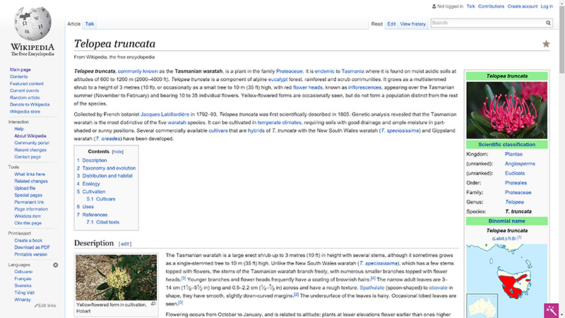
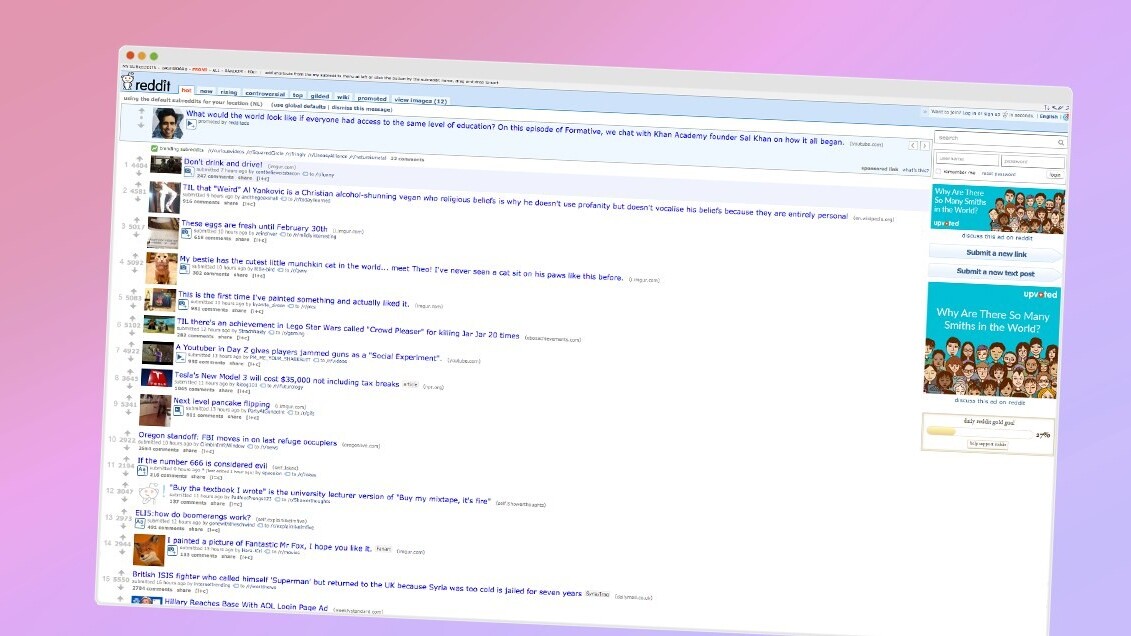
Wikipedia might seem busy and out-of-date, but the information is all clearly legible. Reddit may not be immediately easy to use for first-timers, but it’s ridiculously lightweight and loads quickly on most connections.
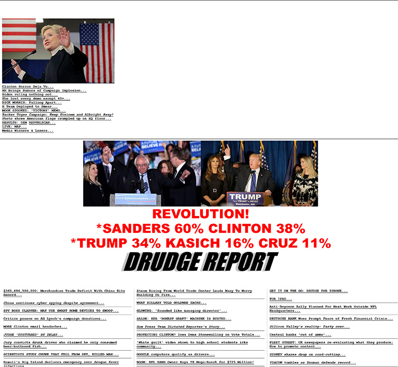
In 2008, Basecamp co-founder Jason Fried wrote about how The Drudge Report’s design is immensely successful, and he made a number of good points that hold true even today: its design is timeless, easy to maintain and compatible with everything. Plus, it’s truly unique.
These are important to consider, because coming up with a solid design takes time, iterations, feedback and careful implementation. It’s not something you can switch around daily, especially if you serve a large number of customers who are used to the way the site looks and functions.
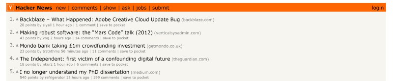
Daniel Gackle, who runs Y Combinator’s Hacker News (HN), explained that there’s a reason why the vote-based link aggregator for developers and entrepreneurs features a sparse interface:
HN emphasizes content above all else. A fancy UI would distract from that. Text is timeless. The information density of HN is carefully calibrated: it would be hard to squeeze more in, and less would feel too lightweight.
HN’s minimal design is good for intellectual curiosity, the guiding spirit of the site. It’s good for readers to have to work a little and decide for themselves what is interesting.
One nice thing about a text-based design is that the pages are small and load fast. Our users care about that a lot, and we care about it even more than they do.
There’s a community advantage to looking ‘classic’ instead of ‘modern’, too: it attracts people who care most about the substance of the site, as opposed to looking for the latest novelty.
Sometimes, ugliness is hard to avoid
Writing about why Chinese sites look so busy, Econsultancy’s Jeff Rajeck pointed out that there aren’t any capital letters or spaces in Mandarin Chinese, so it’s hard for those unfamiliar with the language to decipher what you should be looking at. No wonder their sites look chaotic to the untrained eye.
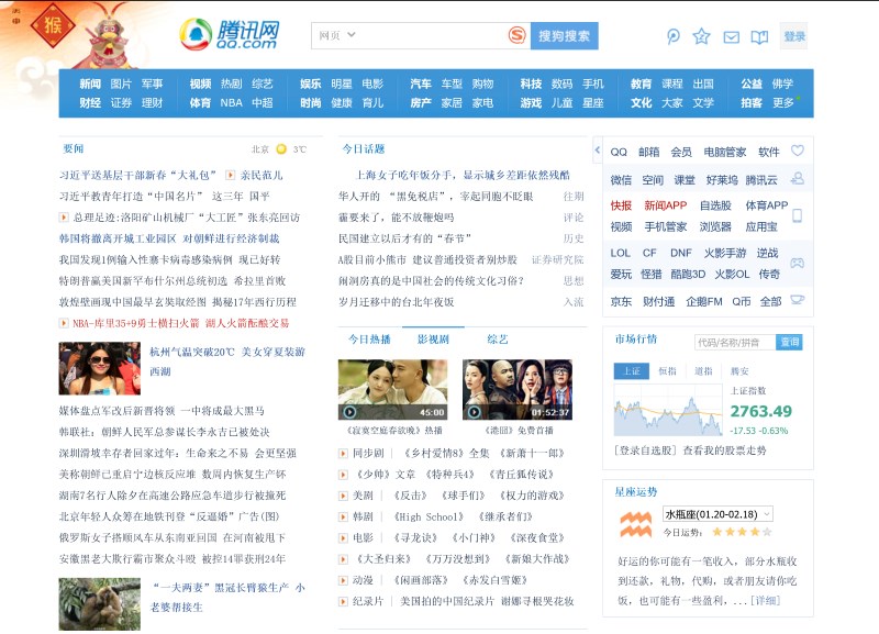
Plus, Mandarin Chinese can be difficult to type and the average internet connection is rather slow. That’s why some sites fill pages with links so as to reduce the number of pages a user has to go through to find what they need.
In the cases of Reddit and The Drudge Report, the idea of filling up the pages with links seems to be a necessary evil. On the one hand, it doesn’t make for a pretty site, but on the other, it lets you quickly scan through plenty of content at a glance, maximizing the value of the time spent during your visit.
However, optimizing sites to only highlight content in their design can intimidate first-time visitors who can’t figure out the best way to make use of their newly discovered source of information. Gackle explains:
A downside of HN’s design is that it can be rather cryptic to newcomers. In the early days, that was kind of fun, like a puzzle to solve. But things don’t stay that way, and as the site has gotten bigger this quality has brought a risk of insularity that I’d like to do something to address. Making the design more complicated wouldn’t make things any clearer, though, so we won’t do that.
Is change always a good thing?
In bemoaning the faults in design of our favorite sites, it often seems like the only way to fix them is to completely revamp them. But it’s worth noting that redesigns can frustrate and alienate users. Remember how Digg’s traffic tanked by as much as 34 percent when it got a new look?
Das explains why this may not always be an ideal solution:
When considering sites with large volumes of traffic, one little design change may result in a huge impact — which companies should definitely get into. As a matter of fact, Reddit started testing out a new design recently. That’s a clear indication that the team behind it is realizing the importance of adaptive design growth.
Many would suggest that Reddit completely overhaul its design entirely, but ideally it should take one tiny step at a time and alter components one at a time so as to not affect any transactional metrics.
Of course, both paths could lead to success. Das points to DeviantArt, one of the world’s biggest design and art communities, which overhauled its site after several years in operation, along with all-new branding. But the core DNA of the product remained the same. It’s still slowly changing its internal page templates one element at a time and not rushing it, and the evolving result is all the better for this approach.
On the other hand, he says, consider Amazon, which keeps adjusting its design bit by bit. “The changes are so small that you’d easily miss them even if you visit the site daily. But look back at its layout from a year ago, and you’ll realize that it’s changed pretty significantly,” Das notes.
Gackle says that this is how Hacker News’ look evolves as well:
We prefer the boiling frog approach—changing things in small increments—over big splashes. Like all users, ours hate change. We’ve actually changed a lot of things in the last two years, but only in ways that fit with what was already there, and sometimes with almost no visible difference. It’s fun to figure out how to add new functionality that way—like when a programmer figures out how to generalize a design without making the code any larger.
My favorite changes are when we find something unnecessary and take it out. [Y Combinator and Hacker News founder] Paul Graham is such a minimalist that every time we’ve found something to remove has felt like a triumph (there haven’t been many such triumphs.).
We’ve also sometimes added things and then removed them when they turned out not to be useful. Having the freedom not only to add new features, but also to simplify the site back again, feels important to evolving HN in a good way.
One thing we won’t do is chase design fashion. That’s a lot of work, and the effort is better spent on ways to improve the quality of the content on HN, which is what our users are there for.

As with other popular sites, many HN fans have called for a revamp and even submitted their own ideas for consideration. To those, Gackle responds:
Because HN looks old-fashioned, people sometimes propose redesigns. Some of these have turned into working apps and websites that offer features that HN doesn’t have. Many of them are wonderful, but they usually have different goals than HN does. For example, they add color or graphics, or they drop the information density.
I don’t think I’ve seen a redesign that serves HN’s goals better than the one [HN founder] Graham came up with. Its basic structure seems optimal for what HN cares about. But perhaps someone in HN’s extraordinarily creative community will prove that wrong, and that would be interesting.
What are your favorite ‘ugly’ sites? Let us know in the comments.
Read next: Beyond design trends: Timeless user interface techniques
TNW originally published this piece in February of 2016. We sometimes update and/or re-publish articles from our archives that are fun, informative, or highly-relevant… like this one.
Get the TNW newsletter
Get the most important tech news in your inbox each week.