
If you have been remotely listening to the Web design conversation in the past five years, one phrase keeps coming up – responsive Web design. By now, you are probably designing every one of your site outlines with a responsive framework.
But some of the talk is shifting to adaptive Web design. The conversation has been out there for a little while, but Google and Apple have really helped bring it back to the forefront. Is adaptive a concept we really need to think about when designing for the modern user?
What is Adaptive UI?
The discussion starts with a primer on adaptive Web design, or AWD. Like responsive design, adaptive is rooted in trying to create a better user experience across a number of different devices.


The 💜 of EU tech
The latest rumblings from the EU tech scene, a story from our wise ol' founder Boris, and some questionable AI art. It's free, every week, in your inbox. Sign up now!
Photo credit: Lufthansa
While responsive design is often one design that has slight variances from device to device – for an overall universal look and feel – adaptive design is a little different. With adaptive design the “magic” is in that the device and device-specific features are detected and a website is served to the user based on that information. The result is a website custom-made for the user’s device, but it can sometimes result in a less consistent cross-device experience than with responsive design.
An adaptive UI is not always something you can actually see. And as we’ve said in the free e-book Interaction Design Best Practices, the best interfaces are where the users doesn’t feel the hand of the designer.
Much of the difference between the responsive and adaptive design occurs in how an adaptive website works. That’s not to say it can’t – or won’t – look different, but it does not always have to.
How is Adaptive Different than Responsive?
While the ideas behind adaptive and responsive design are similar, they are not the same thing. Much of what’s different is in the HTML and CSS, and how that information is served to users.
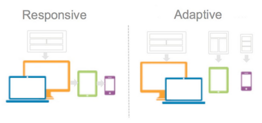
Photo credit: Engineers Without Borders
Garrett Goodman of The Huffington Post might have the simplest explanation:
“Responsive design is client-side, meaning the whole page is delivered to the device browser (the client), and the browser then changes how the page appears in relation to the dimensions of the browser window.
“Adaptive design is server-side, meaning before the page is even delivered, the server (where the site is hosted) detects the attributes of the device, and loads a version of the site that is optimized for its dimensions and native features.”
So the difference is who does the heavy-lifting. For adaptive, it’s the server working hard to deliver an optimized page. For responsive, it’s the device who’s beholden to media queries.
Photo credit: unifi
There are other differences between AWD and RWD as well. The amount of information downloaded on the user end is different, making adaptive websites a little quicker to load. In the build itself, adaptive design uses multiple templates for a “single website” whereas responsive design uses a flexible framework with a single template. Some designers argue that adaptive sites are easier to build because they can be based on an existing site.
The pros and cons for either have a lot to do with the individual design and development team.
But it all boils down to: What’s best for your users?
That’s a question that’s best answered with plenty of research on the front end of the design build.
Weighing the Benefits of AWD
Users of adaptive design cite a handful of distinct benefits for using this type of design outline. (And their arguments make a lot of sense.)
Photo credit: Spire
- Better performance: Because of the way the website is served, it renders faster and more efficiently for users.
- Increased flexibility: You can make changes where they are needed in the code without impacting the entire site. So if a button does not work for iOS users, you can make that adjustment without potentially breaking something that does work for an Android user.
- It makes you think about content strategy: Because your website is actually designed specifically for different devices, you can design functionality in great detail. How do you want something to work? How do you want users to engage with your website? You can make it happen in a way that is unique to the user and device with an almost personalized experience.
Design Thinking With Adaptive
Changing your website design strategy from one where you build responsive websites to adaptive websites requires changes in the way you think about the design process. You really are building multiple versions of a site.
Photo credit: Google Ideas
While the design method is fairly unique to the designer, Google’s Material Design documentation has a good breakdown of how to think about the adaptive process and create a website in that manner.
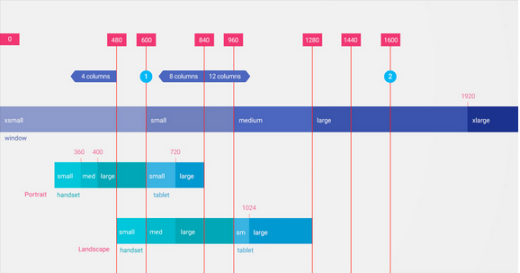
Photo credit: Google Material Design
From Google:
“This adaptive UI guidance includes a flexible grid that ensures consistency across layouts, breakpoint details about how content reflows on different screens, and a description of how an app can scale from small to extra-large screens.”
- Breakpoints: Layouts should work at the following widths 480, 600, 840, 960, 1,280, 1,440 and 1,600 pixels. Knowing these widths allows you to quickly prototype for various devices, using tools such as UXPin.
- Grid: A 12-column framework is preferred with consistent margin and gutter widths that align to a baseline grid. Grids can be full-width or centered.
- Surface behaviors: The UI should adapt based on screen size in specific ways – visibility, width and descriptions – and Google offers details for each of these adaptations.
- Patterns: User action behaviors and patterns – reveal, transform, divide, reflow and expand – are based on screen size. To see today’s most popular and effective mobile patterns, check out the free e-book Mobile UI Design Patterns.
When it comes down to the actual design, you’ll need a few new sets of rules.
This includes a set of templates for different devices. (At a minimum this includes three templates – desktop, tablet and mobile.) You’ll also need a set of guidelines for how you plan to use breakpoints and grids and what adaptations will occur at what points. Finally, comes the discussion about how much difference between device designs is acceptable. Ask yourself: are you OK with a website having multiple aesthetic outlines?
Should You Use Adaptive Design?
So it all comes back down to the big question: Should you use adaptive design?
If you are looking for a universal solution, you are not going to be happy with this answer. The type of design interface you choose really depends on the needs of the project and the users that you serve.
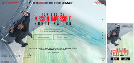
Photo credit: Mission Impossible
There are some instances where a more clear solution can arise. Consider using adaptive design if:
- Device-specific experiences are a necessity.
- You can actually create different experiences for each of these devices.
- You can handle and maintain adaptive templates and resources.
- Your user base is accessing your information on a lot of different devices (if analytics show 70 percent of users are on a single device, an adaptive UI might not be worth your time).
It really comes down to one thing in the end. Are you using adaptive UI to create a better experience for users or because you want to try something different? Always create common and desired experiences that users want to be a part of.
For more advice on designing the best web experiences, check out the free e-book Web UI Design Best Practices. Across 109 pages, you’ll find 33 design teardowns of top companies so you can learn from the best examples.
Read Next: Why micro-interactions are the secret to great design
Image credit: Shutterstock
Get the TNW newsletter
Get the most important tech news in your inbox each week.