Jerry Cao is a UX content strategist at UXPin — the wireframing and prototyping app. To learn more about content-first design, download the free e-book Web UI Design for the Human Eye: Content Patterns & Typography.
Don’t be fooled: chances are, your users scan your content for the best parts. Don’t take it personally, it’s nothing against your content (and doesn’t undermine its value), it’s just standard user behavior.
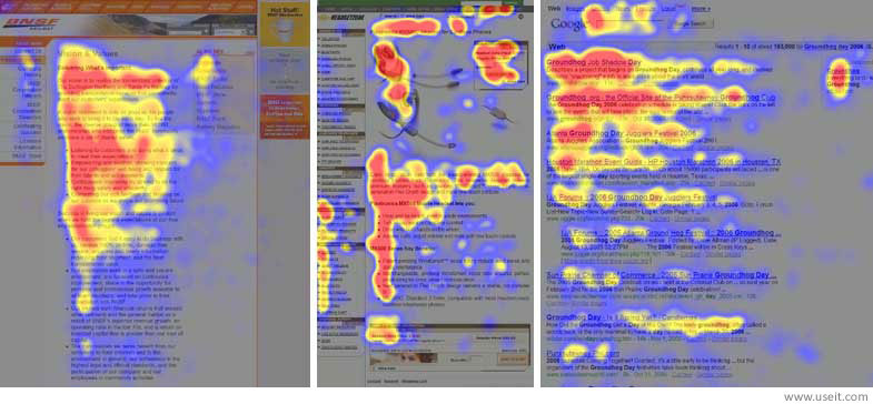
Source: F-Shaped Pattern for Reading Web Content
The F-pattern is the go-to layout for text-heavy websites like news sites, blogs, or in-depth landing pages. Once we explain how and why it works, you’ll start to notice its use on popular sites all over the web.
What is the F-Pattern?
The F-Pattern describes the most common user eye-scanning patterns when it comes to blocks of content.
The F refers to the reader first scanning a horizontal line across the top of the screen, as is understandable for cultures that read left-to-right. Next, the user scans a vertical line down the left side of the screen, looking for keywords or points of interest in the paragraph’s initial sentences or subsection titles. When the reader finds something they like, they begin reading normally, forming horizontal lines.
The end result is something that looks like the letters F or E. As shown in Web UI Patterns 2014, CNN and NYTimes both use the F-Pattern.
Jakob Nielson of the Nielsen Norman Group conducted a readability study based on 232 users scanning thousands of websites and elaborates on the practical implications of the F-Pattern:
- Users will rarely read every word of your text (in fact, only 20 percent on average)
- The first two sections are the most important and should contain your hook
- Cover only one idea per paragraph, using bullets as much as possible
- Start paragraphs and new sections with enticing keywords
How could this impact the interface design of your website? Take a look below.
How to Use the F-Pattern
The below example, from Brandon Jones’s piece on the subject, visualizes the F-Pattern.
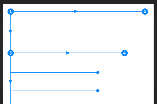
Source: Understanding the F-Layout in Web Design
Clearly, you’ll want to place your best content across the top, with a solid anchor in the upper-left corner (Point 1), the only spot practically guaranteed to get noticed. That’s why you commonly see a company’s logo here.
Commonly, designers will put the navigation bar across the top leading to the upper-right corner (Point 2). This makes it convenient to users who are searching for a keyword that is the title of its own section, for example, “Help.” Designers vary on how thick or catchy they make the top bar: a thin, subtle top line will encourage further scanning immediately, while a bigger one will take advantage more of its dominant position, promoting the content therein at the cost of the content below it.
After the top row, the user will drop down to the next noticeable section (Point 3) and repeat the process (Point 4). In theory, users will continue going down the page until they find something of interest, but in reality they will likely leave after a few seconds — unless you can hold their attention.
For this reason, experts recommend breaking up the monotony with an “awkward” element after the first two or three rows — anything that disrupts the routine. This can be any variation of the earlier rows, just to keep the page visually stimulating. Standard practice is to break the convention every 1,000 pixels beneath the fold.
The visual aid below is a nice reminder of how the F-pattern works.

Source: Understanding the F-Layout in Web Design
It’s worth noting that the end of each row (where Points 2 and 4, etc. are located), are the best places for advertisements and calls-to-action due to the momentary pause before moving to the next row. That’s why you see the “New eBook Out Now!” call to action placed at the end of the first row of content.
The F-pattern works great for these motives, as they present these options in a noticeable way, but without distracting from the primary content. Just remember that content is always king, and the sidebar exists only to get users involved in a deeper level.
With the F-pattern, the righthand sidebar may serve two main purposes:
- Featuring relevant but unrelated content — Anything you want your user to see, but that doesn’t fit in organically with the primary content. These could be advertisements, links to other posts, a social media widget, etc.
- As a search tool — This place could obviously host a search bar, but could also have category listings, tag clouds, a “popular posts” widget, etc.
This is a lot to take in at once, so we’ll show you what we mean with some examples below.
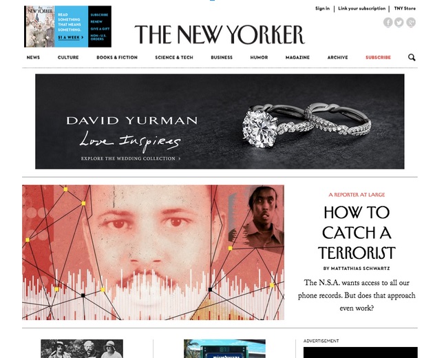
The New Yorker shows that the F-Pattern works especially well for sites that naturally feature advertisements. The first David Yurman advertisement is noticeable, but not distracting thanks to the use of red in the primary photo. As we described before, this advertisement is again shown at the end of the second row of content, where the eye naturally pauses.
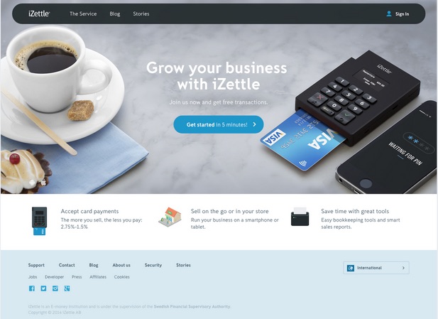
You can see this pattern adapted for sites with sparse copy as well.
iZettle takes a less conventional approach to the F-pattern on their homepage. In fact, it’s the layout represents a hybrid of the F-pattern mixed with the Z-pattern (which we discuss later).
They manage to avoid a templated look by overlaying the primary copy (“Grow your business with iZettle”) and the call-to-action on a large background image. We’d consider this the bare minimum for adapting this reading pattern to your interface layout — no doubt there’s visually sexier examples out there, but this still gets the job done.
Why Is This Pattern Effective?
Designers use the F-pattern repeatedly because it mimics users’ natural sight patterns. Most people have been reading top to bottom, left to right their entire lives.
Designing a site layout with the F-pattern flows with the current, encouraging the user’s sight to follow naturally. Conversely, content-heavy sites that ignore the F-pattern are creating unnecessary strife by forcing the readers to readjust their natural eye movement.

Source: How to Optimize Your Website and Increase Conversions
Site layout affects conversions, so it’s important to know the value of your on-screen real estate. Take Freespee as an example. After redesigning their site into the above version, subsequent A/B testing revealed that they could increase their phone conversation rate by 30 percent for the same ad spend, simply by putting their phone number in a more prime location in the upper right.
As we discussed in Web UI Design for the Human Eye, the above example is by no means a perfect design. They could make the bullet copy more prominent, and replace the background stock image with a visual that supports the described values. But that perhaps speaks even more about the power of layout: even if your typography and graphics aren’t the best, adapting your layout for human reading can still improve site performance.
That being said, let’s dissect what they’ve done right:
- The top-left logo attracts attention at point one, where users naturally scan the navigation, perform searches, or any other top-level actions
- The top-right phone number shown at point two is the first call to action. Since it’s highlighted in green, this further attracts the right attention.
- In the body of the page, concise bullets are featured at point three. This text is structured like a “mini F-pattern” so that the eye naturally moves down to the call-to-action
But the F-Pattern is not infallible. The main drawback to this layout is its predisposition to monotony — it’s easy to bore your users with repetitive and similar content in your rows. This is precisely why it’s advised to throw in an “awkward” row every and then; the variation helps hold the users’ attention.

Source: Understanding the F-Layout in Web Design
As you can see above, Kickstarter breaks its page into three distinct rows. The third row demonstrates the “awkward” row, variating from the pre-established pattern by laying out some widgets vertically (as it were, around the 1000-pixel mark).
Understand that people generally scan large chunks of content in an F-pattern, then alter it as needed to suit your site’s brand and personality. As you modify the pattern, make sure you follow these rules described by A List Apart for ratios and grids.
Takeaway
The F-pattern doesn’t just apply to text.
Any time you show a variety of content, you’ll need to organize it somehow. The F-pattern simply follows the common trends of the human eye so that you can optimize the structure of your layout. You don’t need to follow it rigidly — it’s a guideline, not a template. Even if all you take from this is to punctuate your top navigation bar with a call-to-action in the corner, that minor tweak could make all the difference.
To learn more about content-first design, download the free e-book Web UI Design for the Human Eye: Content Patterns & Typography. The e-book offers practical advice on visual hierarchy, designing for readability, and creating visual language through typography. Design examples are also analyzed from 30 companies including Dropbox, AirBnB, Marketo, Hulu, and Evernote.
Read Next: How to create the right emotions with color in web design
Get the TNW newsletter
Get the most important tech news in your inbox each week.