Nearly every designer out there shares a strong love for typography. Of course, many of us will never become full-fledged type designers, or even dedicated typographers, but somehow we all still manage to lust for the details of gorgeous type treatments, display and text typefaces.
And out of every genre hidden in the depths of typography, from black letter to grotesque, I have the softest of soft spots for experimental typefaces. They push boundaries, and that’s exactly what keeps this industry alive and well, and so in that spirit, here’ s a list of 9 beautiful and/or handsome experimental typefaces found on Behance’s Typography Served gallery:


For the 2010 edition of Getxophoto we thought of leisure, which is the theme of the festival this year, and as the leisure is what people do on the free time we thought to represent it with something that will take us a long time to do so. As in the poster with the logo done in cut paper, folded and photographed we created the typeface that we call it “Paper Chain Type” as strings of paper dolls we did as a child.
.


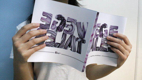
These typographic experiments combine two of my favorite things into a single project: food & type.


.
Food & Wine Magazine Lettering:

Not a downloadable or purchasable typeface, but this hand lettering work by Sasha Prood is beyond spectacular. It’s the wild attention to detail that really gets me.
.

Metatron’s Cube is a figure of sacred geometry, known as “in sacred geometry. Its name makes reference to Metatron, an angel mentioned in apocryphal texts including the Second Book of Enoch and the Book of the Palaces.
.


.


Venin pushes thick and thin far beyond its limits — to the point where the thins disappear into the background. From a distance, this face feels sharp and hard, but up close it feels fluid and expressive, making it more dynamic than you’d think.
.

Dimencia collaborates the essence of 3D principles and 2D design in a graphic display. Suited as an elegant and suave headline font, the letters are composed of very thin strands of thread hooked onto needles and cut paper mounted on the background. The movement of the strands creates a linear movement while the thick elements provide a pause for the eye to rest on. This high contrast conveys a unique visual effect and the use of the pin needles allow the letters to be interactive; the form of the letters change as the viewer moves his or her position from the work.
.


Baby’s Breath is a typeface formed with Gypsophila/Baby’s Breath. The meaning of Gypsophila is to miss, to adore, and to give. Gypsophila often serves a supporting role, but its existence is significant. This font should have a feeling of freshness, graciousness, and tenderness. I made three different sets of the typeface, the Autumn, the Winter, and the Baby’s Breath.
There’s something amazing about the designers that take on the tremendous goal of creating their own font. The devil’s in the details as far as the brunt of the creation process goes, and like I’ve written before, the entire process requires a special breed of designer.
Did we miss one of your favorite experimental typefaces? If so, let us know in the comments below. For more inspiration, check out this list of 5 more awesome experimental typefaces and other typography articles from TNW’s Design + Dev channel!
Get the TNW newsletter
Get the most important tech news in your inbox each week.