Nearly every designer shares a strong love for typography. Many will never become type designers, or even dedicated typographers, but somehow we all lust for the details of gorgeous type treatments, display and text fonts.
Out of every genre hidden in the depths of typography, from black letter to grotesque, I have a soft spot for experimental typefaces. Seeing technology, art and design merge together yields spectacular and wild results. Here’s a list of 5 highly original experimental typefaces:
IQ Font
IQ Font is one of the wider-known experiments built with openFrameworks. It was actually created in part by the framework’s founder, Zach Lieberman, and is a perfect example of the power and beauty of code.
From Zach Lieberman: “Two typographers (Pierre & Damien) and a pro race pilot (Stef van Campenhoudt) collaborated to design a font with a car. The car movements were tracked using a custom software that I wrote, which was then outputted into data to create a font.” You can download the results here.
➤ IQ Font
Mekkanika
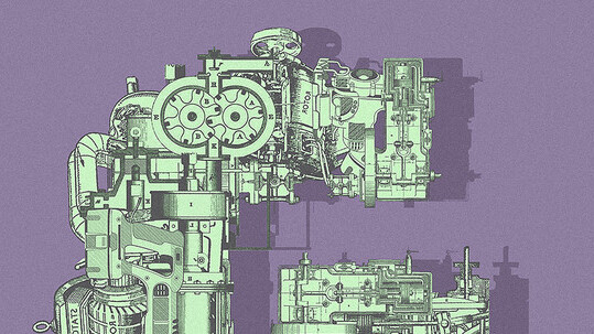
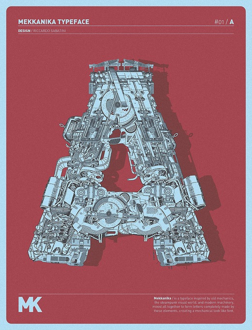 “Mekkanika is a mind-blowing experimental typeface by Italian designer Riccardo Sabatini based on the Din Alternate Black font. Sabatini scanned hundreds of mechanical technical drawings and used the component pieces to create each intricate letterform, leaving no letter, number, Autobot or Decepticon logo unfinished.” (via Colossal)
Skin Type
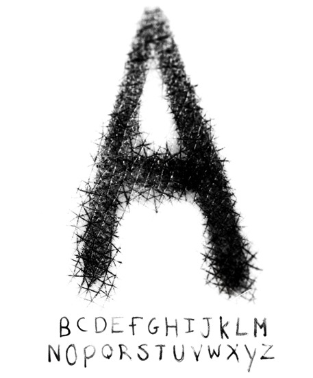 “Everyone has one. Any time you’ve written on your hand, you’ve created one. A unique DNA based typeface.” Skin Type, created by Brian Stewart, is an intense experimental typeface. Stewart told TNW:
I wrote something on my hand and noticed how the black ink bled into the wrinkles and creases in my skin. It was just something I’d kind of noticed for the first time, even though I’ve written on my hands hundreds of times.
Then I thought it’d be interesting to make a typeface from it, especially if you were able to capture the intricacies of how the ink fills in the patterns on your skin. I was also thinking that because your skin pattern, like your finger prints, is unique – then when everyone writes on their hand, they create a unique DNA based typeface without even considering it.
BalletFont
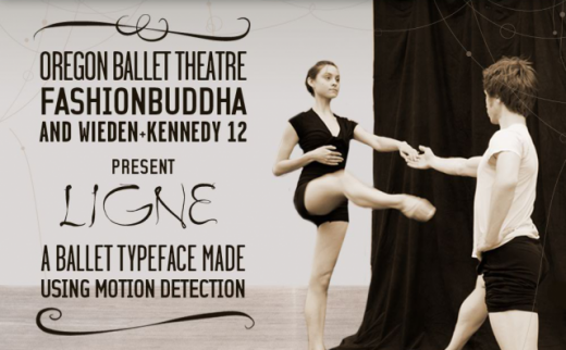 BalletFont follows in the footsteps of IQ Font, but takes the concept of motion tracking in an entirely different direction. It is “a project to create a typeface ‘Ligne’ from a dancer’s movements in space.” (via Creative Applications Network)
Three versions of software called “Chireo” (chirography + choreography) were developed using openFrameworks. “capture” did the initial motion and video capture. “augment” let the team clean up the data and export the font and rendered videos. “live” is the real time motion tracking / augmented reality software which was used for the realtime demo.
Bite off more than you can chew
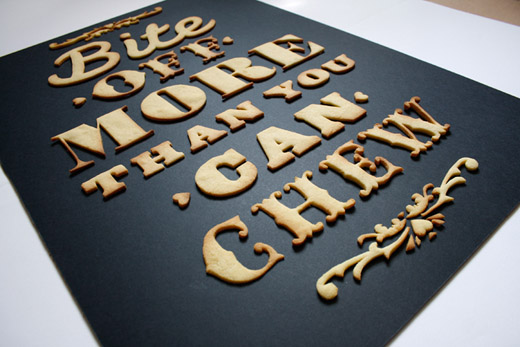 Bite off more than you can chew comes from designer Anna Garforth. She said “I thought to myself what could I ever love more than a good cuppa and a biscuit…typography. So there you have it, a home baked poster fresh out the oven.”
If this appeals to you then you may want to take a peek at TNW’s 6 awesome examples of great typography, all made with food. If you don’t leave hungry, there might be something wrong with you.
There’s something amazing about the designers that take on the tremendous goal of creating their own font. The devil’s in the details as far as the brunt of the creation process goes, and like I’ve written before, the entire process requires a special breed of designer.
Did we miss one of your favorite experimental typefaces? If so, let us know in the comments below. For more inspiration, check out other typography articles from TNW’s Design + Dev channel!
Get the TNW newsletter
Get the most important tech news in your inbox each week.

