Everyone has their passion. For some it’s typography and for others, it’s food. Obviously, some strange combination of the two sounds like a good idea, creating letters that are both elegant and edible.
Here’s 6 awesome examples of great typography, all made with food. If you don’t leave hungry, there might be something wrong with you.
Bite off more than you can chew
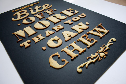 From designer Anna Garforth: “I thought to myself what could I ever love more than a good cuppa and a biscuit…typography. So there you have it, a home baked poster fresh out the oven.” Check out the entire design/baking process via the link below.
➤ Bite off more than you can chew
A Typographic Feast
Serious Eats: “Around 1:20 they get to arguably the best [of all five senses]: taste. Letters sizzle in oil, others are formed from a fruit punch-resembling liquid, and probably the coolest of all are the bouncy, jiggly ones spelling T-A-S-T-E.”
Typfruitography
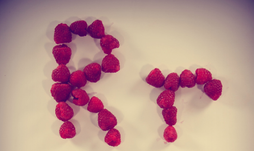 Garret Steider, a CommDesign student at UNT, created this experimental display face made mostly out of fruits and vegetables (there’s gum too).
Helvetica cookie cutters
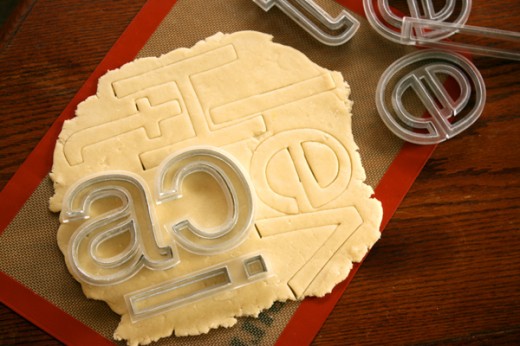 These cookie cutters, created by Beverly Hsu, allow anyone to bake letters in Helvetica. So far there’s no word if these cutters will go back into production, but you can always send over an email to find out!
Eatphabet
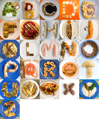 The creator of Eatphabet, Luiza P., explains on her site that this project was made during her last days as a design student. Also, she says she “never really stopped playing with [her] food,” but does anybody creative ever stop playing with everything?
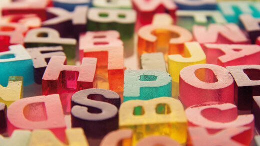
Sweet Letters
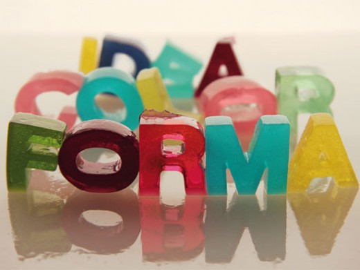 Sweet Letters was created by Aranxa Esteve and Lucia Rallo, “two young graphic and industrial designers from Valencia, Spain.” According to Moco Loco, the jello-like series was created with just sugar and gelatin and is completely edible.
These aren’t the only projects that embace the love child of food and typography. From major companies to school and illustration projects, this is clearly a well-loved trend.What do you think of these projects, and what other forms of art could merged together with beautiful results? Let us know in the comments!
Check out our full Design and Dev channel for more inspiration! Also, you can exclusively view typography articles here.
Get the TNW newsletter
Get the most important tech news in your inbox each week.


