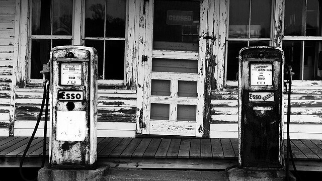
The beauty of restricting yourself to color has similar benefits to the style of minimalism. When color is stripped out, other design elements such as form and texture come to the forefront. Avoiding color is also a great way to quickly improve as a designer, because you’ll no longer be able to lean on your color pallet for visual interest.
Sticking to black and white also has an overwhelming simplicity to it, while creating a visually interesting website without any color is quite a difficult task. If you’re up for the challenge, you’ll need some inspiration…
Here’s a list of 9 gorgeous black and white websites to get you started:
Visualbox
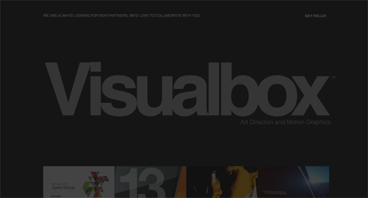 By restricting the site’s color scheme to black and white, Visualbox’s work samples are guaranteed to pop. Eliminating every distraction is the best way to focus your viewer’s attention on what really counts.
TH = SUM
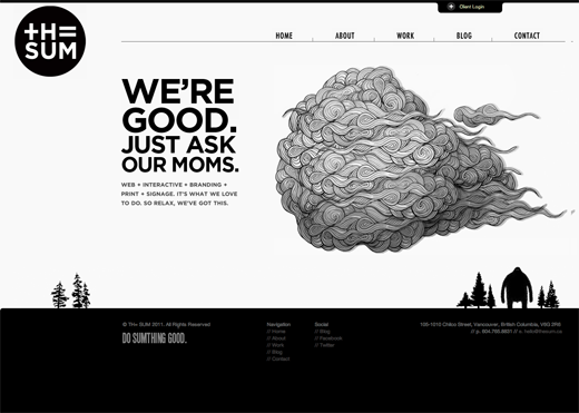 TH = SUM follows an illustrative theme, while remaining very clean and easy to navigate. The use of illustration creates a playful feel with the otherwise serious black and white.
➤ TH = SUM
Leah Haggar
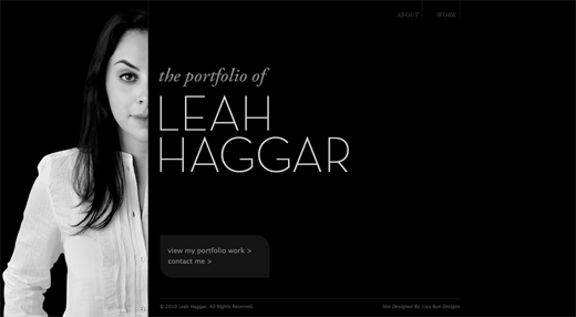 Leah Haggar’s portfolio is clearly all about her. The lack of reveal (her face is half hidden by content) keeps me around, looking at every page. Overall, there’s just a strong sense of calm and simplicity in this use of black and white.
Blissfully Aware
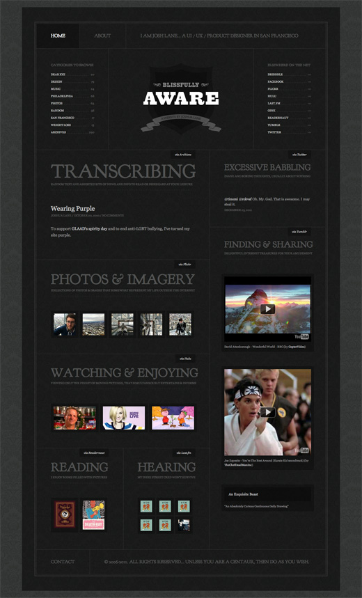 A cross between a collage and an appendix, Josh Lane’s site showcases a perfect use of white space (in this case, it’s black space), making it easy for the eyes to bounce around from header to header.
Made By Tim
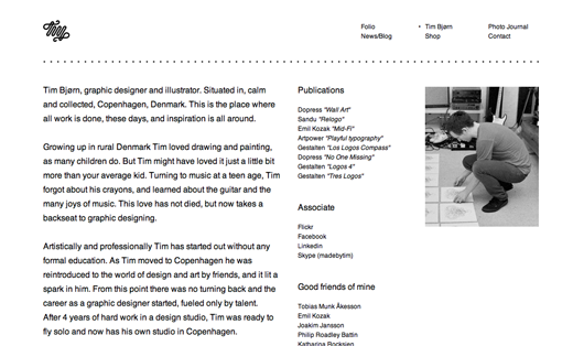 Tim Bjørn’s portfolio is highly minimalist and stays completely out of the way. Avoiding color keeps the emphasis on his work, just like Visualbox.
80/20
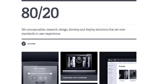 80/20’s portfolio is features very cold grays and blacks, and has a strong impact in an unexpected way.
➤ 80/20
The Grid System
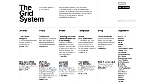 The Grid System, the ultimate grid resource, uses black and white as a mechanism for simplicity.
Uber Stealth
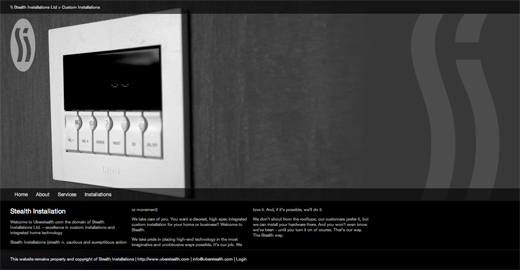 Uber Stealth lets big, bold photographs do its talking. I’m not a fan of the menu bar animation or the paragraph text size, but this site is still worth a look.
The Old State
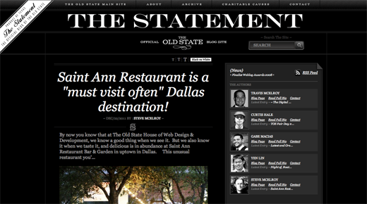 The old-styled typography makes this design feel like a vintage, inverted newspaper. It definitely stands out, though the header feels a little crowded. Circus Family has a similar affect.
I personally recommend that inexperienced designers avoid color all together, until 50% of the design process is complete. This is especially important with logo design, because starting with black and white assures your work will look its best no matter how it’s reproduced.
For more design inspiration, check out 14 awesome examples of illustrative web design. You should also take a peek at these 9 reasons to consider minimalism for your design portfolio.
Get the TNW newsletter
Get the most important tech news in your inbox each week.


