Odes Roberts is an in-house designer for Shutterstock. This post was originally published on the Shutterstock blog and has been reprinted with permission.
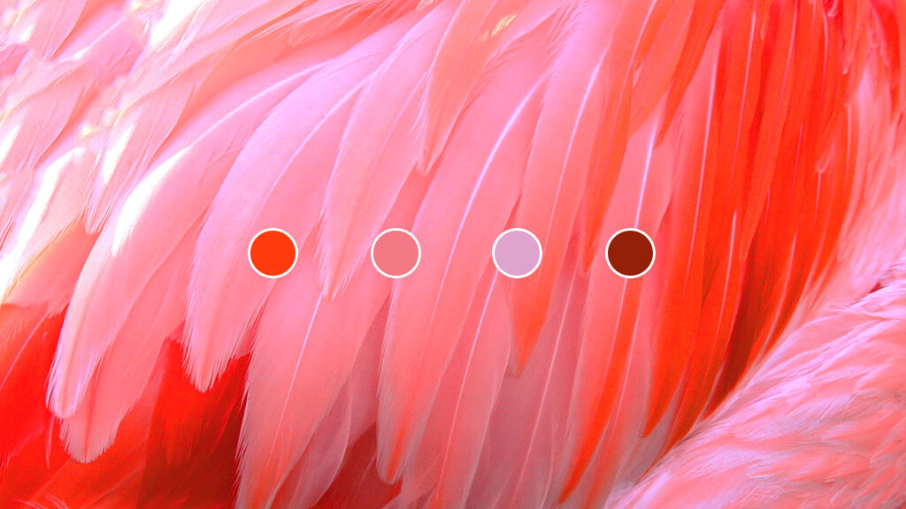
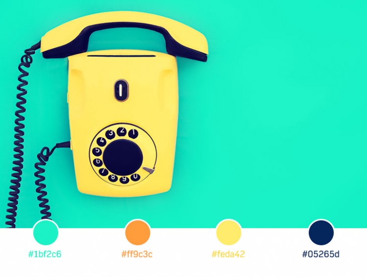
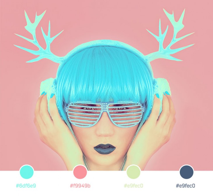
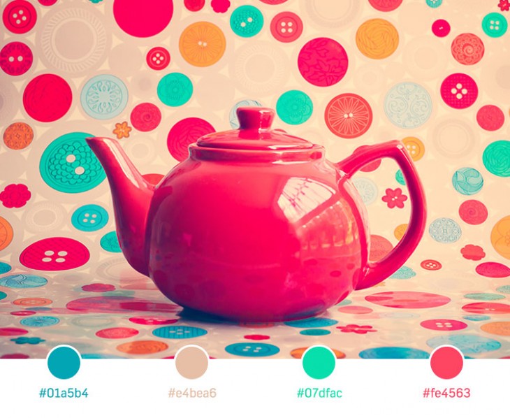
I love color. I especially appreciate bright, vivid colors that make you feel like you’re in another world. With summer coming to my neighborhood, I’ve been inspired to look for more vivid and stunning color-harmony arrangements.
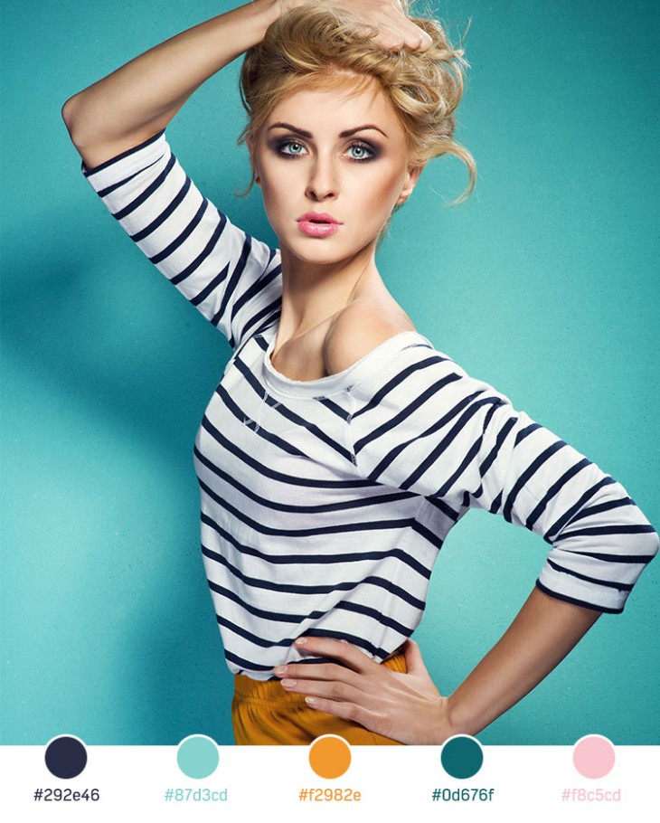
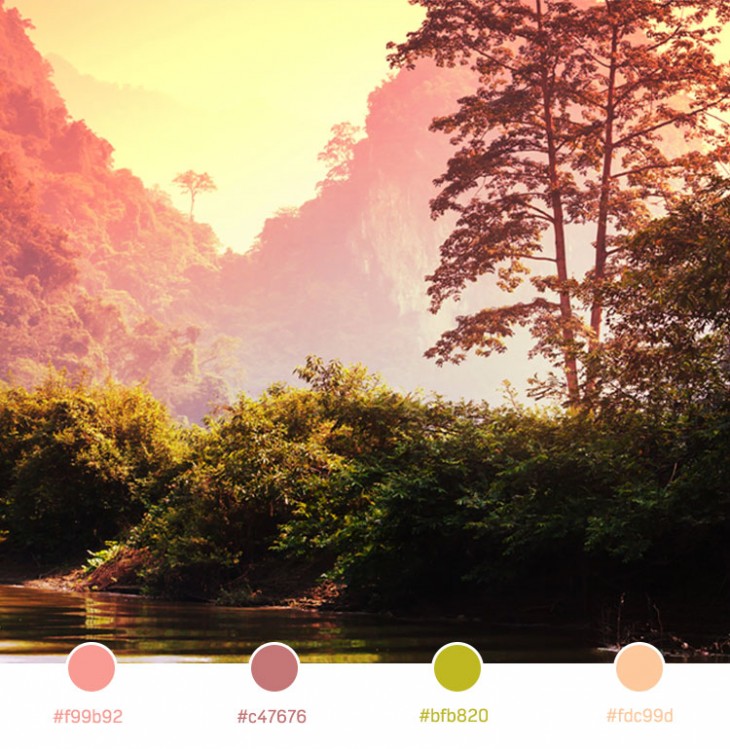
Color harmony creates a balance that’s pleasing to the eye. When imagery isn’t harmonious, it becomes either boring or chaotic. At one extreme is a visual experience so bland that the viewer isn’t connected to what he or she is looking at, while at the other is an experience so overdone that the viewer can’t stand to look at it. Color harmony delivers both visual interest and a sense of order.
Here are some examples of great color harmony, along with the color codes in each palette. Try using any of these to create your own pleasing imagery, or share your own favorite combinations in the comments!

The 💜 of EU tech
The latest rumblings from the EU tech scene, a story from our wise ol' founder Boris, and some questionable AI art. It's free, every week, in your inbox. Sign up now!
Get the TNW newsletter
Get the most important tech news in your inbox each week.