This article aims to share a series of advices, stemming from lessons learned through designing for kids over a period of twelve years. There is one resounding lesson: kids are not just a target audience. They are interesting, complex beings with thoughts and dreams bigger than giant unicorns, and they possess a broad range of emotions.
The only way to design something meaningful for them, is to get to know them on a level that forces “adult logic” into the back seat. From there we can start to understand and appreciate the incredible nature of the way they think and behave.
While there are many theoretical resources on the subject, here are some practical tools and methods that can help your creative processes when it comes to designing for our future generation.
Ask the kids
This seems an obvious one, but when many, slightly more established companies have direct access to a diverse panel of kids that help them validate early concepts, it can be a little intimidating setting out on a DIY kids-testing mission.
First off, where on earth do you find a perfectly diverse group of critical, chatty children to help you validate the very first stages of your idea? The answer is, simply, right in front of you.
- Ask your own kids, your niece and nephew, your friend’s kids, or your kid’s classmates if they want to help out. Show dead jpegs, sketches and simple prototypes: observe their thoughts and reactions. Are they positive, negative, indifferent? Ask questions they can relate to. “Is it cool? Do you like it? Why do you like it? Why do you think it sucks?”
- Create a friendly, relaxed atmosphere where the kids can be themselves and where it’s okay to be honest. Play a game, draw together, make it special. It’s most likely the highlight of their day, and probably also yours!
- Parents or guardians can be a distracting element for the kids, so make sure they don’t feel monitored or judged. You can do this by luring the adults with treats, such as tea and cakes, into another room. It’s a welcome break for them too.
- It’s beneficial to test in groups — e.g. two friends, so they’re comfortable in the setting. You will have a great opportunity to observe play and interaction dynamic this way.
- Dividing children up by age is better for observing accurate play patterns.
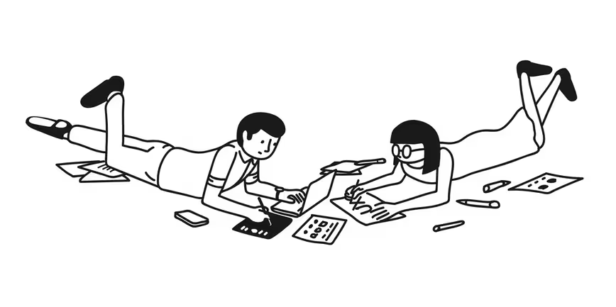
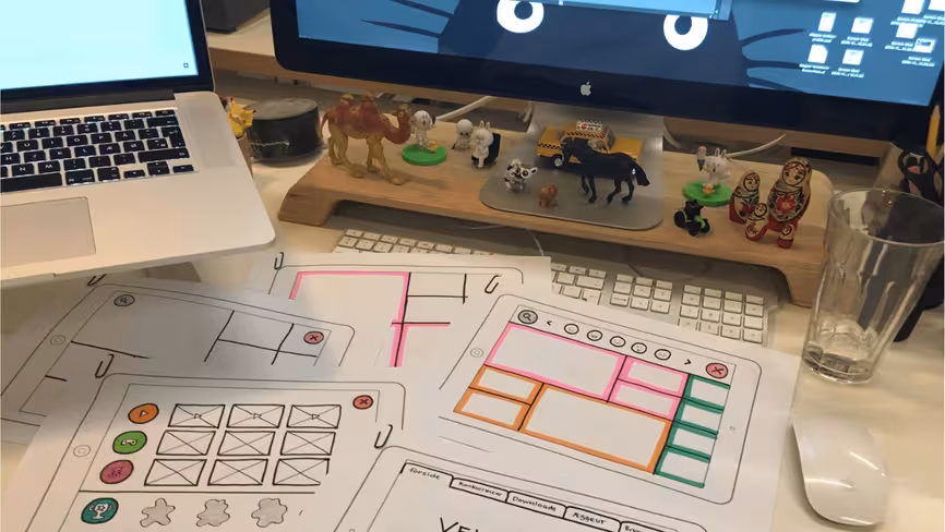
- Drawing wireframes is a great way to keep the process fun and interactive from start to finish. Here is an example:
The best thing about these types of DIY kids tests, especially in the early stages of a concept, is that you never really know what type of feedback you‘re going to get. Expect the unexpected.
Promote life after screen-time
Screen-time is not necessarily bad for a child’s wellbeing. It all depends on the rules parents set, if they’re actively engaged, if it disturbs sleep, and if the quality of the content is suitable.
I’ve observed kids reacting strongly to parents turning off — or telling them to turn off — their devices. Apart from the obvious frustration experienced by the kids through a, sort of, forced-separation, it’s pretty clear that there are addictive tendencies when it comes to their devices.
That is why we have a responsibility to ensure that kids engage in offline life too — nobody gets excited about a dystopian future where our friends don’t have eyes or mouths and the world is run by robots. So we should show them that taking a break from technology doesn’t have to be an abrupt or unpleasant experience, and that whatever awaits them outside of the device, in real life, is equally awesome.
Bake the breaks into the products
If you’re making something that’s truly addictive, it can be a good idea to add a cushion for the usual frustration experienced in an ‘end of session’ scenario.
Herein lies another lesson. When designing for kids, we’re also designing for their parents or guardians. Adults tend to facilitate their children’s development, and in most cases they are the gatekeepers of the technology that delivers their digital experiences, especially for younger children that borrow their parents’ devices.
Considering how a parent or guardian will interact with a digital product is equally important, and if there’s a way to save them from being evil villains every evening before bed-time, you should try to find it.
Age isn’t just a number
So what’s the difference between designing for a 4 year-old and a 10 year-old? In short, the overall development curve of a child is very steep, and just one year can make a huge difference. It’s about knowing the child and where they are on that curve.
While no ‘age group overview’ can replace years of getting to know them, here’s a list with a few key factors that have help you understand the kids, both young and younger.
- Age 3–5: They have less developed motor skills, need immediate visual / audio feedback, and they like to explore. They don’t “watch” content — they play with it. When they are watching a show with their favorite character, they feel like they are hanging out with them. You can teach kids anything at this time as they have “sponge brains.”
- Age 6–8: They are able to read, but they still have a simple vocabulary. The naming of elements (for instance navigation) starts to be important, and they are also able to understand and appreciate gamification aspects.
- Age 9–12 /tweens: They are already pro tech users. They’re scanning through content fast, they know what they want, and they’re chatting and communicating. This is the group we need to coach. Tweens have their own devices, and they use them more “freely.” They’re also more open to learning how to do things in new ways. They like “bite-sized” information/entertainment, they are picky users, and they watch what they want and disregard content that doesn’t interest them. You can say that they’re part of the swiping generation. It’s not that tweens necessarily have an aversion towards “cute” — it just needs to be balanced with weird and quirky.
Kids go through different phases, and from one moment to the next, the fascination with cows saying “moo” is replaced by an obsession with bacteria, The Titanic, or nature time-lapse videos. The development of a young human being is fascinating, and we have an opportunity to positively impact that development.
And then there’s all the other stuff, like size of UI elements to fit different finger sizes, navigation principles that translate across the board, engaging elements that captivate different personalities, etc. — that makes designing for kids of different ages a completely different ball-game.
Abandon adult logic
Just for a bit of perspective, where an adult might open an app with a specific purpose — to go from A to B (mainly trying to achieve what the app’s intended function is), a child will be much more explorative. They might open the app to have fun and be entertained, without knowing exactly where they want to go only to happily get lost in a world of content and features.
Where an adult has a relatively predictable attention-span for figuring out how something works, kids of different ages have different types of attention spans, ranging from almost non-existent, to unyielding determination to make something interesting happen.
When you’re designing for kids, it’s also important not to apply any of our inner-adult to the design the products if you want to make engaging and fun experiences for everyone.
Don’t forget the big kids (the adults)
Pixar mastered this one a long time ago: Remember to design for kids, but not just for kids.
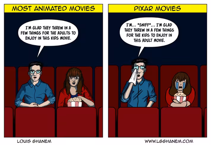
Adults used to be kids, but along the way many of them simply forgot what it was like to be a child, (funny how that happens). Luckily, from time to time they spot a chance to return to Neverland, and as designers, we enable this by creating experiences that tap into nostalgia with a hint of adult appeal.
And some final thoughts about designing for kids
- Responsibility — they’ll try most things we serve them, so we have a responsibility to serve them good stuff.
- Time is relative. For an 8 year old child, 1 year is 1/8 of their lives, so they can be nostalgic about things they saw or interacted with two years ago.
- We believe that kids are innately unbiased and open-minded when it comes to their own identity, so let’s design in a way where we don’t tell them how to be. Let them choose who to be, and not put them in boxes.
- Kids are active users. They are also more picky, and they know what they want. They’d rather see less if it’s better.
- We win when me engage them. We fail if we make them addicted without a chance to breathe.
- Park best practices and bad habits — try to wash your brain clean. How do you do that easily? Interact with kids and you will be reminded.
Get the TNW newsletter
Get the most important tech news in your inbox each week.