One of the cool things about sci-fi is that it acts like a demo for technology that hasn’t been invented yet. In that way, it’s a bit like a UI design — an idea about how a product will function that needs to be developed by someone with knowledge of coding and hyperspace. If you’ve ever pondered the logic behind the wireframes of the Death Star, you’ve considered some of the conflicts we still encounter in UI design.
2017 is shaping up as something of a tipping point for UX as users push back against feature-loaded interfaces (looking at you, Twitter push alerts). For users sick of constantly having to opt out of features, notifications, and subscriptions, interfaces that do less are suddenly something of a prize (see also: the quest for ways to boost productivity in the face of sticky interfaces). The current feature overload is actually super reminiscent of the 1980s, when visions of the future usually came overloaded with visual indicators.
So let’s go through some sci-fi classics and see what would have delighted, and what would have sent the user down a navigational black hole.
WarGames (1983)
This movie centered around Matthew Broderick “hacking” into a NORAD supercomputer through a short string of MS-DOS commands. The blorpy computer texts are the best thing about the movie, along with Broderick’s helmet hairdo, but the weird thing is that the movie is actually super relevant to how things are done today. The WOPR supercomputer is nearly identical to current chatbots — at least on a surface level — down to the left- and right-aligned conversation threads, and flashing cursor to indicate live typing.
But the way we conceived of human-machine interaction in the ‘80s is quite different to now. Futurists in the early ‘80s were fixated on the idea of a machine with some level of sentience, whereas now people are very aware of what a “bot” is and what it consists of.
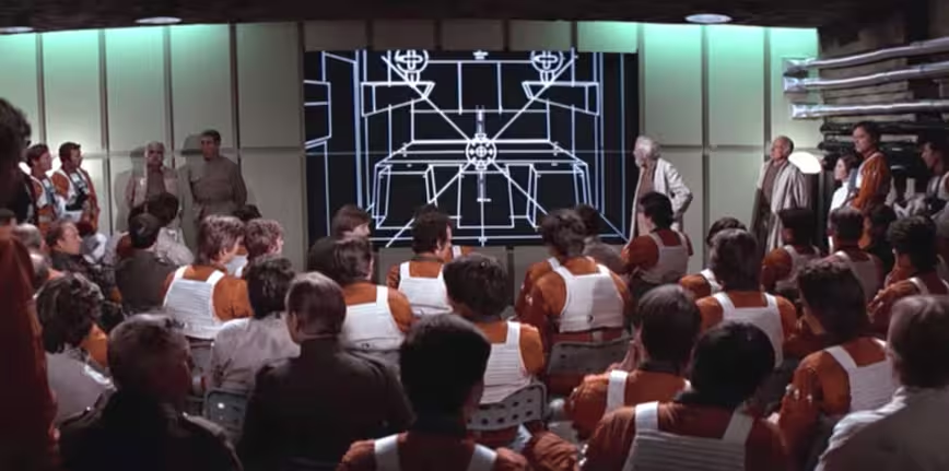
Star Wars: A New Hope (1977)
I know it’s not strictly an ’80s movie but I couldn’t resist having Star Wars: A New Hope in here — you can voice your outrage about its inclusion and the header image in the comments below.
The shot in the gif above comes from the “how to blow up the Death Star” TED Talk hosted by some rebel general or another, and is a good analog for online learning.
The design here seems clean and straightforward — a solid visualization of what’s going on. Shoot a dotted line into the tunnel opening, then watch it travel down to the center of the circle and *boom!* Got it.
The single color and simplified visualization feels clean and makes much more sense than some movie UIs where they add and add and add to make things look more “real.” That’s total bogus as simplicity is often closer to the truth. The high brightness-contrast and thick line size would probably pass for AAA-level according to the latest web content accessibility guidelines.Before there was the iPhone bezel, there was… the joystick. The gif of the destruction of the Death Star shows how radically our ideas about interactivity have changed in the past few decades. But let’s focus on the graphics.
The interface Luke uses to orient his blasters toward the chink in the Death Star’s armor is, to put it lightly, over-designed. The crazy flashing stuff on the side doesn’t seem to indicate anything. This is something you’d avoid in actual UX design, as it’s going to make the experience distracting, confusing, and overwhelming for the user.
Overall, the dashboard is cluttered, making it difficult for the user to navigate. I would also say the icons (alert alert cigarette instrument!) don’t seem very clear.
The Terminator (1984)
Here’s a screencap gif I call “the T-1000 surveys the wreckage; or, Los Angeles on a hot night.” This is a wild example of too much information in an interface. I’m interested in how the human casualty-o-meter works. Can you have a 0.5 casualty, like the half death of a person? Did the developer forget to specify zero decimals for this feature?
The infrared palette makes things difficult to distinguish and is probably a tactic to make the scene feel more sinister in mood. This dystopic view will send you running back to the minimalist white interface of Twitter.
I’m also unsure about what any of the acronyms on the right could possibly be referring to — though I may have attended summer camp with a CAMI? — and it seems like a bad idea to represent a large amount of data in acronyms requiring memorization. Are all of these acronyms being identified in the image?
It’s unclear the point of the 0 binary except to fill space. Google Glass could learn a lot from this UI fail.In this gif, the Terminator is zeroing in on a car. The flashing indicator is certainly effective in that you’re aware the target has been acquired. The blinking of the callout draws extra attention and creates a visual cue for the user to get used to. There is still a lot of extra information, but the user would learn to anticipate that primary “target acquired” alert.
Escape from New York (1981)
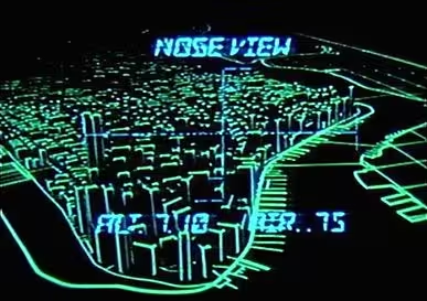 John Carpenter’s titles are little masterpieces of minimalism, but this graphic of Snake Plissken steering his drone-like aircraft into New York City is overall a visual mess. Is this the Financial District? The picture is hard to pick out and the blue text is hard to read on the green background — certainly a design no-no.
The “alarm clock” font choice also seems totally unnecessary as it’s hard to read and is designed to be used on devices that cannot properly render images. Alarm clocks, say, use characters that can be made by turning a block of lines on and off. This device is able to render the rooftops of all lower Manhattan, so we know that the font is being used more as a nod to ~technology~.
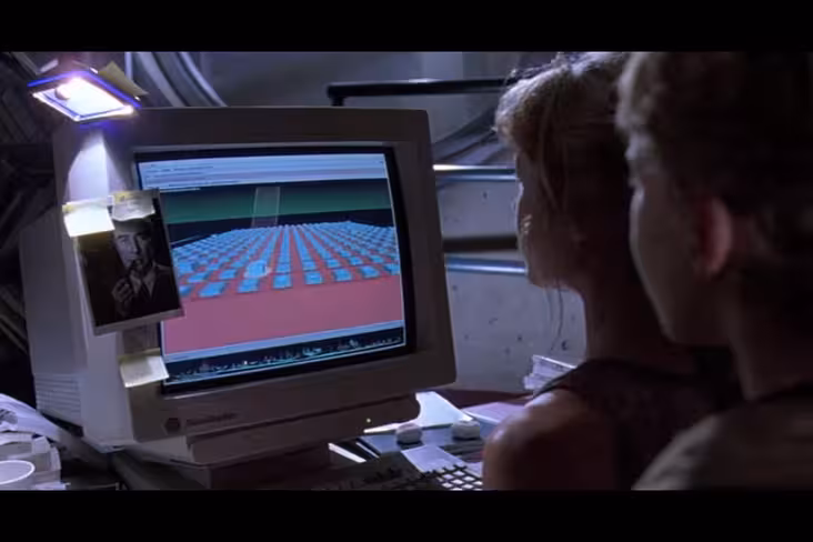
Jurassic Park (1993)
 Again, not really a ‘8os movie, but it doesn’t matter — it’s a cool movie and I wanted to include it. Sue me.
Before designers tried to get users’ heads around “the cloud,” there was the UNIX system containing the controls to Jurassic Park. If I had to describe the UI here, I’d say it’s a hall of boxes.
I don’t know what the boxes represent or if it’s necessary to display them in this three-dimensional world. This is an instance where the design is deliberately complicated to show viewers that this girl is smart.
There doesn’t seem to be any guidance on the screen at all, so navigation must be very difficult for a new user. Overall, it reminds me of filing back before I used tags. I do not wish to go back.
Get the TNW newsletter
Get the most important tech news in your inbox each week.