If you’ve visited the BBC homepage today and wondered why it looks a little different, today’s the day its redesign exits beta and is rolled out to everyone in the UK.
We reported on the new homepage when it was debuted back in September, noting at the time that the BBC’s vision with the design and layout was to help users find a broader selection of its content. So you may already have been using the new homepage for over two months, but if you haven’t, then you may be a little disoriented.
To give you a little recap of how we got to this point, back in January the BBC announced plans to reshape its online service, centering around ten products – one of which was the BBC Homepage. This was part of its ‘Delivering Quality First’ programme of change, which at its core is about doing fewer things, but doing those things better.
In August, the BBC launched a new version of iPlayer specifically for TVs, before setting out its vision for the service in the future, as it strives to take it beyond the tech-savvy, beyond catch-up and beyond the PC.
In terms of the BBC Homepage, this is actually the broadcaster’s third most popular section after News and Sport, and during a demo at BBC Broadcasting House in London on 21 September, it was clear it was taking a cue from the new touchscreen revolution with its design ethos, following a ‘swipe’ approach for navigating content.
Indeed, it’s likely that these design principles will be rolled out across many other BBC Online services gradually, leading to what it calls a “graphically-rich London 2012 Olympics digital offering”.
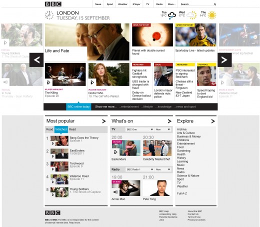
Beyond reorganization of content and clearer signposting, you’ll now see a ‘carousel’ designed to let you browse the BBC’s content more easily, whilst also providing an easier route to discover fresh content.
In a blog post earlier today, James Thornett, Head of Homepage product at BBC Future Media, said of the responses and feedback the BBC has had since launching over two months ago:
“Since the beta launch ten weeks ago we’ve had three hundred comments on the blogs, over twenty thousand responses to our online survey, and over two and a half thousand direct emails. We have reviewed all your comments, and I’d like to thank those of you who took the time to test the beta and provide feedback. The BBC Homepage occupies a unique position within the BBC Online portfolio as it can showcase the full breadth of the BBC’s content.”
The best way to get accustomed to the new layout is to visit the homepage yourself. You’ll see your location has been positioned at the top of the page, alongside the date and time, and weather. And you’ll also see a new filtering tool – the bar that is labelled BBC online today/entertainment/Lifestyle etc.
This change will only be reflected in the UK, and the website for international users is operated as a separate commercial entity and managed by BBC Worldwide. Earlier this year, The Next Web talked to Rebecca Conroy, Chief Operating Officer of BBC.com, and looked at some of the key differences between the domestic and international versions of the website.
Get the TNW newsletter
Get the most important tech news in your inbox each week.


