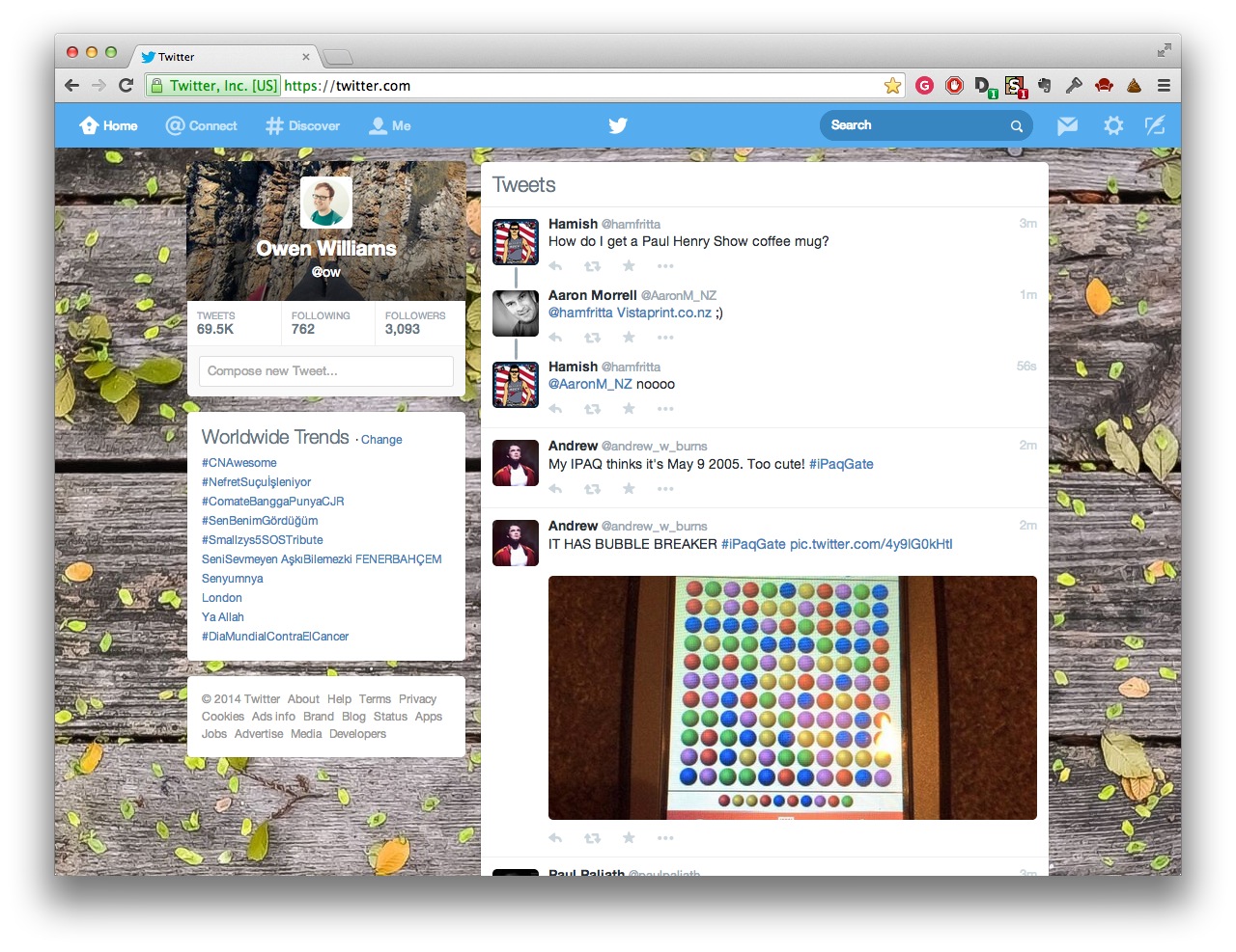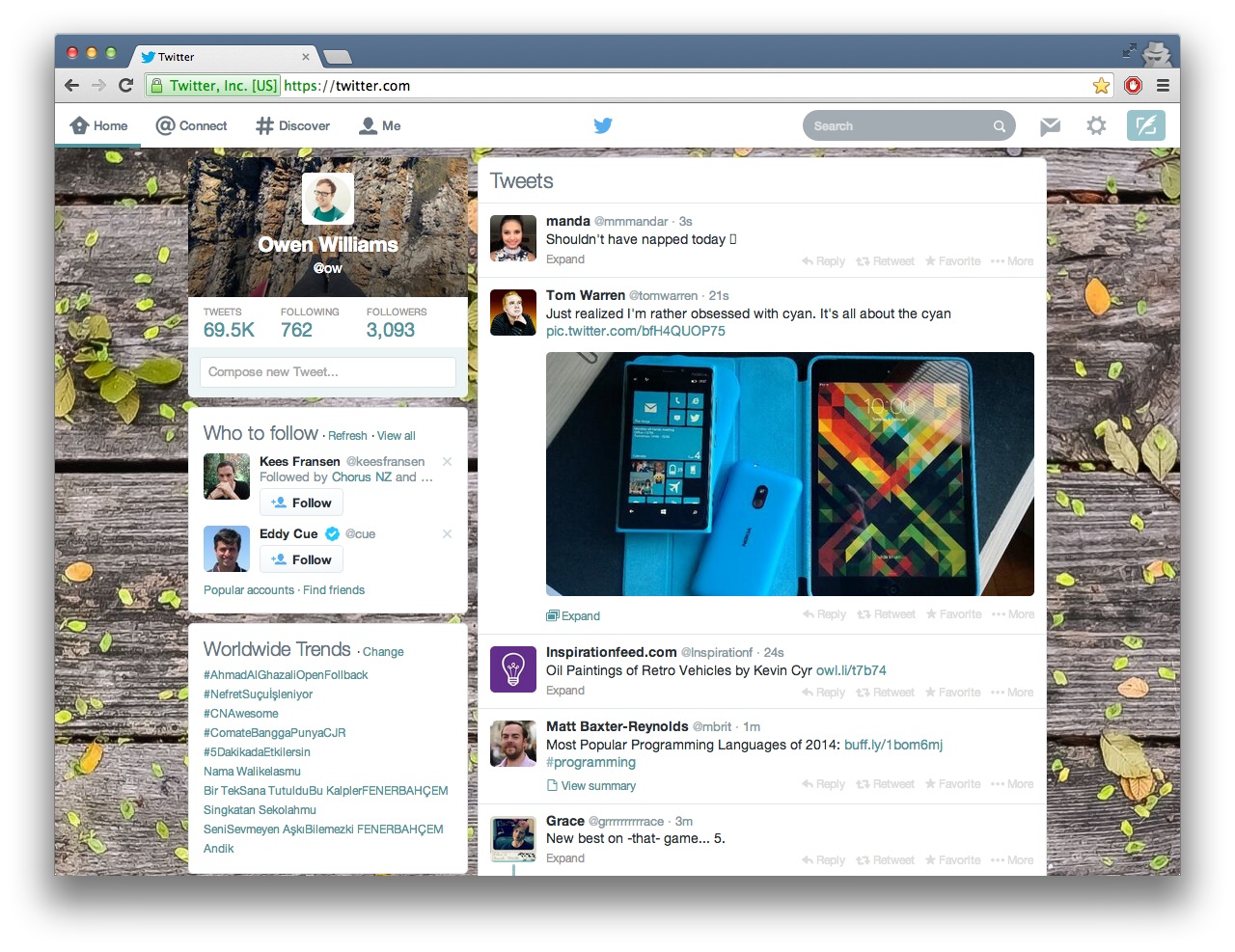
Twitter rolled out its new design to all users of its official website today, but many users (including myself) found the refreshed style overwhelmingly white and hard to look at for any length of time.
Luckily, the author of Bootstrap, Mark Otto, has made available a script that allows users to change the design themselves. The tweak replaces much of the white introduced in the new design, as well as removing the obtrusive new ‘recommended users’ box and replicating much of the design found on the iOS application.
Before:
After:

- Install the Userstyles extension from either the Chrome, Safari or Firefox store.
- Open the settings of the extension and select “write new style.”
- Copy and paste the contents of this file to the code section.
- Change the “applies to” setting to “URLs starting with” and then type “https://twitter.com” into the text box.
- Give the style a name, like “Twitter” and click save.
- All done!
Perhaps the changes will grow on users of the Web interface eventually, but for now, hopefully this tweak will help quell the stream of complaints about it on the service today.
Photo credit: DAMIEN MEYER/AFP/Getty Images
Get the TNW newsletter
Get the most important tech news in your inbox each week.


