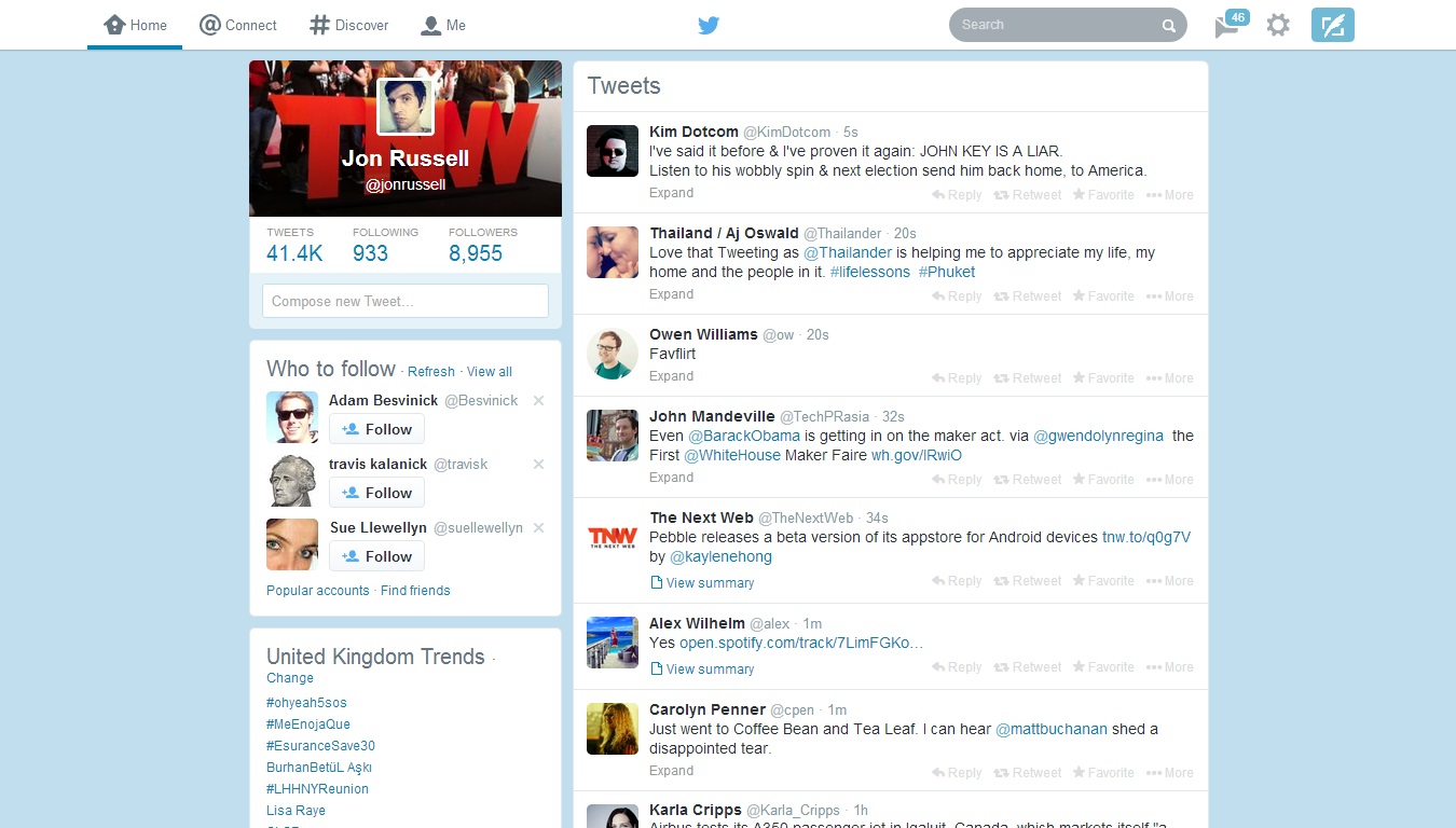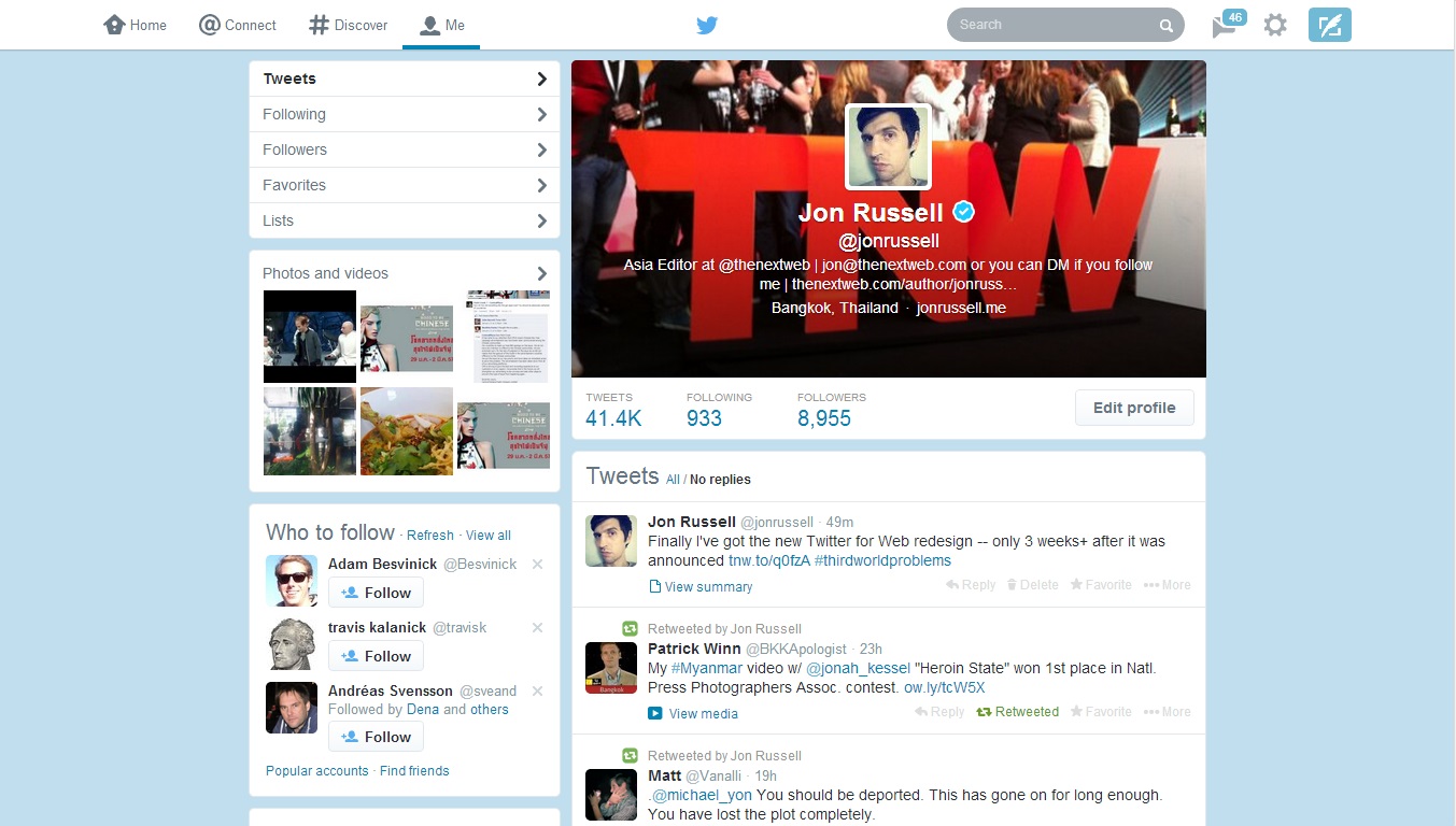
Quick PSA for Twitter users who are seeing an entirely new design at Twitter.com today — that’s because the redesign announced three weeks ago has finally rolled out to all.
The new layout includes a whiter design and bigger buttons, it was developed to bring Twitter’s Web client in line with the style of its official mobile apps.
The changes are purely aesthetic, as we noted when it was announced last month, though there are customization options:
Twitter has a refreshed look on the web! To change the accent color, pick a new Link color in your Design settings: https://t.co/EXEhImdngn
— Support (@Support) February 3, 2014
The general consensus seems fairly mixed, though I’m spotting plenty of complaints while searching for reactions: Tweets about “new twitter design”
Thumbnail image via DAMIEN MEYER/AFP/Getty Images
Get the TNW newsletter
Get the most important tech news in your inbox each week.


