Foursquare’s website has just undergone a whole host of improvements designed to make discovering content easier.
The new redesign will hopefully allow it to “expand and launch new user-facing features more easily and quickly”, and is slated to go live over the next couple of days.
Foursquare Redesign Highlights
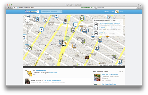
- A new and large map added to the top of foursquare.com will show everything interesting nearby (friends, trending places, locations with Specials, and popular places).
- Recommendations on the map change by what time you access it. Loading the map at 11:30AM, for example, will show great lunch spots, while early evening access reveals dinner locations.
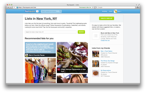
- New List discovery provides both search and visual recommendations from the nearly 15 million users strong foursquare community, along with Radar implementation alerting you to when you’re nearby a location on these Lists.
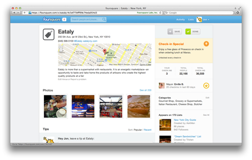
- Place pages have been completely updated with the following: Comments now allowed from the homepage, celebrity and brand recommendations, foursquare points tallies, bigger and prettier photos, etc.
- Oh, and the whole thing looks even better on your iPad.
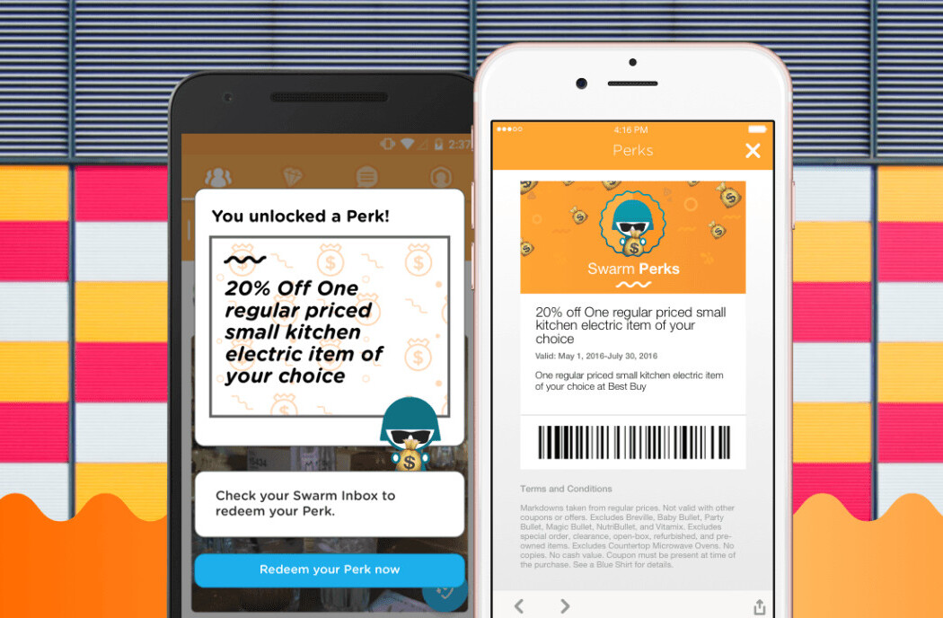
Here are a few screenshots for your viewing pleasure:
On sites trending towards improved user experience
Phew. I feel like I’ve been announcing homepage makeovers aimed towards content discovery for several social sites over the past few days, including the ever popular YouTube and Storify. To see companies like these trending towards what they hope will be better user interface experiences is definitely refreshing, especially knowing how complacent some brands tend to be after reaching a certain level of success.
Foursquare’s founder, Dennis Crowley, has admitted in previous interviews that the key to success for startups is to just go for it regardless of how broken they think their product might be, then iterate on top of that result after receiving initial user feedback to improve, improve, and improve again. It’s a scary thought, yes, as feedback won’t always be brimming full of glowing positivity, but extremely profitable once-upon-a-startup sites like Facebook didn’t get to where they are without taking a few risks.
That said, assuming you aren’t entranced by foursquare’s new look, this won’t be a problem. Again, the site redesign was done to make user-facing iterations easier and more manageable, so your feedback will surely help foursquare get on track. Head to the new foursquare.com to take a peek for yourself, then drop us a comment and let us know what you think about the facelift.
Get the TNW newsletter
Get the most important tech news in your inbox each week.
