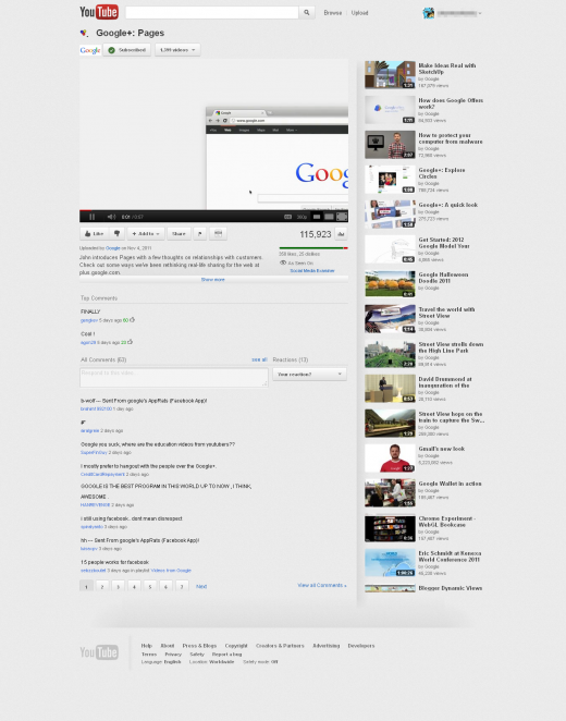
This morning, we received a tip pointing out some serious user interface redesigns on YouTube. Don’t rush off to take a peek just yet, though — the changes haven’t been rolled out to everyone. Google’s been known to test redesigns with small subsets of users, so it’s expected that only a few folks will be seeing the makeover.
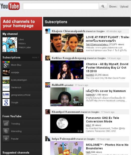
Besides the generally updated look, one of the more important changes here is the focus this redesign will put on shared content from Google+. This move should take Google one step closer towards extending the social platform more heavily into each of its products.
Also, an emphasis on user subscriptions is a good way to keep people coming back to specific channels. Given YouTube’s investment in original content, this could be a better way to keep users watching while retaining viewer loyalty.
Assuming the new look tests well among those with access, it’s likely you will soon be seeing the following changes.
YouTube Redesign Highlights:
 Deeper Google+ integration shows off YouTube content your Circles have shared to Google+, letting you surf user-recommended videos from people you might actually care about.
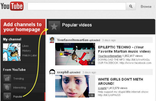
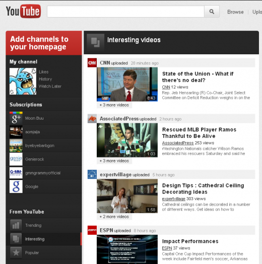
- New left-column dashboard sorts your Subscriptions and more into easily-clickable sections, including featured videos and recommended content categories.
- Homepage content will be displayed in a single column, putting a focus on larger preview images for videos.
- A slight color scheme tweak (new gray background) highlights content.
- The “fullscreen” button in actual YouTube videos will receive a more user-friendly update, giving viewers the option to shrink, expand or, yes, fullscreen the video.
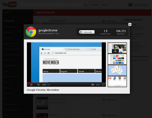
- Recommended video content pops out when clicked, allowing you to easily exit to where you last were before clicking after viewing.
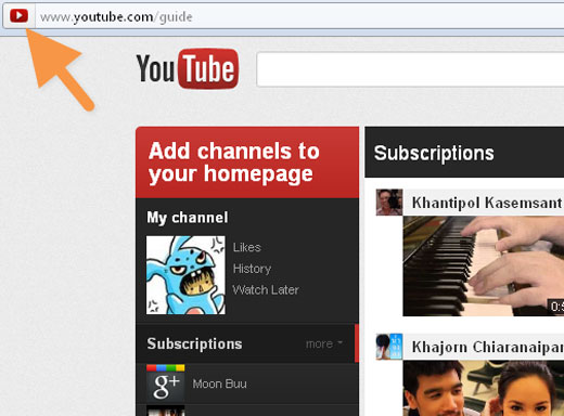
- Clicking the YouTube logo on the top left of the site will lead to http://www.youtube.com/guide.
- YouTube’s favicon will also be switched out for an updated version.
These are the most apparent changes, though it’s possible we may have missed some key elements. We’ve dropped a line to Google and will let you know anything that we find.
As for actual visuals, all the descriptive text in the world won’t give you the same impression that real screenshots will. Take a peek at the following images and get your YouTube facelift fix.
Want more? Check out this post on how to share posts from Google Reader directly to Google+.
Get the TNW newsletter
Get the most important tech news in your inbox each week.
