I’ll be the first to say this is a first-world problem, but it’s been bothering me for a while: Android’s navigation bar – the space with three virtual buttons at the bottom on many phones – is pointless.
They waste space, add nothing to the experience, and sometimes hinder it too.
Why Google and others use them
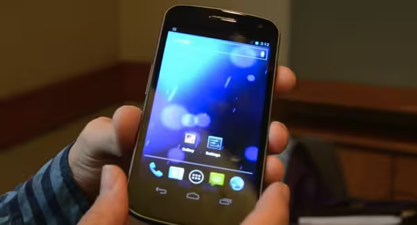
It all started with the Galaxy Nexus and Ice Cream Sandwich (Android 4.0, for you weirdos who prefer numbers to desserts), when Google decided Android phones would look better if they didn’t have any buttons on their fronts (Microsoft has since adopted the style for Windows Phone as well)

The 💜 of EU tech
The latest rumblings from the EU tech scene, a story from our wise ol' founder Boris, and some questionable AI art. It's free, every week, in your inbox. Sign up now!
At the time, it seemed like a good idea. It meant you never had to worry about physical buttons failing (soft keys existed, of course, but hardware buttons were still commonplace), and Google insinuated that virtual buttons would be able to transform and adapt to apps as they were needed.
While manufacturers have the final say, Nexus phones are Google’s models for how Android devices should look and behave, so the trend caught on. In 2016, half or more Android phones use the navigation bar, and they’re pretty much always worse for it.
Why it sucks
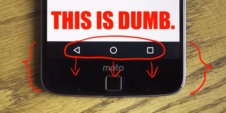
On Android, the only adapting the nav bar does is when you have a keyboard open. The back button points downward to indicate that pressing it will hide the keyboard, and a keyboard icon will show up on the bottom right to help you change input methods. Exciting.
Then, there’s the obvious issue: it unnecessarily takes up 10 percent of your display’s real estate. Sure, that may not sound like much, but it’s counterproductive for Android phones to flaunt their big screens and then effectively shrink them with a navigation bar.
It’s particularly noticeable when browsing websites and other vertical scrolling media. That in effect means many smartphones are larger than they need to be – and most Android phones are already a pain to use with one hand.
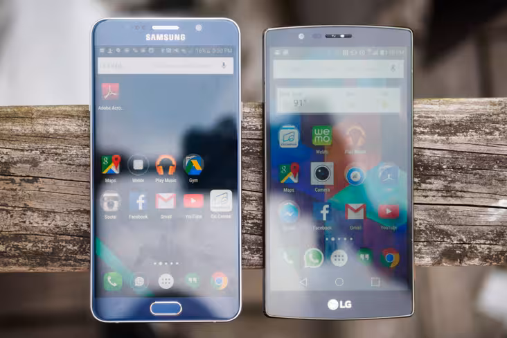
The simple fact is you can fit more of an app or article on a smaller screen if you don’t use a navigation bar. That’s why Samsung’s phones are so small for their screen sizes; they use capacitive buttons on small bezels, so as much surface area as possible is devoted to the screen.
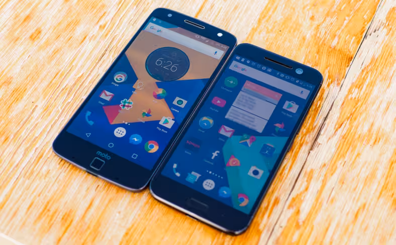
Compare that to Moto Z I recently reviewed, which adds a navigation bar to an already prominent bottom bezel. It’s silly.
The buttons do hide while watching video or viewing photos, but even then it feels sloppy – you need to tap the screen to make the buttons show back up, and on some software, leads to odd glitches as the app tries to resize.
These aren’t deal breakers, but the simple fact is you wouldn’t have these issues with regular, static soft keys.
You could argue that some manufacturers like LG let you rearrange and slightly customize the navigation bar, but that’s not a default Android behavior. Besides, some Android phones allow you to set custom functions to capacitive buttons with a long-press or double tap, which is a much more efficient use of space.
The only reasonable excuse I can come up with for maintaining the navigation bar as it currently exists is if you literally have no space on the bezels due to stereo speakers (as in the Nexus 6, but the Nexus 6P’s bezels are still wide enough to fit capacitive buttons).
What Google should do
The way I see it, until someone comes up with a completely bezel-less phone, Google has two options: either actually do something interesting with the navigation bar or just get rid of it altogether.

The initial potential of having a virtual buttons has gone unfulfilled. Google could’ve mapped a variety of gestures to the area, like on Palm’s underrated WebOS. It could’ve allowed app-specific functions and buttons that only show up when you need them. It could’ve at least provided customization options by default.
Instead, we have a space-wasting emulation of what capacitive buttons already do more effectively.
Google has pushed its design chops with every generation of hardware and software, but the navigation bar feels like a lazy relic. Google can do better than that.
Get the TNW newsletter
Get the most important tech news in your inbox each week.