When it comes to mobile social networks, I’m feeling quite a bit of functionality fatigue.
Swipe left, swipe right, swipe up. Tap to see it before it ends. Watch now or it’ll be gone in an instant. Real-time updating your neighbor’s cousin’s live stream of a dog. See new filter updates once a week.
Today, Twitter released its mysterious, much-hyped “Project Lightning.” It’s actually called “Moments” — a feature designed to give users curated, media-driven tweets that can be flipped through by swiping right. These moments are designed to change fairly frequently throughout the day, and can be broken down by channel. Once you’re done consuming them, they’ll disappear.
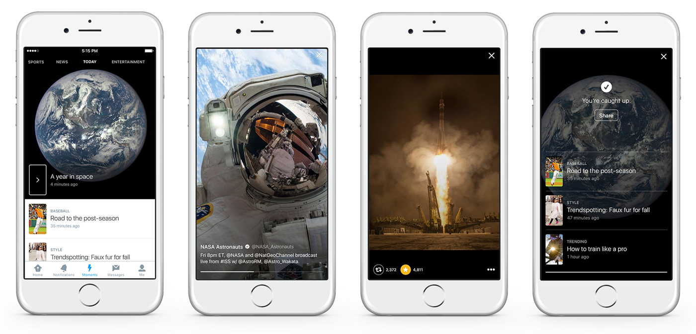
Does it sound a little like Snapchat’s Discover tab to you? Sure, it’s missing the media branding (and subsequent revenue stream), but the bones of the service are pretty much there. Consume a small piece of news or information, or a video lasting between six and fifteen seconds. Swipe right when you’re ready to move on to the next nugget of media. Once you’re done, it’s all gone.
Or, maybe you’re a frequenter of the dating scene, so Moments for Twitter sounds a lot like (you guessed it) “Moments” for Tinder. Sure, there’s less out-and-out curation involved on the mobile dating app, but the idea of ephemerality — the particularly aggressive stickiness in threatening a user that it might be missing out on something (or someone) important — is certainly there. Plus, you know, the name.
So I read the details of this new feature — ostensibly the one designed to reinvigorate Twitter’s connection with people who aren’t quite sure how to get the most of the platform while cementing new CEO Jack Dorsey as the startup savior they can believe in — and sighed.
How could I not? For all of its hype, it sounds like an idea that’s been iterated many times before by other companies. It sounds like I’ve already seen it.

The problem with mobile-only features is that they rarely incorporate originality. Possibly in fear of hindering user interaction, they’re all swiping right. They’re all creating daily, weekly, hourly incentives to catch attention. It beings to feel all same-y, and Twitter acting like Tinder acting like Snapchat is the kind of mobile interaction turducken that’s coated in all kinds of hype and served to masses for familiarity’s sake.
They’re not the only culprits, either. Facebook’s self-cannibalization of Doodle into its own man app shows that its method of cherry-picking trendy features from other apps — like Snapchat’s draw feature– in separate, testable chunks (in this case, within its Messenger app) might serve as a means to imbue the big dinosaur platform with some kind of youthful vigor.
Not that I think that (Twitter’s) Moments can’t or won’t be a successful feature in its own right — perhaps what newcomers to Twitter need is a sense of intuition, an inborn sense of how the app is best used. Twitter needs a better tool to surface the best news and the best people broadcasting that news, and it looks like Moments could fulfill that.

My philosophical hangup is wondering whether we’ve reached mobile feature inertia. When everything is looking the same and acting the same, with the same features and the same time limits, is there any room to iterate outside of the box?
I believe we’re due for another radical shift in the way we interact with our mobile apps. I want to believe we have more in us than simply killing hamburger menus and changing stars to hearts. Until I see something new, it’s hard be truly excited by all these ‘new’ features
So maybe time is a flat circle, nothing is new and we’ve reached a stage of mobile apathy. Or maybe there’s more left to see. Either way, I’m waiting.
Get the TNW newsletter
Get the most important tech news in your inbox each week.


