LeEco (formerly LeTV) has made a name for itself in China with its popular streaming video service. The company has since branched out into manufacturing mobile devices in order to introduce users to its library of content more easily.
It’s now launched two phones in India – the flagship Le Max and the budget Le 1s. The latter is more compelling because it packs impressive specs into a reasonably priced package that doesn’t look too shabby, and that’s what we’re looking at today.
LeEco hasn’t yet brought its streaming apps to the country, so for now, we’re only evaluating the device against its competition. I put the 1s through its paces over the past three weeks; here’s what I found.
Design and hardware
The 1s features an all-metal unibody crafted from aircraft-grade aluminum that’s well machined and feels solid. It easily outclasses most other devices in its price range and is comparable to the iPhone 5s in terms of build quality.
The display takes up most of the front fascia, while the panel above it features the proximity sensor, speaker grille and camera positioned to look like an emoji. The panel below it houses the hardware buttons, which become visible only when pressed. All that helps the 1s make an impression when you set it down on a table.
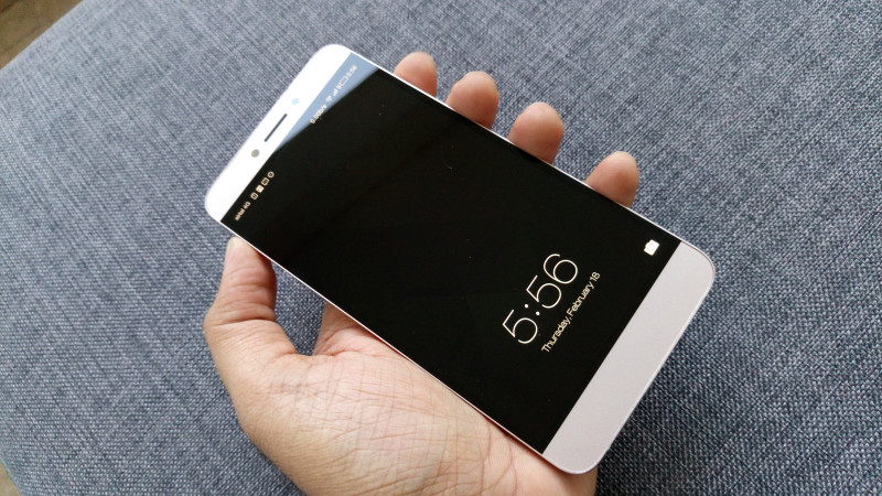
The speaker cutouts at the bottom of the device, as well as the volume rocker and power button are also flawlessly executed. There are other sharp details too, like chamfered edges around the entire device that you can see both on the front and back.
You’ll find a fingerprint reader with a mirror finish on the back of the device, which I’m not a fan of because that placement means you have to lift the device to unlock it (more on that later).
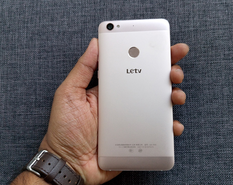
The phone is about 7.5mm thick, but it feels more substantial than that because its edges aren’t rounded.So if you have small hands, it might be a bit difficult to grip and use. It also feels heftier than its 169g weight, possibly because of the way it fits in your palm.
Display and sound
The 1s has a Full HD 5.5-inch screen with a pixel density of 403ppi. Colors are more saturated and a bit on the warm end of the spectrum. If you prefer, you can switch between a few display profiles like Vivid, Natural and Soft to suit your taste.
Other than that, the screen gets bright enough to use in direct sunlight and can be turned down a fair bit for reading at night. The IPS panel ensures uniform colors from just about any angle.
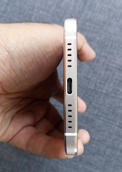
The 1s’ speakers fire from the bottom and are unremarkable: the sound doesn’t distort at the highest volume, but then again, it doesn’t get very loud either. It’s fine for watching Netflix by yourself or playing games, but don’t expect to start a party at a campsite.
Features
The 1s lacks NFC, which means you won’t be able to make contactless payments with Android Pay — but it includes a couple of other features usually reserved for pricier handsets: a fingerprint reader and a USB Type-C connector for charging.
As I mentioned earlier, the placement of the fingerprint sensor on the back doesn’t sit well with me. I wouldn’t have minded so much if the phone allowed you to wake the device by tapping on the screen, and then unlocking it by swiping a pattern code. Sadly, the 1s doesn’t have the former feature and only lets you use a PIN if you’ve got fingerprint security enabled.
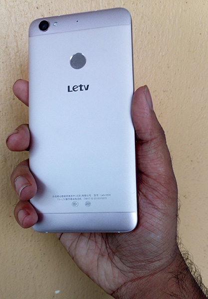
It’s nice to be able to plug in the USB Type-C cable to charge the 1s without worrying if it’s upside down. The device also supports quick charging, so you can top up its 3,000mAh battery and get a couple of hours’ use in just 25 minutes and a little more than a day’s worth in roughly two hours.
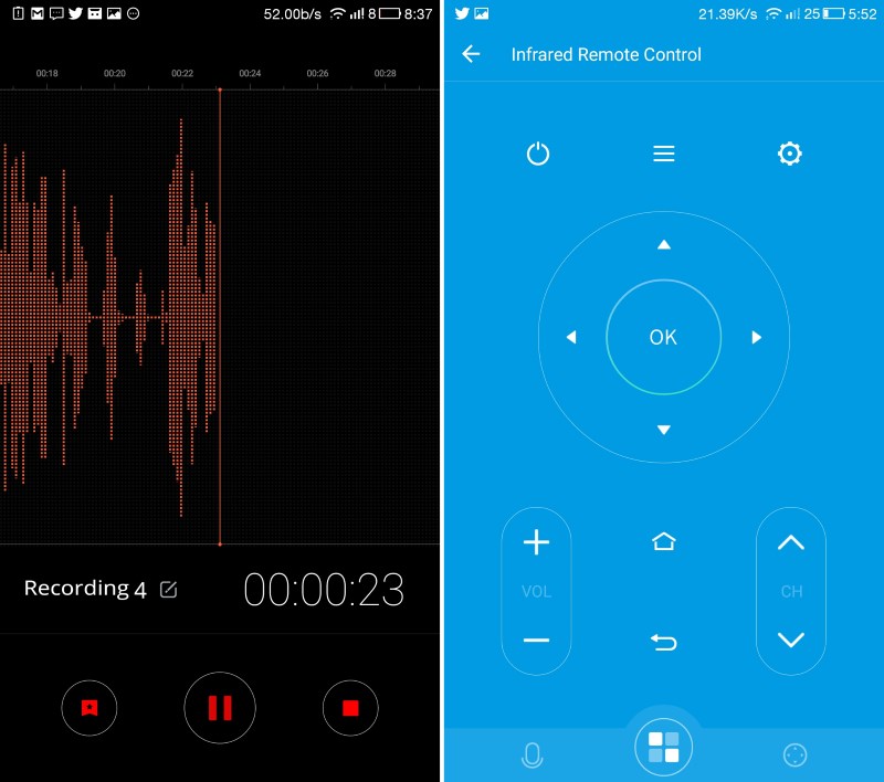
In addition, the 1s supports dual 4G SIMs and has an IR blaster so you can control your TV or air conditioner using the bundled app. Both features sweeten the deal a fair bit, especially given the 1s’ low price.
Software
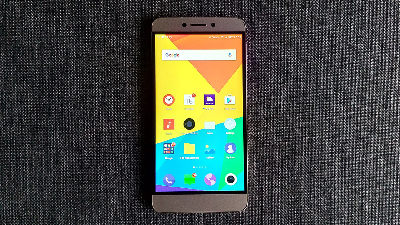
The 1s runs Android Lollipop with LeEco’s eUI software layer on top. It’s geared towards pulling you into the company’s growing ecosystem of devices and content services, but it doesn’t really improve on the OS’ user experience.
For starters, eUI, like some other flavors of Android, attempts to mimic iOS by doing away with the app drawer and placing all your icons on multiple home screens.
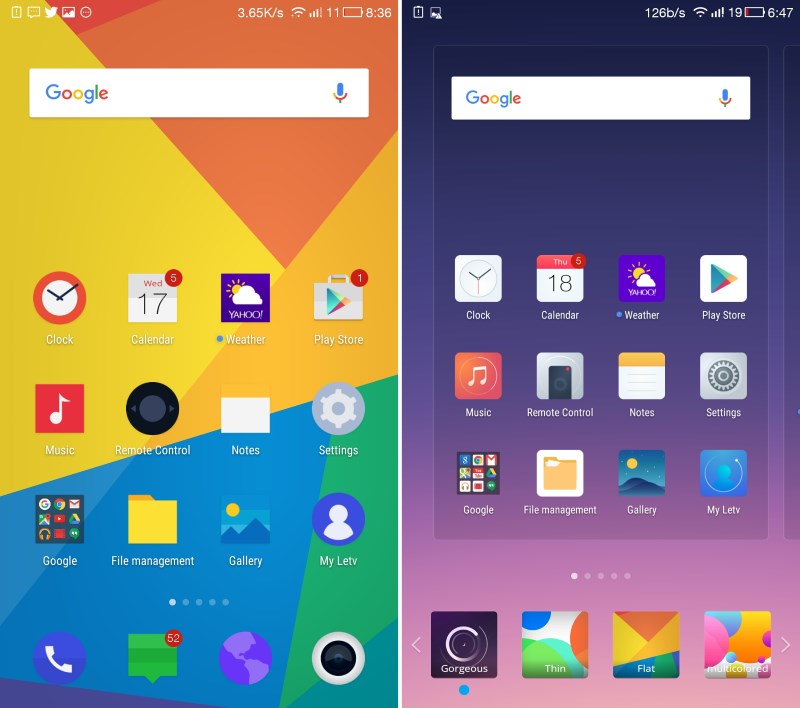
I wouldn’t mind it so much if there was a way to organize them quickly, either by selecting a bunch at a time or rearranging them by function or color. Instead, you’re left with a mess that looks like a child forgot to put away their toys after a day of play.
It’s also not great at handling notifications. You can’t expand them or mute alerts from select apps, like you would with CyanogenOS. Oh, and there are no quick settings toggles here.
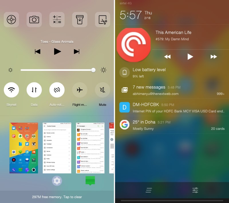
Instead, you’ll need to tap the physical menu button to bring up the app switcher to find them. Perhaps it’s just me, but I prefer being able to adjust settings without having to minimize my app to do so.
Of the preloaded apps for basic functions like email and messaging, the only one I liked was the voice recorder. It lets you add bookmarks while you capture audio, so that it’s easier to find specific points such as the beginning of a response during an interview.
eUI also lets you switch up themes, but there are only a few to choose from at present and none of them really grabbed my attention. What’s more useful, though, is the battery assistant that you can turn on to automatically disable certain features and eke out a few more hours of use when you’re low on power.
Camera
The 1’s 13-megapixel rear camera is perhaps the only component that gives away the fact that this is a budget phone. Shots turn out less saturated and colder than I’d like. And it’s also fairly difficult to get some depth of field in your photos.

To adjust the exposure, you have to drag an on-screen cursor to a lighter or darker part of your scene — not very intuitive or easy. However, its saving grace is that it focuses quickly.
Don’t expect to get clean shots in low-light conditions; the camera is quick to introduce noise if you’re not in the sun. The 5-megapixel front camera is does a decent job of snapping selfies, but it isn’t remarkable in any way.

What’s particularly disappointing is the default camera app: it doesn’t offer any manual functions and only supports four basic shooting modes including panoramas and slow-motion video. Editing features are also fairly basic, with only basic adjustment tools and a handful of filters to play with. If you want more control over your shots, you’d do well to try using a third-party app like Camera MX instead.
Performance
Under the hood of the 1s is a Helio X10 Turbo 2.2GHz octa-core processor paired with a Power VR G6200 GPU and 3GB of RAM. The combination allows the device to handly most graphics-intensive games like Mortal Kombat X without breaking a sweat.
The 1s also handles social media, productivity and content consumption apps easily, and rarely lags even when you’ve got a bunch of things going on at once.
However, its quirky memory management causes it to close apps after a certain period of time, which means you might miss notifications from messaging services if you haven’t used them for an hour or two.
Other than that, it offers a level of performance that’s comparable to heavyweights like last year’s Honor 6 Plus and the more recent OnePlus 2 — both of which cost more than double the 1s’ asking price.
Verdict
At Rs. 10,999 ($160), the 1s is a no-brainer. Had it been priced at $250, I’d still call it a smart buy. It’s very well built, lasts just over a day on a full charge and is pretty nimble with everything from browsing to games.
I’ve said before that I’m a fan of smaller devices and if this were available in a 4.7-inch variant, it’d quickly become my daily driver.
The only factors letting it down are the camera and the uninspired OS — but that’s in comparison to much more expensive phones. Overall, If you’re comparing this to, say, the $180 3rd generation Moto G, the 1s easily comes out on top.
If you’re in the market for a new phone, the LeEco Le 1s makes a strong case for looking beyond flagships and is well worth braving its flash sales to get your hands on one.
➤ LeEco
Get the TNW newsletter
Get the most important tech news in your inbox each week.


