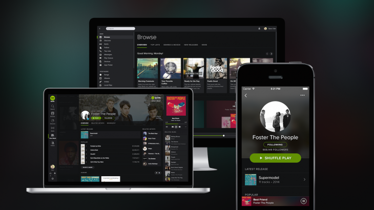
Music streaming service Spotify has sported more or less the same look since its launch in 2008, and it’s finally time for a change. The new Spotify is rolling out gradually from today onwards to iPhone, desktop and Web users — and will “soon” be available across all platforms including Android.
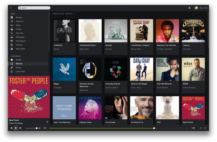
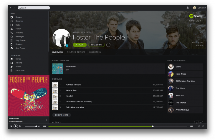
Spotify’s overhauled design comes with a darker theme — which particularly helps album art to stand out — as well as refreshed fonts and rounded iconography. Michelle Kadir, director of product, describes the darker interface as providing an experience akin to watching a movie in a cinema, where the lights are dimmed and then the movie plays. “That’s basically what we want to do with Spotify too. We wanted you to log on to Spotify — the lights are dimmed, and the music comes forward,” she tells TNW.
The new design is also much more minimalistic, which is a refreshing change from the pretty cluttered interface that Spotify has sported so far. Kadir explains that the team set out to make the newly-designed platform function in as straightforward a manner as possible. Users were roped in to test the new design and provide feedback — and this interface stood out in particular, across many territories and countries, and no matter the age of the listener.
We thought it was time for us to make a change… What we felt the past year is that we’ve kept innovating — we’ve shipped a lot of new features, we’ve launched in new markets, and we’ve also shipped on many new platforms. But what we haven’t done is to take a step back and just redo the design so that we feel like it’s new, it’s fresh — but also so that it really works across all platforms.
We really wanted Spotify to feel very familiar — so if you go to Spotify on your phone, or Spotify on your computer, it would feel the same. We thought that right now that’s not the case, so we wanted to do a big design change and basically make that work.
Other than the new look, Spotify is also introducing a revamped ‘Your Music’ feature which gives you a “frictionless way” to save, organize and browse music the way you want to — via options including songs, albums or artists. The old Spotify threw together all the music you starred under one category and could be rather frustrating to navigate.
The ‘Browse’ feature has also been given a revamp to enable more music discovery by delivering even more localized and relevant content. “You’ll now see something that changes depending on the time of the day you go in (to Spotify). So when you go in on a Monday morning, on the Featured section you may now see something about commute, or a playlist that will work with taking a train. For Friday evening, you may see a playlist about partying, or a dinner,” Kadir says.
These upgraded music discovery features come as Spotify acquired music data platform The Echo Nest last month. The deal has given Spotify a lot of intelligence around music, and Kadir says that will help to accomplish the service’s ultimate goal: for users to find new music.
Other than that, Kadir also says that Spotify is working to boost social experiences on the platform.
Either you discover music through recommendations that we give you, or the best type of recommendation is the one from your friends. And we want to make that better and simpler every day, we want you to have that trusted social bracket of people you follow whom you think their music taste is the best. That’s what we want to get at. We want to make what they recommend and what you like be connected more and more.
Competition is heating up in the music streaming industry, with rivals including iTunes Radio, Pandora, Deezer and Rdio among others, as well as a myriad of music discovery apps. Spotify’s redesign thus comes at a pivotal time as it seeks to keep its existing users, and probably attract more new users. After all, it has been expanding aggressively — in December last year, it announced that it was landing in an additional 20 markets, bringing its presence to a total of 55 countries.
Here’s a video for a better look at the new Spotify.
Headline image via Mario Tama/Getty Images
Get the TNW newsletter
Get the most important tech news in your inbox each week.
